Spring 2023
Ramp up the key strokes

Keith Armstrong
Barrie Tullett
Dom Sylvester Houédard
Bob Cobbing
Reviews
Typography
RUHUMAN: The Typewriter Art of Keith Armstrong
ed. Barrie Tullett and Tom Gill. The Caseroom Press, £20.
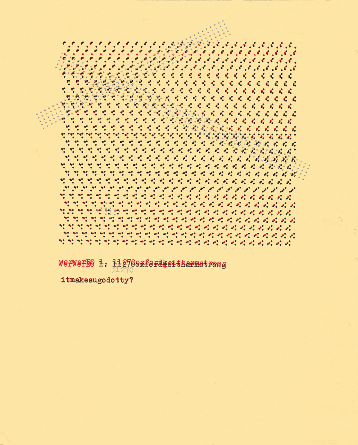
Keith Armstrong (1950-2017) was a poet, artist, film-maker, musician (under the name ‘ruhuman’) and activist who earned a reputation for his typewriter art while still in his teens. He published a small but ambitious art and poetry magazine called The Informer from 1966-71, and that brought him into contact with writers, such as J. R. R. Tolkien, Bob Cobbing (see Eye 93) and Dom Sylvester Houédard (aka dsh, see Eye 20), who became a friend. Issue no. 8 featured an unpublished essay by Boris Pasternak. The Informer was also a vehicle for Armstrong’s typewriter art, such as the work below: werwerEO itmakesugodotty? (1970), below. You can see this and many other examples in RUHUMAN: The Typewriter Art of Keith Armstrong, which explains how Armstrong’s life and work were both constrained and liberated by his disabilities, which resulted from childhood polio. As his mobility decreased, his typewriter art took a back seat to other causes and enthusiasms.
werwerEO itmakesugodotty? (1970), from RUHUMAN: The Typewriter Art of Keith Armstrong.

He became more active in campaigning for disability rights – with some notoriety. After Armstrong was arrested for blocking London’s New Oxford Street, the judge threw out the case because there were no courthouse wheelchair ramps for the accused.
RUHUMAN features hundreds of examples of visual poetry by the young Armstrong (also referred to as ‘keitharmstrong’, as in Tullett’s excellent Typewriter Art, 2014). His dense and rhythmically patterned work has a direct impact that belies the complexity of its creation. When compared to other concrete poetry, Armstrong’s work has a highly personal sense of colour. He often used coloured papers or pre-painted sheets and his two electric typewriters had ribbons in black, red and silver ink and cartridges in brown, black, green, red and blue.
With
mathematical precision, Armstrong created riveting moiré effects,
isometric projections and gridded blocks whose stability was
challenged by stray characters that fray, fragment and drift towards
the corners of the page. However ‘anchored’ his designs, they
implied a movement, rhythm and a freedom that is typical of this
underappreciated artist, whose life and work is celebrated in this
fascinating book.
John L. Walters, editor of Eye, London
First published in Eye no. 104 vol. 26, 2023
Eye is the world’s most beautiful and collectable graphic design journal, published for professional designers, students and anyone interested in critical, informed writing about graphic design and visual culture. It is available from all good design bookshops and online at the Eye shop, where you can buy subscriptions and single issues.

