Spring 2018
Rational, exuberant, eclectic

The Moderns: Midcentury American Graphic Design
By Steven Heller and Greg D’Onofrio. Designed by Kind Company. Abrams Books $55, £40.

In a section of his final book, Vision in Motion (1947), László Moholy-Nagy describes what can be read today as an early definition of ‘modernist’ graphic design. He advocates ‘simplicity and forcefulness through the simultaneous organisation of the numerous messages which have to be transmitted to the reader’, highlights the rise of ‘a great number of other visual manipulations, such as superimpositions and photomontage’ increasing ‘the attempts to change typography from typesetting to photo engraving by fusing into a “collage” all the elements, that is, the copy, drawings, photographs, facsimile of documents, scripts, etc.’, along with ‘textures […], cutouts and foldings, […] later added to the printed matter to vitalize the reception range of the eye.’ Finally, he asserts that ‘although most of these devices are used mainly in advertising layouts it can be safely predicted that soon they will form the normal routine of every type of communication ....’
These observations were illustrated by black-and-white reproductions of works by designers Herbert Bayer, Xanti Schawinsky and Paul Rand (two Europeans and one American), who played a significant part in building this ‘normal routine’ between the 1930s and the 1960s. Today, the publication of The Moderns: Midcentury American Graphic Design, aims to reassess the relevancy of its outcomes and accomplishments. On this topic, some readers might already be aware of R. Roger Remington’s American Modernism: Graphic Design 1920 to 1960 (Laurence King, 2003), which is structured as a general historical study, unlike The Moderns. The authors of this substantially researched and illustrated book have chosen to organise its main contents in two sections offering a series of biographical notes with a selection of works arranged in alphabetical order.
The first section is dedicated to the ‘emigrés’. It goes without saying that the American graphic design trade (among many others) owes a huge debt to the men and women who left Europe in various circumstances, driven by the prospect of success or scared by the ascent of Nazism. Whereas famous designers who are already the subject of monographs, such as Herbert Bayer, Alexey Brodovitch and Ladislav Sutnar are well represented, it is a great opportunity to discover lesser known figures, such as György Kepes (one of Moholy-Nagy’s disciples), Erik Nitsche, or Cipe Pineles, one of the (very few, apparently) women who entered the trade in the 1930s, when she was hired and trained by Dr Mehemed Fehmy Agha, the art director of Vogue and Vanity Fair (sidenote: who’s going to research and write about the birth and development of the American modern magazine?).
The second section, ‘Homegrowns’, displays even more renowned designers, from Saul Bass to Lance Wyman, but, again, is more enthralling when presenting several women whose achievements remained for too long in the shadows. One can read about fashion photographer Lillian Bassman who designed Junior Bazaar, a magazine targeted at college girls, the ‘functional Modernism’ of Jacqueline S. Casey (see Eye 68), the ‘multidimensional’ approach of Tomoko Miho or the vibrant ‘typo-graphics’ of Deborah Sussman.
Finally, L. Sandusky’s essay ‘The Bauhaus Tradition and the New Typography’, is republished as an appendix, though not as a facsimile as originally designed by Lester Beall (see Eye 24) and published in PM, A journal for art directors and production people (June–July 1938). This narrative is an appreciable document to understand the passage of Modernism from the ‘old world’ to the ‘new’.
As the authors notice in their thorough introduction, American Modernist came in many flavours: ‘rational’, ‘exuberant’ or ‘eclectic’. The Moderns effortlessly manages to give it a kaleidoscopic portrayal. It sparks (as often a new, solid book can do) ideas and an appetite for more books; one hopes to read someday a study of American graphic design in the broader and intricate context of American design, architecture and arts of the mid-twentieth century.
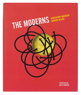
Cover for The Moderns featuring an advertisement for Container Corporation of America, 1941, designed by Herbert Matter.
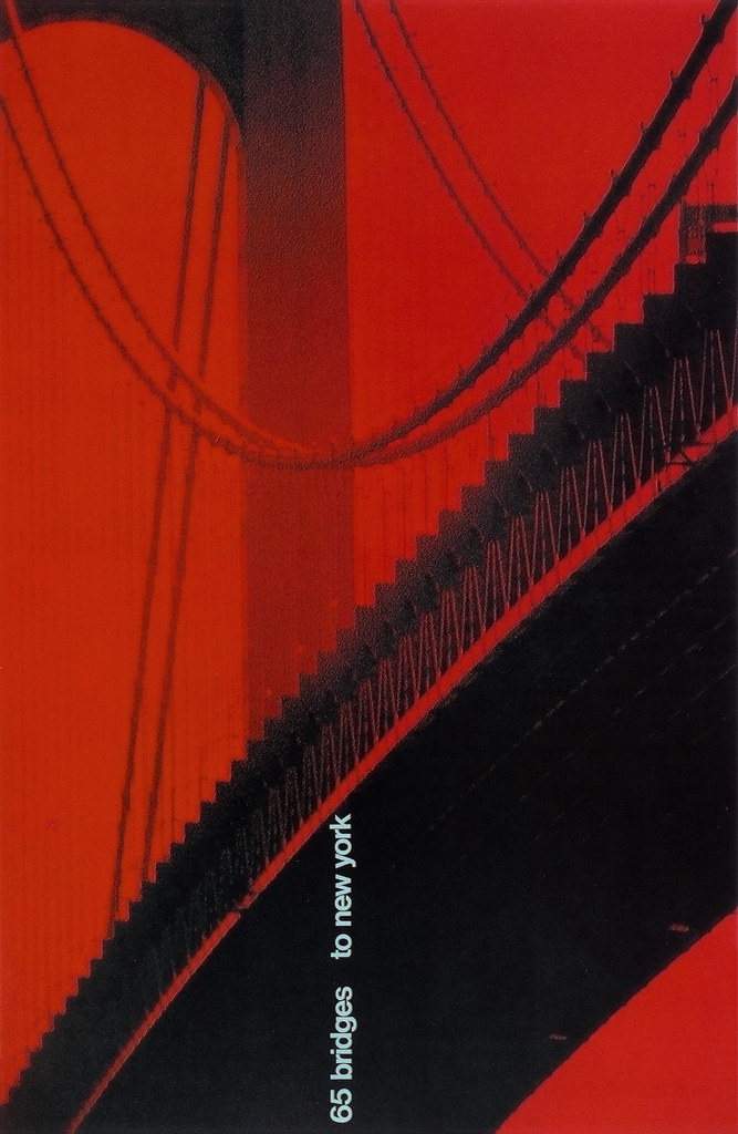
Top: Tomoko Miho’s poster 65 Bridges to New York from the series ‘Aspects of New York City’, Center for Advanced Research in Design, 1967, shown in The Moderns.

Sébastien Morlighem, teacher, researcher and writer, Amiens, France
First published in Eye no. 96 vol. 24, 2018
Eye is the world’s most beautiful and collectable graphic design journal, published quarterly for professional designers, students and anyone interested in critical, informed writing about graphic design and visual culture. It is available from all good design bookshops and online at the Eye shop, where you can buy subscriptions and single issues. You can see what Eye 96 looks like at Eye Before You Buy on Vimeo.

