Autumn 2013
Raw and radical

Power to the People: The Graphic Design of the Radical Press and the Rise of the Counter-Culture, 1964-1974
Edited and designed by Geoff Kaplan University of Chicago Press, £29, $45, hardback

The ‘underground press’ died out more than 40 years ago. Yet it lives on, thanks to a spate of recent books published. There was 200 Trips from the Counterculture (2006); On the Ground (2011); and Sex Press (reviewed in Eye 84). The latest, Power to the People, is the one with the largest helping of visual material. Yet there is still much more to see.
Omissions are inevitable, since reportedly 800 different underground newspaper titles were published in the US alone, most of them on newsprint, and many of them obscure. Kaplan must be forgiven for missing some key publications, while praised for including some very rare important ones, like Ed Sanders’ Fuck You / A Magazine of the Arts, a hand-scrawled mimeographed revue that bridged Beat and hippie generations.
Kaplan also has many of the touchstones, such as Other Scenes, The Oracle, Rat, Berkeley Barb, Good Times, The Realist, The Seed, the Whole Earth Catalog – and the list goes on. The inclusion of a few I’d never seen before, such as the lesbian Amazon Quarterly, the Screw-like The Organ, and the People’s Computer Company and Radical Software (the last two from the early 1970s prefiguring the hacking movement) are very tasty treats.
What separates this from the other books is the term ‘graphic design’ in the subtitle. Although graphics played a huge role in the underground’s identity and its impact on its readers, there has been little consideration of its layouts, cartoons and lettering in terms of formal graphic design. It is the proper term but since the undergrounds were often against establishment design there has been a tendency to regard what went on their pages as something other than design. Of course, that is not true. Kaplan acknowledges that while the underground may have been amateurish and anonymous, ‘several important figures emerged in this period who are now household names within the era’s visual culture’.
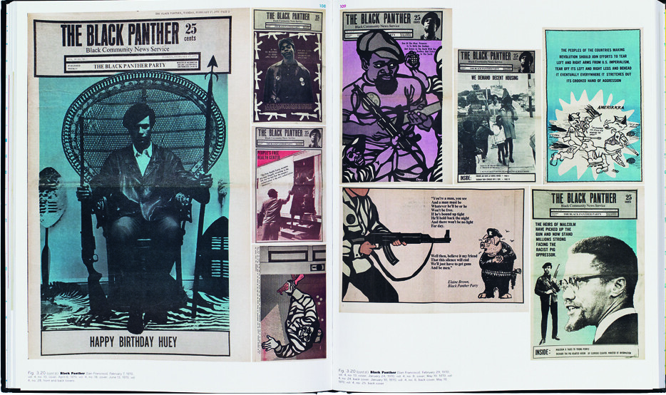
What also distinguishes this book from the others is the generous splash of covers and interior spreads from so many publications, allowing the wide range of graphics from ad hoc collages for Distant Drummer to the studied bold line of Emory Douglas’s work for The Black Panther. The layout presents readers with graphic design in its raw state.
After four decades, some of the newsprint pages reproduced have yellowed but the lettering, layout and illustration does not look particularly old-fashioned. Underground press graphic design is not trending at the moment, but neither is it covered in mould. I’m not sure whether that is a testament to the work, or the eclecticism of the age, where old versus new is no longer as telling as slick versus DIY.
Cover makes colourful use of Hendrix diptych from The Seed.
Top: spread showing covers and interior pages from The Black Panther, which featured Emory Douglas’s illustrations and photomontages.

Steven Heller, design writer, New York
First published in Eye no. 86 vol. 22 2013
Eye is the world’s most beautiful and collectable graphic design journal, published quarterly for professional designers, students and anyone interested in critical, informed writing about graphic design and visual culture. It is available from all good design bookshops and online at the Eye shop, where you can buy subscriptions, back issues and single copies of the latest issue. You can see what Eye 86 looks like at Eye before You Buy on Vimeo.

