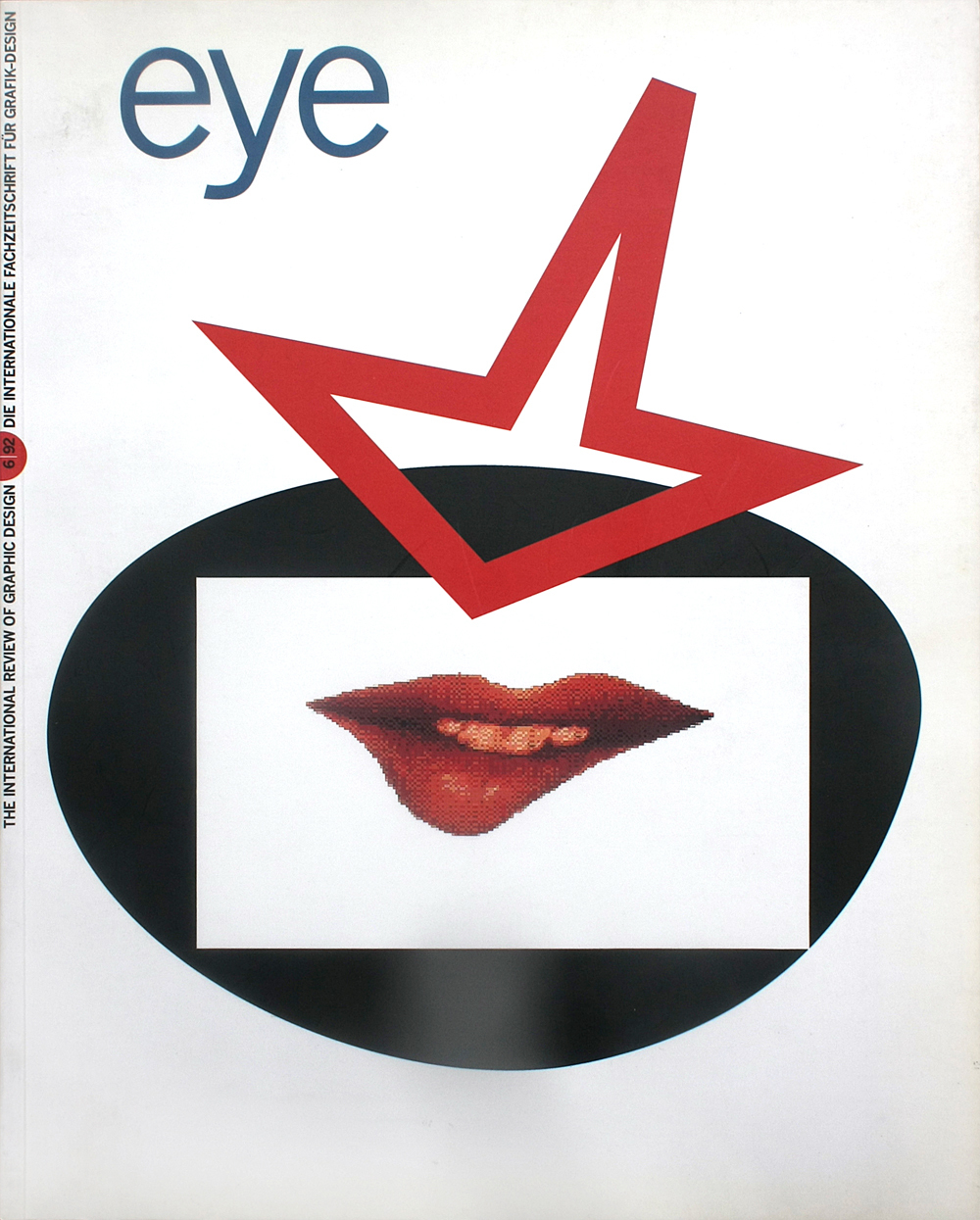
Spring 1992
Safety pins and Letraset
Jamie Reid: The Rise of the Pheonix
Celtic Surveyor IV, 051 Media Center, Liverpool 1991In recent years, the work of several British graphic designers has been elevated from the realm of ephemera into what is generally understood to be the higher, more immutable realm of formal fine art. This is evident both in the increase of graphic design exhibitions in conventional fine art venues, and in the enhanced artistic recognition conferred on British graphic designers such as Neville Brody, Vaughan Oliver and Jamie Reid.
These designers are distinguished from traditional graphic design by their use of unconventional design methodologies and a new visual semiotics. Their association with ephemeral pop cultural movements has been very close, especially those movements propagated at street level and by the music industry. Their success is linked to an ability to integrate rapidly in their work new and often experimental ideas. This continual renewal of pop and street ideologies embraces, by definition, many subversive elements. The conventional barriers between art and design are dispensed with to meet the needs of the moment.
What is revealing about Reid’s work, whether seen in the context of the current neo-punk revival or viewed as a retrospective, are the elements of humour, spontaneity and political commitment which have survived intact over the last three decades. Reid has avoided joining the ranks of mainstream graphic design and the commercial fine art establishment, opting instead to continue to subvert conventional forms of art and design practice.
In part, Reid is a product an art school system once considered to be a centre of artistic innovation and now felt by many to be a slowly dissipating. He attended the Wimbledon Art School (1962-64) and Croydon College of Art (1964-68) where he first met Malcolm McLaren, later manager of the Sex Pistols. After a series of odd jobs, Reid began a community magazine called Suburban Press, publishing six issues from 1970-75, each distinguished by a mix of technologically primitive graphics and Situationist texts.
The work on show in Liverpool included examples of Sex Pistols record covers, as well as posters for the films Letter to Brezhnev, Blond Fist and I Hired a Contract Killer. The extension of Reid’s own design activity was demonstrated with current examples of interior design projects for a London-based recording studio and videos for the Liverpool rock bands Cactus Rain and Half Man Half Biscuit. Holidays in the Sun, Leaving the Twentieth Century, and a series of ‘No Clause 28’ posters protesting against anti-gay legislation provided examples of his collaborative efforts with the photographer Trevor Key, actress Margie Clarke and designer Joe Ewart, respectively.
There were numerous examples of Reid’s earlier subversive ‘agit prop’ efforts, or what critic Jon Savage has described as ‘art that was political but didn’t shout it’. The Suburban Press stickers ‘This Store Welcomes Shoplifters’ and ‘Save Petrol Burn Cars’ (1972-73) were exhibited alongside ‘stolen’ Cecil Beaton portraits of the Queen collaged with safety pins, swastikas and ransom note typography. These have since become recognised as the methods of anarchic subcultural bricolage. The images are immediate and recognisable. Their success lies in the appropriation of conventional media imagery to subvert the very same political, social and cultural conventions such media portrays.
Jamie Reid’s work and the message embodied in it have become myth. His lexicon of ‘do-it-yourself graphic design’ has been universalised and ‘acculturated’. Specific meanings are no longer to be found in the ritual and secret codes of punk. Rather, Reid’s graphic and linguistic ‘language’ has in some measure become part of the establishment. Reid parodies this, as well as his own career, by producing his own pragmatic design aid in Letraset Multi-Punk (1988). Instead of creating random note texts with the aid of scissors and newspapers, Reid sees the advantage of a rub-down Letraset sheet. Such commodification institutionalises his graphics, reducing it to both a do-it-yourself form and a conventional medium and process. It is perhaps this formal rejection and subversion of conventional ideology that stabilises new media, allowing them to be elevated to high art, and encourages purely artistic readings of what has traditionally been understood (and is probably still considered by Reid) to be pure ephemera.
First published in Eye no. 6 vol. 2, 1992
Eye is the world’s most beautiful and collectable graphic design journal, published for professional designers, students and anyone interested in critical, informed writing about graphic design and visual culture. It is available from all good design bookshops and online at the Eye shop, where you can buy subscriptions and single issues.

