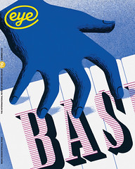
Summer 2010
Space to think, however untidy
Uncorporate Identity
Metahaven, Lars Muller Publishing, €48, £45, $80The catalogue entry for this book shows the cover with a subtitle – ‘Emblem and Void’ – that was removed in the final version. It gave the layout balance. Conventional branding cleans things up, ties things down and gives definition and focus. The gap where the subtitle was is now filled with a blurry tube of purple then yellow running up the middle of the cover. It is all a bit uncorporate: not fashionably ugly, just a little bit messy.
This 608-page brick of a book is Metahaven’s exploration of branding, borders and logos at a moment when corporate brands and national and international borders have got a little bit blurry, and seem a little less safe and grounded.
Metahaven, based in Amsterdam and Brussels, are graphic designers Daniel van der Velden and Vinca Kruk, and spatial designer Gon Zifroni. They were worrying away at these issues long before the credit crunch. Their 2004 Sealand project, branding for a state beyond borders (see Eye no. 71), is reprised inside. It just seems that this is Metahaven’s moment. What is interesting is not that they have carved out a space for themselves as a ‘think-tank’ but that they have created this space, as good graphic designers do, by questioning the assumptions of graphic design.
Metahaven explore how space is punctuated, divided up and shaped by power and politics through buildings, fonts, logos, laws and institutions. The writings, conversations and interviews in this book, which they refer to as a ‘concept album’, include an essay on democracy as disagreement rather than consensus by Chantal Mouffe, whose work on Italian philosopher Antonio Gramsci helped popularise post-Marxist thinking from the 1980s onwards; a compelling dialogue on the sacred with anthropologist Michael Taussig; and an essay by Metahaven themselves that connects Fraktur typefaces, Black Metal Music, the legibility of logos and post-9/11 conspiracy thinking.
The visual narrative of the book is also uncorporate in the sense that its different size fonts, illustrations, cut and paste columns, photography, overlaying headlines, do not hang together like a book. It is really an oversized ’zine, with not so much a clash of different styles as a visual clash of voices. Because this is the politics Metahaven and Mouffe espouse. You could call it ‘ugly’ but this is what democracy that is not smoothed over by consensus or design looks like. If you think of graphic design as the creation of form for content, it is inevitably going to produce something balanced at best, or flat at worst. It is not difficult to extend that idea to politics.
In his essay ‘Empire and Design’ Dieter Lesage argues that Rem Koolhaas’s proposed symbol for the European Union, a ‘barcode flag’ made up of different colours (see Eye 44), not only represents a consumerist idea of Europe but is the ultimate in graphic design as an exercise in form. It marks the point, he writes, where ‘an obsession with pure form, such as that of ikebana, the Japanese art of flower arranging, has at last become the model for artistic practice as Alexander Kojève, in his lectures on Hegel’s philosophy of history once predicted.’ Is twenty-first century graphic design the art of saying it with flowers?
When that is the only model for graphic design there is something fundamentally wrong. Metahaven’s work has generated negativity among some designers and it must be said that not all of Uncorporate Identity stimulates, provokes and inspires. As much as philosophy has opened up the humanities and contextual studies, its persona in some academic writing is as stolidly institutionalised as corporate-speak and branding. But when the book is so busy and full of ideas it is easy to turn the page. It is a challenging book at times, but it is also playful, especially the sections on ‘Symbol Squatting’ and ‘Low-Res Opinion’.
So what kind of thoughts does this ‘think-tank’ inspire? First, it invigorates the idea of the ‘think-tank’. Most think-tanks have the same muddy relationship with thinking as paintball-bonding sessions have to group-psychology (disclosure: call it philosophy or call it neurosis, but as a former academic philosopher I spend far too long thinking about thinking). Metahaven have used design to sculpt the thinking of this book.
And the second lesson is not that every graphic designer needs to think of design as politics but that it would make professional lives (and perhaps even clients) richer to think of design as thinking – to see the arrangement of content as more than flower arranging. Most clients already have the answers by the time it comes to design, and do not demand much thinking from designers, and, like clients, designers often have what the philosophers call an ‘instrumentalist’ approach to thinking, design as ‘problem-solving’.
Metahaven’s work suggests there is a professional opportunity for designers to use design as the vehicle for thinking, to create something more direct and immediate than the baroque architecture of brand-thinking, but more systematic than the magpie methodology of trend-reports and blogging. Most of all, designers need to create a space in their professional space to think, to think (as a designer) about thinking. Every designer needs to create a meta-haven – that ultimate refuge where we can think for ourselves.
First published in Eye no. 76 vol. 19 2010
Eye is the world’s most beautiful and collectable graphic design journal, published quarterly for professional designers, students and anyone interested in critical, informed writing about graphic design and visual culture. It is available from all good design bookshops and online at the Eye shop, where you can buy subscriptions and single issues.

