Autumn 2013
Surfing a 1960s California wave

50 Years of Graphic Design
by John Van Hamersveld<br>Foreword by Shepard Fairey<br>Design by John Van Hamersveld<br>Ginko Press, £42.50, $49.95

Having spent a week alternately prancing and slogging through John Van Hamersveld’s career-capping monograph, I have two responses: appreciation and frustration.
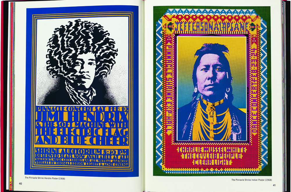
Van Hamersveld is a towering presence in American graphic design, largely for a handful of posters and album covers done between the 1960s and 1980s. He is also versatile: outside the hermetic circle of graphic design, his best known images are topped by ‘The Endless Summer’ poster, an emblem of surf culture (1966); the ‘Pinnacle Shrine Hendrix’ poster, a touchstone of 1960s electric psychedelia (1968); the covers for Jimmy McGriff’s Black Pearl album (1972) and the Rolling Stones’ Exile on Main St (1972). Much of his other work, while minor in the grand scheme, could occupy pedestals in the graphic design pantheon. This monograph is long overdue.
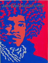
Cover uses a recoloured detail of the Hendrix poster.
Top: spread shows two Van Hamersveld posters from 1968: the ‘Pinnacle Shrine Hendrix’ (left) and the ‘Pinnacle Shrine Indian’.

The book is a visually and textually riotous romp through the rambling memories and cultural milestones that are always pulled magnetically north by Van Hamersveld’s personality. His musings are at times egotistical yet informative. Though I have followed his work for decades, I was unaware of the all-encompassing role he played as a galvaniser of California’s 1960s-70s visual pop culture, evidenced by the photographic portraits of him – alone and with the famous – that appear throughout the book. However Van Hamersveld’s graphic design is at times an unclear, confusing amassing of word and picture.
The text, which is often typeset in wide or tight columns with oddly close leading, is often stream-of-consciousness, yet tantalisingly evokes the times and places he has chronologically organised. Still, he crams in so much that the eye gets overloaded – Van Hamersveld’s penchant for cutting and pasting undermines his story. Yet I’m glad I stuck with it.
As much as any book can, this mirrors the circuitous meanderings of his aesthetic and stylistic shifts and returns. And there are generous helpings of reproduced work – a testament to his individuality. Although he hung out with psychedelics, such as Rick Griffin and Victor Moscoso, his work did not follow their conventions. And while there was a certain retro leaning, his work was never nostalgic. In fact, the most eye-opening – since I’d never laid eyes on it before – are his brilliant ‘Wave’ prints.
Reservations and frustrations not withstanding, this book makes a successful, if egocentric, case for his work. Recommended to all rock poster fans and mid-century formalists.
Steven Heller, design writer, New York
First published in Eye no. 86 vol. 22 2013
Eye is the world’s most beautiful and collectable graphic design journal, published quarterly for professional designers, students and anyone interested in critical, informed writing about graphic design and visual culture. It is available from all good design bookshops and online at the Eye shop, where you can buy subscriptions, back issues and single copies of the latest issue. You can see what Eye 86 looks like at Eye before You Buy on Vimeo.

