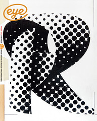
Spring 2011
The visualisation of complex data
The Design of Understanding
St Bride Library, London, 28 January 2011St Bride Library has been undergoing something of a renaissance in recent years. It is emerging as the place to host design-related events in London, and ‘The Design of Understanding’ 2011 conference was only one of a string of recent events to sell out to a mix of regulars as well as new faces. (Eye was there, too.)
Max Gadney’s approach in putting together the conference was evident: this is information design on the cutting edge, but with memory, and a conscience. Most of the speakers work beyond the traditional areas of information design, either in areas where new modes of use make the designers unwitting researchers, or in areas where the volume of stuff to make sense of depends upon design to make the utterly opaque both accessible and meaningful. Some of these new paradigms of use raise interesting questions about the role of users as editors of their experience, and contributors to a design process that may break down old models.
Michael Blastland highlighted the fallacy of objectivity in statistical arguments. He pointed to two often neglected factors: the sample size, and the assumptions implied by the models for representing results. There is a real tension between expediency and access to good data, and the easiest way to confuse a seasonal variation for a trend is to have a small pool of data. In his deconstructing of Bill Gates’s investment in schools, Blastland hinted at the growing field of meta-research, which can be used to show the errors in the assumptions of researchers. This kind of research is largely possible through access to large data sets, and cheap computing – a theme in many talks. Blastland made a second, more subtle point: that many of our conventional representations imply false causal assumptions, and may disguise critical relationships between parameters in the data.
David McCandless showed some imaginative models, but I can’t help thinking that there is room for innovation beyond the simple ‘if-then’ of two-dimensional representations.
Fiona Romeo was eloquent on the potential of objects to tell stories, and the need for thoughtful, inspiring interpretation. But she did not stop there: she explored the opportunity for museum audiences to weave their own narratives through paths of self-discovery, as they navigate museums turned inside-out, their store areas accessible to all. This approach adds value to the objects themselves, and empowers visitors in new ways. However, objects tell the most interesting stories when interpreted in their wider context (echoes of Blastland, here). As visitors mark their own paths, the texts accompanying the objects (whatever form these texts may take) will threaten the contribution of curators. This means that designers will have to address the building of narratives and making connections. People will have to learn to weave stories through snippets of information.
Simon Rogers’ work with The Guardian hinted at what is probably the most interesting area of design innovation (design for tablets is cool, but nowhere near as challenging). Handling raw data with hundreds of thousands of data points (the WikiLeaks material, mps’ expenses, the breakdown of public expenditure) makes it a real challenge to find the critical story, and display the results in meaningful ways. Rogers highlighted the risk of representation being determined by the tools available: for example, geolocated data may make it easy to map improvised explosive devices on Afghanistan’s road network but it does not readily allow you to map expenditure on equipment. The Guardian team also raised crowdsourcing as an increasingly valuable asset. We have been witnessing the debunking of expertise for years; is this an area where ‘lay power’ will prove invaluable?
Chris Heathcote and Jack Schulze both raised the personalisation of information and the creation of new paradigms for interfacing with information as the key developments of the coming years. They rightly point out that we are in the very early stages of a transformation in our behaviour, brought about by ubiquitous and personalised interaction with information. This reality, as certain in its coming as it is uncertain in its shape or details, is exciting and empowering but also worrying: you might be sitting in a coffee shop making sense of the Ofsted reports for British schools with berg’s Schooloscope, just as your social networks are telling your supermarket that you are adventurous in your choice of muffins. Kidding aside, Matt Patterson’s questions to Schulze – ‘Designers who code, or developers who design? And who educates these people?’ – should cause us all to pause and consider how the role of designers is changing dramatically.
There were useful lessons, for all these issues, in Rob Waller’s talk, which combined the perspectives of the academic and the practising designer. Waller reminded us of conferences and publications from the 1970s and 80s that brought together psychologists, sociologists and other -ists who approached typography as an interdisciplinary domain with a multiplicity of expressions. These efforts left a series of important documents behind, which often, sadly, did not reach the shelves of lecturers, let alone designers. The challenges of design today (publication design on tablets, anyone?) may present themselves through new technology, but the key questions in design are about people. A dip into such texts will show that the user perspective was at the centre of their deliberations. For design to be of any use, it needs practitioners who can ask (and understand) these questions.
First published in Eye no. 79 vol. 20 2011
Eye is the world’s most beautiful and collectable graphic design journal, published quarterly for professional designers, students and anyone interested in critical, informed writing about graphic design and visual culture. It is available from all good design bookshops and online at the Eye shop, where you can buy subscriptions and single issues.

