Summer 2014
Thirty years before the masthead

Felix Berman
Robert Büchler
Yves Zimmermann
Wolfgang Weingart
Helmut Schmid
Lauralee Alben
Design history
Graphic design
Magazines
Reviews
Typography
30 Years of Swiss Typographic Discourse in the Typographische Monatsblätter
Edited by École Cantonale d’Art de Lausanne (ECAL), Louise Paradis with Roland Früh and François Rappo<br>Designed by Robert Huber, Louise Paradis<br>Lars Müller Publishers, £45, €50, hardback<br>

This book is a lavishly illustrated summary of the three decades when Swiss typography journal Typographische Monatsblätter (TM) was at its most influential. It is based on the research of Canadian-born Louise Paradis as part of her masters degree in art direction at the ECAL / University of Art and Design Lausanne, Switzerland – research also presented on the TM Research Archive website.
Website and book both focus on TM between 1960 and 1990. All of the issues illustrated come from the private collection of Jean-Pierre Graber, chief editor of TM for more than twenty years. The book is divided chronologically into five chapters, each exploring in accessible, clear text the influence of significant people or events – among the factors considered are typographic styles, differences between activity in Basel and Zurich, major figures in the field of Swiss typography, changes in editors, effects of new typefaces, input from design schools, technological changes such as photo typesetting and the computer, and financial difficulties.
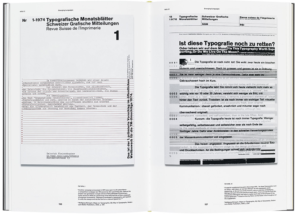
It is rare to see such exhaustive research on a subject such as typographic design, and both book and website are excellent resources for designers. The presentation of images of the front covers, always a great feature of TM, is handled particularly well on the website. You could happily spend hours scrolling through some amazing examples of twentieth-century typography. My favourites are those designed by Felix Berman, Robert Büchler, Yves Zimmermann and Wolfgang Weingart – now the subject of an exhibition at Museum für Gestaltung Zürich – whose character shines through every cover.
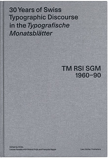
The layout of the book is not as successful. The cover is very low-key (I assume to avoid competing with the rich and wonderful examples of typography inside), and it would be sad if today’s design students passed over this book because of its apparent dullness. The chapter title pages seem clunky and unresolved. While the page layout is clean and uncomplicated, I struggled a bit more with the page spreads. Sometimes a TM cover is placed alongside images from an article it was designed to complement. But a lot of the time, because the structure of the book is chronological, the images are all over the place stylistically and as you are turning the pages you leap from one style to another. When you’re reading an actual copy of TM you’re looking at a single ‘curated’ issue. When you pull together many issues, it becomes a real challenge to display effectively such a wealth of material. While the chronology is important and needs to be noted, the main visuals need to be selected and arranged to enhance the main topic: Swiss typographic discourse.
To be fair, it would take multiple volumes to cover all the examples I’d like to see of TM’s contribution to the typographic universe. The book begins and ends by focusing on covers – the 28 preliminary pages form a photo essay of TM front covers, while the appendix presents a thumbnail of every one of the 257 covers from 1960 to 1990, set out neatly on a horizontal grid. Often a single designer would be given the task of creating all twelve covers for a year, a dream job for any typographer, and in the appendix you can see how that assignment could be treated as a series.
When you close the back cover and think, sadly, that there are no more to come, a treat is still left. The TM Research Archive website has what is possibly the most interesting part of Louise Paradis’s research – some fascinating interviews with designers who contributed to the publication, including Wolfgang Weingart, Yves Zimmermann, Helmut Schmid and Lauralee Alben.
Cover from 30 Years of Swiss Typographic Discourse in the ‘Typographische Monatsblätter’.
Top: The spread shows covers for TM by Wolfgang Weingart from 1974 and 1976.

Hamish Thompson, graphic designer, Wellington, New Zealand
First published in Eye no. 88 vol. 22 2014
Eye is the world’s most beautiful and collectable graphic design journal, published quarterly for professional designers, students and anyone interested in critical, informed writing about graphic design and visual culture. It is available from all good design bookshops and online at the Eye shop, where you can buy subscriptions and single issues. You can see what Eye 88 looks like at Eye before you buy on Vimeo.

