Spring 2016
Weimar volumes
Herbert Bayer
Werner Eggert
John Heartfield
László Moholy-Nagy
Peter Nils Dorén
Georg Salter
Jan Tschichold
Design history
Graphic design
Posters
Reviews
Typography
Visual culture
The Book Cover in the Weimar Republic / Buchumschläge in der Weimarer Republik
Edited by Jürgen Holstein Designed by Peter Nils Dorén Taschen, £44.99 / $69.99 / €49.99 (hardback, 456pp)

The musical Cabaret gave a popular view of Berlin between the two world wars; the drawings of George Grosz another, more bitingly cynical picture. The 1000 illustrations in The Book Cover in the Weimar Republic, all from Berlin, provide an encyclopaedic record of the years 1919 to 1933, the period of the Weimar Republic, when a heroic attempt was made to establish a social democratic Germany in the aftermath of the First World War.It was the time of Fritz Lang’s Metropolis, the Bauhaus, the New Architecture, Thomas Mann, Bertolt Brecht – all recorded here. Inflation, deprivation and political extremism are the background to these book covers, which display the exhilarating creative activity in Berlin, where the East-West avant-garde came together. The city had overtaken Leipzig as the centre of book production in Germany, and by 1927 there were nearly one thousand publishers in Berlin. In that year they issued 7547 new titles. Designers were kept busy.
This 450-page book, in English and German, is divided into five chapters – ‘Politics and Society’, ‘Publishers’, ‘Art and Artists’, ‘Book Design’, ‘Literature and Authors’ – which are subdivided into sections. The first chapter, ‘Politics and Society’, has 27 sections, some of two pages (typically, ‘Anarchy: Historical Perspectives’), others extending to twelve. The length of each section depends on the number of illustrations chosen from his personal collection by the editor, Jürgen Holstein, an antiquarian book dealer. The range of designers is as wide as the types of book, from famous names of the early twentieth century, such as Fritz Ehmcke, E. R. Weiss and Lucian Bernhard, to modernists such as Herbert Bayer, John Heartfield (see ‘Scissor action’) and Jan Tschichold. Every artistic tendency of the period is represented: Expressionism, Neue Sachlichkeit (New Objectivity), typo-photo, Constructivism, alongside realistic illustration and commercial kitsch.
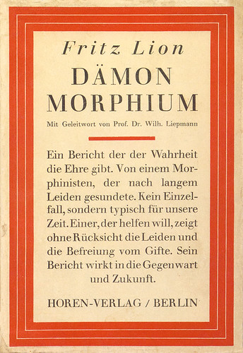
Right. Classical typography by Georg Salter for a sobering account of morphine addiction, 1929.
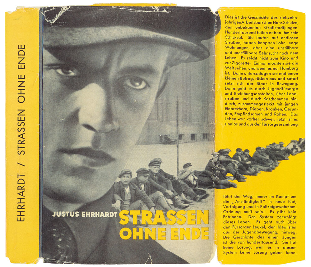
Top: Photomontage book jacket for a 1931 title [Roads Without End] about the challenges facing the young working class in Berlin. Design: Werner Eggert.
In his introduction, Holstein points out that the book jacket has three functions: to protect the book from damage; to attract the potential buyer; and to give some idea of the content. But the illustrations are mostly of the front covers only and we are left to forget that this is only one part of a three-dimensional structure: front, front flap, spine, back, back flap. At least Holstein mentions the perforated front flap in Heartfield’s design for Ilya Ehrenburg’s Das Leben des Autos (The Life of the Automobile), to be torn off for use as a bookmark; but we only see the front, back and spine.
In one accompanying essay, ‘The Art of Eyecatching’, Peter Nils Dorén (the book’s designer) writes: ‘Ideally, a book jacket’s design and its interior layout went hand in hand.’ Unfortunately, there is little further discussion of the relationship of the book’s cover to its page layout. The absence is especially frustrating in the case of designers such as Tschichold, who integrated each part of the book in the spirit of his New Typography. It is tantalising to see only the front covers of some key innovative works, such as Heartfield’s Deutschland, Deutschland über Alles and not to see pages from Werner Graeff’s unconventionally modernist books, Es kommt der neue Fotograf! [Here comes the new Photographer] and Filmgegner von heute – Filmfreunde von morgen [Opponents of Film Today – Movie Fans of Tomorrow], which are so rarely reproduced.
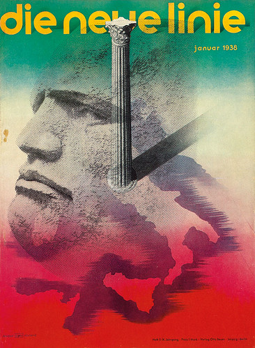
Cover designed by Herbert Bayer for the January 1938 special edition of the upmarket magazine die neue linie, which employs a portrait of Mussolini and sophisticated printing to reproduce the three colours of the Italian flag.
For English-speaking readers it is a problem, too, that the editor has not translated book titles – if we cannot see the relation of the words of the title to the image, we can have little understanding of the designer’s success. This limits the scope of Dorén’s essay, in which, nevertheless, text and astutely chosen illustrations combine to produce an exemplary piece of design history.
Though captions to illustrations give the book’s dimensions, their relative size on the page is disregarded. It is not clear if larger images represent a book’s significance in literary terms or the quality of its design. Information on designers is accurate but patchy. Captions are inconsistent in the amount of detail they offer.
Typo-photo jacket designed by László Moholy-Nagy for Erwin Piscator’s 1929 manifesto for political theatre, Das Politische Theater.
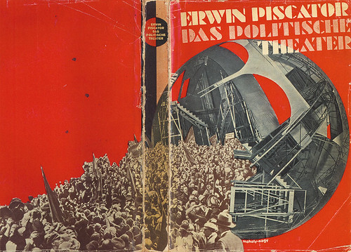
Despite these limitations, The Book Cover in the Weimar Republic is of huge interest. Every political viewpoint is covered, from anarchist to fascist. There are a few welcome anomalies, such as the inclusion of two state exhibition catalogues by Herbert Bayer from 1934 and 1936 – after the collapse of the Weimar Republic – which remind readers of his flirtation with Hitlerism. Among the magazine covers included, Bayer’s Mussolini design for die neue linie, as late as 1938, is equally worth seeing, especially as there are few examples of right-wing publications.
This well produced book will attract social, political and economic historians, students of German literature, and publishers, but its largest audience will be graphic designers and design historians. Designers in want of an idea will find this marvellous, compendious book a treasury of graphic styles. A place in any expanding library of design history should be reserved for The Book Cover in the Weimar Republic.
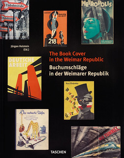
Book cover design by Peter Nils Dorén.
Richard Hollis, designer, writer, London
First published in Eye no. 91 vol. 23, 2016
Eye is the world’s most beautiful and collectable graphic design journal, published quarterly for professional designers, students and anyone interested in critical, informed writing about graphic design and visual culture. It is available from all good design bookshops and online at the Eye shop, where you can buy subscriptions, back issues and single copies of the latest issue.You can see what Eye 91 looks like at Eye before You Buy on Vimeo.

