Winter 2008
What a genius

Reasons To Be Cheerful: The Life and Work of Barney Bubbles
By Paul Gorman. Essay: Peter Saville; Foreword: Malcolm Garrett; Introduction: Billy Bragg<br>

At one time, Barney Bubbles seemed like the Zelig of graphic design, the man who was everywhere, knew everyone, who rose without trace and then disappeared. Bubbles, born Colin Fulcher, never signed his work, shunned credits and invented pseudonyms. After a prolific career spanning several phases of postwar pop culture, he committed suicide in 1983 at the age of 41.
As the discipline of graphic design history emerged in the 1980s, his name barely registered. Julia Thrift’s 1992 article for Eye no. 6 vol. 2, which lavished sixteen pages on his work, was headlined ‘In search of Barney Bubbles’. Richard Hollis’s Graphic Design: A Concise History (1994, revised 2001) describes him as ‘the most original talent’ of the New Wave. A mention in Eye no. 68 provoked calls for republication of Thrift’s piece on the Eye website (where you can now find it).
Online chatter about Bubbles’ legacy has been growing: in particular blogs by designer John Coulthart and David Wills, a lifelong friend and a collaborator on many of Bubbles’s 1960s projects. Now Paul Gorman, whose previous titles include The Look: Adventures in Rock & Pop Fashion and books about Goldie and Boy George, has produced the first book on Bubbles’ work.
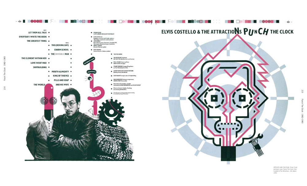
Reasons To Be Cheerful reproduces original artwork, printed sleeves, posters and press ads, together with little-seen private work, intimate photographs and a rejected cover for Elvis Costello’s Punch the Clock (1983). Gorman did the graft, interviewing everyone he could find, including family, friends, clients, colleagues and fans, from Fulcher’s sister to designers Rebecca and Mike, who mounted an exhibition of Bubbles’ work in 2001.
Gorman rapidly traces the phases of his subject’s life: the sickly child, born during an air raid in the summer of 1942; the sparky art student at Twickenham College; the hard-working rank-and-file designer at Conran; the proto-hippy light show innovator; the rock band (Hawkwind) auteur; the New Wave brandmeister; the pop video pioneer (he deserves a place in cultural history for the Specials’ Ghost Town video, if nothing else).
Fulcher changed his name by deed poll to Barney Bubbles, a handle acquired while providing lighting for 1960s rock gigs, when he mixed coloured inks with oil sandwiched between glass slides to create ‘bubbles’ of contrasting colours.
We learn more of the work than the life, however – whether because of lack of verifiable information, or out of respect for his family and friends is not clear. We are told that he was diagnosed with manic depression in the 1970s, but little more is said about his treatment (if any) or the effect of the condition on his state of mind. He often disappeared for long periods, vanishing into the British countryside or Ireland, before returning to the city, restored to his usual self and prolific as ever.
You also get the impression of a life spent working, with little time for anything else. His Hawkwind designs were so extensive – not just elaborate gatefold album covers but sets, lighting and detailed installation diagrams – that he virtually became a member of the band. When Jake Riviera and Dave Robinson founded Stiff Records in 1976, they agreed that Bubbles – an old collaborator from their pub-rock days – should provide the visual identity. But because they launched during one of Bubbles’ habitual disappearances, Stiff’s original label is not his.
When Bubbles returned to punk-struck London later that year, he cut his hair and applied his genius to the most dynamic artists of the era, including the Damned, Ian Dury and Stiff producer Nick Lowe. His skill in identity design, honed at Conran (where he designed logos for Strongbow and Justin de Blank), can be seen in his logos for Radar, NME, Stiff, F-Beat, Demon, Line and the Blockheads. Many are still in use today. Hollis describes the Blockhead symbol as an ‘ideogram of startling invention’.
It was possibly Bubbles who first linked Constructivism to punk, with his cover for Generation X’s debut single, but the most memorable work was for the ‘new wave’. Costello’s Armed Forces, for which he enlisted the help of painter Tom Pogson and French collective Bazooka (see Eye no. 57 vol 15), is a baroque tour de force of design and art direction for print. Bubbles’ covers for Costello’s My Aim Is True and This Year’s Model and Ian Dury’s New Boots and Panties and Do It Yourself, while stylistically quite different, stick in the mind as strongly as the tunes; much more so in the case of his Penguin-inspired covers and Utility label for Billy Bragg, who contributes a warm elegy to this most gifted graphic design hero.
Top: Proof of a cover for Punch the Clock rejected as too ‘quirky’.
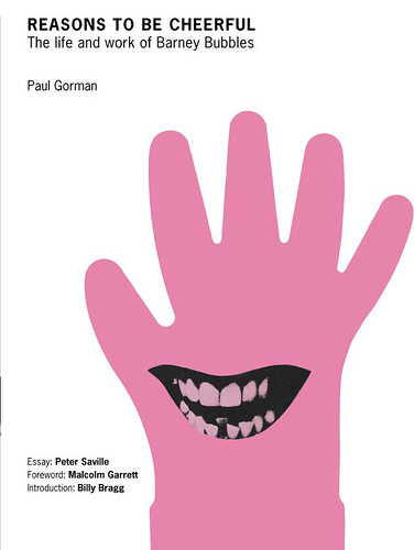
Below: The cover of Reasons To Be Cheerful refers to Bubbles’ design for Nick Lowe’s Cracking Up (1979).

John L. Walters, Eye editor, London
First published in Eye no. 70 vol. 18, 2008
Eye is the world’s most beautiful and collectable graphic design journal, published quarterly for professional designers, students and anyone interested in critical, informed writing about graphic design and visual culture. It is available from all good design bookshops and online at the Eye shop, where you can buy subscriptions and single issues.

