Autumn 1993
Yes, but what does it mean?
Dutch Graphic Design
Kees Broos and Paul Hefting, Phaidon, £34.95Graphic design may be a popular subject in Holland, but there is a distinct lack of reflection and debate in the way it is treated. The business of design criticism is limited largely to the popular press, where design journalists stick safely to images accompanied by bland texts with little more content than the average caption. A few critics say what they think and create debate, but usually their words are confined to the margins of the media.
Given such circumstances, it is hardly surprising that Dutch Graphic Design (Dutch title: Graphic Design in Holland: A Century) is primarily about good looks, and a book that contains no arguments. Nevertheless, the book is a milestone. Written by two highly respected art historians, this is the first survey that treats Dutch graphic design from its early days to the present as an autonomous profession. Among those singled out for praise are Jan van Krimpen for traditional typography, Piet Zwart and Paul Schuitema for commercial Modernism, Jan Bons for posters, Wim Crouwel for highly organised Swiss typography and Studio Dumbar for post-modern design.
A century ago, the printing trade in the Netherlands was booming. Following some political moves – the raising of educational standards and the abolition of tax on newspapers – numerous trade printers were established to service the new generations of readers. Predictably, there was soon too much competition, causing a crisis within the industry. Thus in 1907, when type designer S. H. de Roos joined the staff of Typefoundry Amsterdam, the poet C. S. Adam van Scheltema took the opportunity to question him by letter about the liquidity of the firm in which he was a shareholder. De Roos reassured his friend, but had to admit business was not so prosperous as it had been.
Perhaps it was this drop in sales that led to De Roos’ appointment as aesthetic adviser, an important landmark in the establishment of the graphic design profession in the Netherlands. De Roos’ post brought a new form of specialisation that was to open the way for personal style in printed matter and to supplant parts of the traditional roles of the typesetter and printer, causing some resentment. It was not until the 1950s that those involved in the graphic trades fully accepted the presence of the graphic go-between.
Dutch designers worked their way through a series of styles fashionable in Europe. Meanwhile, Pieter Brattinga, offset printer, designer and publisher of Quadrat Prints, seemed to stand along in his admiration for the US and for commercial design, bridging the gap between advertising and more traditional areas of graphic design. Following the Second World War, Dutch designers showed a certain self-consciousness in their designs and in their commitment to the cultural arena. Design was increasingly considered as an alternative to art – as art made manageable and profitable. While grants to artists were cut, design was, and still is, lavishly sponsored by the government, an arrangement that repels some designers but comforts many.
This could be a synopsis of Dutch Graphic Design. But it isn’t. The scope of the book allows no complexity of treatment, discussion of design in terms of technique or society, or analysis of such areas as packaging design, the role of women in the profession (of only four women mentioned, Lotte Stam-Beese, an architect, is stupidly represented by her plagiarism of a Zdenek Rossmann design), or design moralities. Like a mail-order catalogue, the book is an inventory of names and styles, with some biographical information thrown in. There is no explanation of the authors’ principles of selection, though it is clear that their interests – one a former museum curator with previous publications on Piet Zwart and typophoto, the other a staff member of the PTT Art and Design department – must have influenced their choices.
With Dutch Graphic Design, what you see is what you get – 13 inscrutably structured chapters, more than 500 full colour illustration, and an index of names with about the same number of entries. It’s a strategy that made McDonald’s, and with six editions in preparation, Dutch Graphic Design too aims at worldwide consumption.
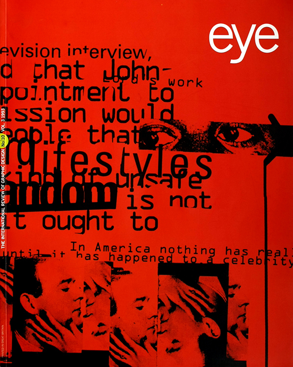
First published in Eye no. 10 vol. 3, 1993.
Eye is the world’s most beautiful and collectable graphic design journal, published for professional designers, students and anyone interested in critical, informed writing about graphic design and visual culture. It is available from all good design bookshops and online at the Eye shop, where you can buy subscriptions and single issues.

