Friday, 5:05pm
9 October 2009
A night at the Loeries
South African creativity finds a voice at this year’s awards

‘Woop woop woop korr, korr, korr, korr…’ So goes the call of the crow-sized Knysna Loerie, at least according to my burgundy coloured Roberts’ Birds of Southern Africa, an enduring classic in South African book design and illustration, writes Sean O’Toole.
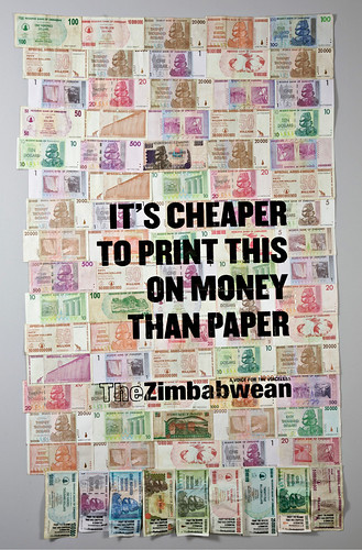
Having bagged another headline award for The Zimbabwean poster campaign (top), this time at the 31st annual Loerie Awards in Cape Town (25-26 September), one might justifiably have expected Damon Stapleton to sound a bit like a loerie. Not so. Instead, the shaggy haired adman in square-rimmed black glasses delivered a droll Philip Seymour Hoffman impersonation.
‘Out client paid us trillions and trillions of dollars,’ he intoned at a press conference where his agency’s local Grand Prix win dominated the talk. Stapleton, who has presided over TBWA Hunt Lascaris’ return to form after a couple years in the doldrums was also remarkably sanguine about the implications of the agency’s recent win in Cannes: ‘Winning a Cannes Lion is never going to hurt you.’
The improvised quality of The Zimbabwean campaign, which used real Zimbabwean currency as substrate for an agit-prop poster campaign, prompted some discussion on the current status of local print design (see previous Eye blogs ‘Money’s worth less than paper’ and ‘Trillion-dollar brainwave’). ‘I think design in South Africa is becoming far more conceptual,’ ventured Stapleton. Seated next to Stapleton was Chris Gotz, creative director of Ogilvy Cape Town. After singling out print design entries by three studios, Richard Hart’s Disturbance Design (two silvers, three bronzes), Garth Walker’s newly launched Mister Walker (silver) and Cape Town’s The Black Heart Gang (gold craft award for book design, below), Gotz remarked: ‘A decade ago the biggest hammering we took was that South African design was derivative of things in the annuals.’ Added Stapleton: ‘For a long time we were good at doing what other people were doing.’
It would be hard to accuse Cape Town-based designer Peet Pienaar of being derivative. The former performance artist turned print designer has over the past few years garnered a cult following for his unorthodox print design treatments. His fans include Chipp Kidd, who in an interview a few years ago likened Pienaar to illustrator Chris Ware: ‘Their work has qualities in common. Chiefly that on first inspection it’s formally beautiful. But then when you look at what the content actually is, it’s often quite devastating. Peet’s work concerning the sudden disappearances of South African youths comes immediately to mind.’
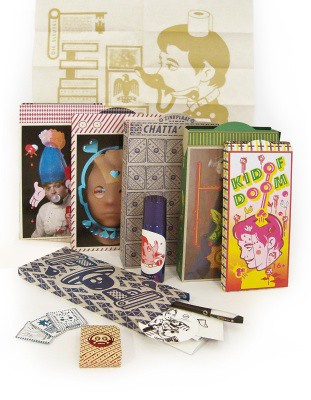
Pienaar’s studio The President clinched a gold for MK Bruce Lee (below), a magazine commissioned by a local satellite TV station MK. The magazine is aimed at the music station’s mostly white viewers, aged 18-24. Pienaar’s solution: his and hers format magazine, Bruce for boys, Lee for girls. Similar to Afro, Pienaar’s earlier foray into conceptual magazine design (reviewed in Eye 52), the designer eschewed binding, instead presenting his assortment of folded posters, packets of cards and stickers and a mini-book in a paper ‘Lucky Packet’ envelope.
A 2006 conversation with Pienaar offers insight into his experimental practice as a designer. ‘One is allowed to do more in design than in art because people are not so critical around design and you can push things in interesting directions,’ he said. ‘Push how?’ I asked. ‘You can change people’s ideas about themselves, their own identity. You can influence how other people start designing, especially in South Africa where there is not a big identity of local design – you can formulate it.’ That he appears to be doing.
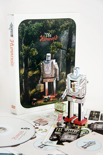
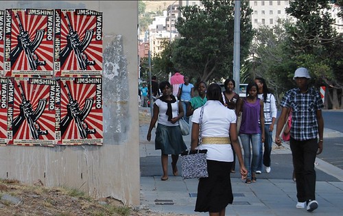
Anther notable gold in the design category went to illustration and design studio The Motel, who further clinched the Sappi Creative Use of Paper Award for their whimsical corporate identity for a collective of filmmakers trading under the name Humanoid (above). In a country without a significant poster tradition, the lone recipient of a gold in the poster category was agency Young & Rubicam. Working in conjunction with the magazine I edit, Art South Africa, Y&R devised a Zulu language poster that riffed on the war song controversially popularised by President Jacob Zuma, ‘Awuleth’ Umshini Wami’ (‘Bring me my machine gun’, below). The song formed the subject of a special issue. ‘Awu leth’ Umshini Wakho,’ offered the Y&R/Art South Africa poster, the admonition to ‘bring your machine gun’ contextualised by a request, also in Zulu: ‘Please hand in your unlicensed firearm at your nearest police station.’ Zulu is statistically the largest language in South Africa; it is also intelligible to Xhosa readers, the second largest language group in the country.
According to latest statistics, 18,000 people are murdered annually in South Africa. That this violent context can be a source of creative inspiration has recently been highlighted by the success of director Neill Blomkamp’s cliché-riddled but hugely entertaining film, District Nine. Damon Stapleton was emphatic on this point: ‘It’s all because of Distict Nine.’ Possibly.
Eye is available from all good design bookshops and online at the Eye shop. For a taste of the magazine, try Eye before you buy.

