Tuesday, 11:05am
24 August 2010
A quick burst of sound
Zurich this autumn: the typographic music of posters made of letters

‘Writing is Drawing is Writing’ is a declaration by the late graphic designer Alan Fletcher, a man whose hand formed words and images with seamless skill, writes Emily King.
Fletcher was talking about the relationship between sketching and handwriting, but his claim applies more broadly. In creating posters from letterforms, the designers whose work is featured in Letters Only (and exhibition opening next month at Zurich’s Museum für Gestaltung) refer back to the common origins of type and image.
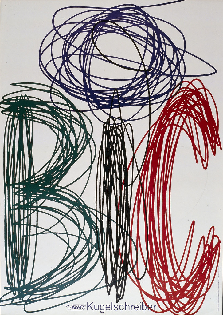
Top: Advico Young & Rubicam AG, Bic (1961)
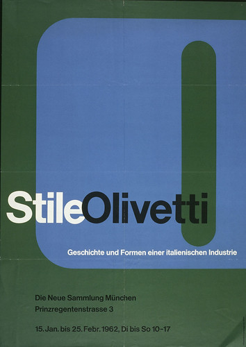
Below: Walter Ballmer, Stile Olivetti / Die Neue Sammlung München (1961)
The letters of the alphabet, twenty-six of them in the case of the modern English alphabet, have developed over thousands of years. Delving back into typographic prehistory, their roots lie in various systems of representation. In using these letters on posters to grab attention and communicate with an audience at a level that precedes reading, graphic designers are relying on the symbolic power that, as well as deriving from the immediate familiarity of their current form, refers to their evolution.
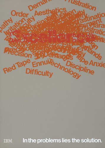
In John Anderson’s 1980 poster for IBM (above), a pile of red words describing various problems and challenges associated with the working world creates a darker-hued overlap in which the viewer can trace the word ‘Excellence’. The tag line is: ‘In the problems lies the solution’. Crucially, the poster suggests an animated heap of trouble, a sense of the passage of a working day during which one difficulty rains down on another.
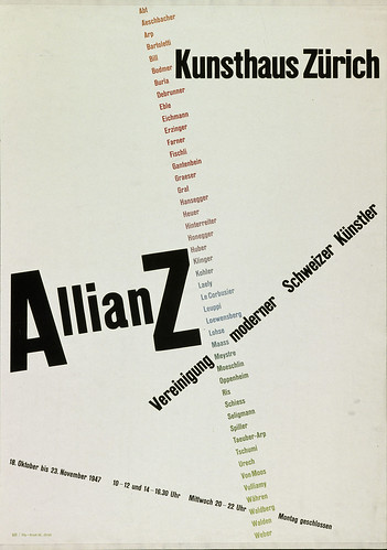
Above: Max Bill, Allianz / Kunsthaus Zurich (1947)
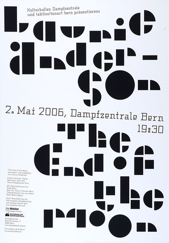
Below: Ruedi Wyss, Laurie Anderson / Dampfzentrale Bern (2006)
All of these posters could be seen as quick bursts of typographic sound. They are something like a set of alphabetic scores conjuring up the impression of noise. Significantly, each one isolates the components of written language, and, in so doing, prompts consideration of its nature as a whole. Just as Alan Fletcher argued that ‘Writing is Drawing is Writing’, so these posters make it clear that ‘Letter is Language is Letter’.
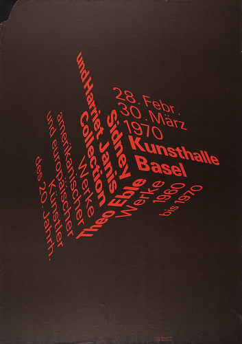
Below: Peter von Arx, Sidney und Harriet Janis Collection / Kunsthalle Basel (1970)
This is an edited extract from Emily King’s essay ‘Language is Letter is Language’ in Letters Only, Lars Müller Publishers (2010).
1 September > 10 December 2010
Letters Only: Typographic Posters
Museum für Gestaltung
Ausstellungsstr. 60
CH-8005 Zurich
www.museum-gestaltung.ch
Eye magazine is available from all good design bookshops and at the online Eye shop, where you can order subscriptions, single issues and back issues.
The summer issue, 76, out now, is a music special – full contents here, and you can see a selection of visual details on Eye Before You Buy on Issuu.
Student subscriptions are half price, see bit.ly/EyeStudentOffer.

