Thursday, 10:05am
3 February 2011
And more again
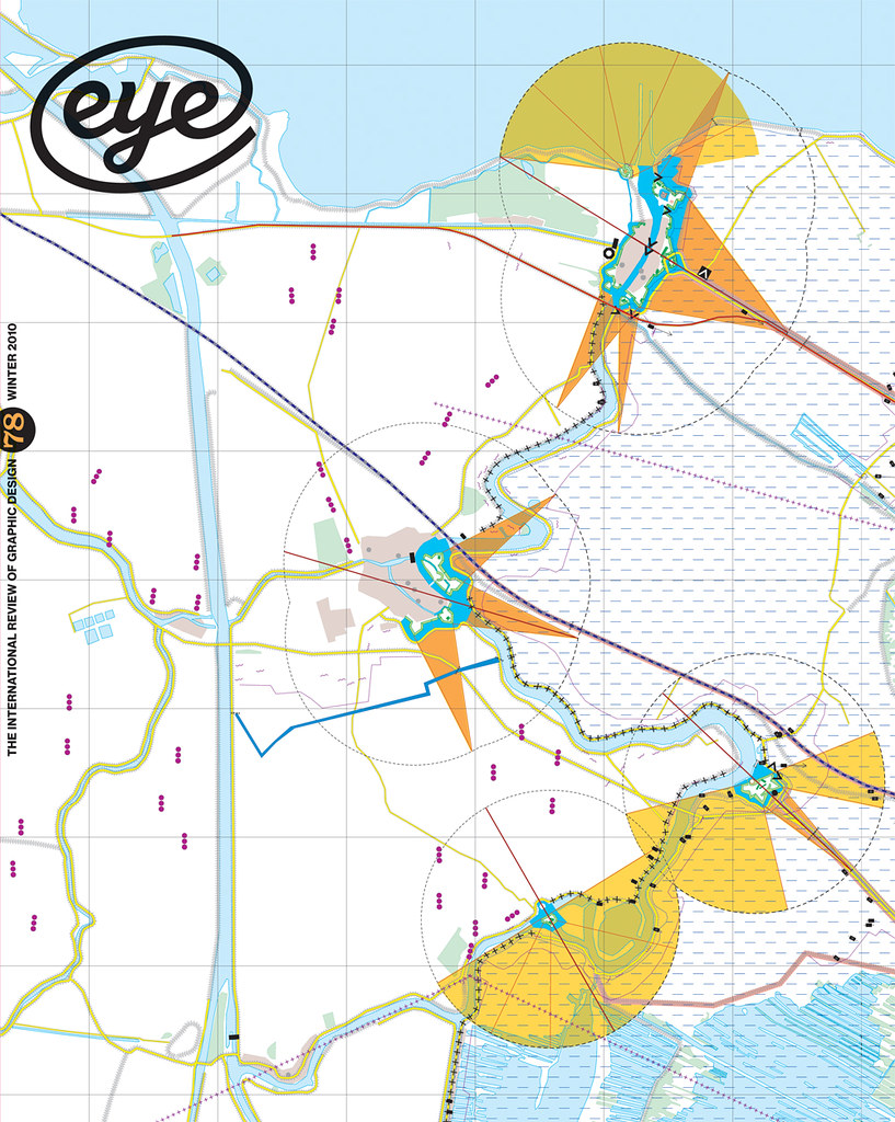
Information design and graphics in Eye 78, our biggest ever issue

It has been printed, packaged and delivered to subscribers and bookshops all over the world. But if you haven’t seen it yet, here’s a taste of what to look forward to in Eye 78, our biggest ever issue.
Information design, our main focus, is a huge part of every designer’s world. As the editorial concludes: ‘information design is not so much a specialist genre, more an essential fact of design life.’
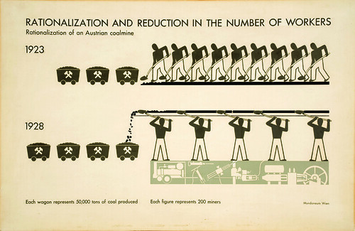
Isotype, a system for visualising data developed by Otto Neurath in the 1920s, is one of the most influential movements in the history of information design (see example above). We take a look at Neurath’s long dormant manuscript, From Heiroglyphics to Isotype: A Visual Autobiography, newly published by Hyphen Press, and an Isotype exhibition at London’s Victoria and Albert museum.
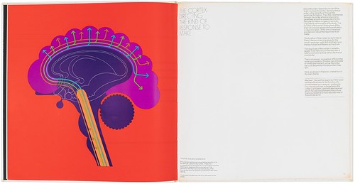
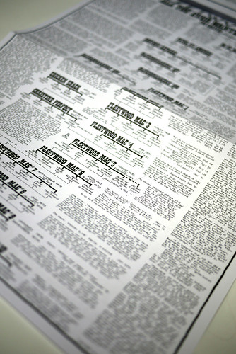
Our ‘Figures and Facts’ special sees a variety of writers and designers select some of the other great examples of infographics over the years. Ken Garland praises his coveted 1971 edition of The Whole Earth catalog, and Simon Esterson examines a psychedelic marketing brochure for anxiety drug Nobrium (above). Mendeleyev’s Periodic Table of Elements is praised by Tony Pritchard (‘the beauty of its form is intrinsic to its function’), Fraser Muggeridge admires an illustrated DIY manual published by the Reader’s Digest and John L. Walters traces the break-ups and reunions of Pete Frame’s Rock Family Trees (below). Other highlights include the British Road sign system, Google Maps, Information Architects’ Web Trend Map, New York magazine’s Approval Matrix and the graphic analysis of JFK’s assassination.
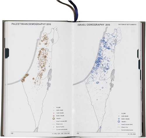
Ours has often been heralded as the ‘Information Age’, but Dutch art director Joost Grootens calls it an ‘era of information obesity’. His recent series of atlases are an example of how good design can cut through complex, unwieldy and sometimes controversial data (see his Atlas of the Conflict, above. A detail of one of his maps, in special colours, is on the cover).
And Max Gadney argues, in his Eye Education piece ‘Understand, visualise, survive’, that information design should be a compulsory part of every graphic design course.
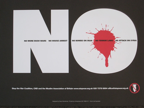
But it’s not all infographics in this new, weighty issue of Eye. Rick Poynor is sucked into the stroboscopic credits of Gaspar Noé’s Enter The Void, Lance Knobel examines the rise and rise of McSweeney’s, and in the regular Reputations series we catch up with designer-illustrator David Gentleman, who says: ‘I don’t think design and illustration are totally different. Goya and the Disasters of War, for example – which do you call that?’. And our Uncoated reviews section is full of lively critiques of the latest graphic design books and events.
See summaries of Eye 78’s contents here and here.
Above: One of David Gentleman’s ubiquitous designs for Stop the War Coalition.
Eye, the international review of graphic design, is published quarterly for professional designers and students. It’s available from all good design bookshops and online at the Eye shop, where you can buy subscriptions and single copies. For a further taste of 78, see Eye before you buy on Issuu.

