Monday, 3:17pm
26 January 2009
Broadsheet bounceback
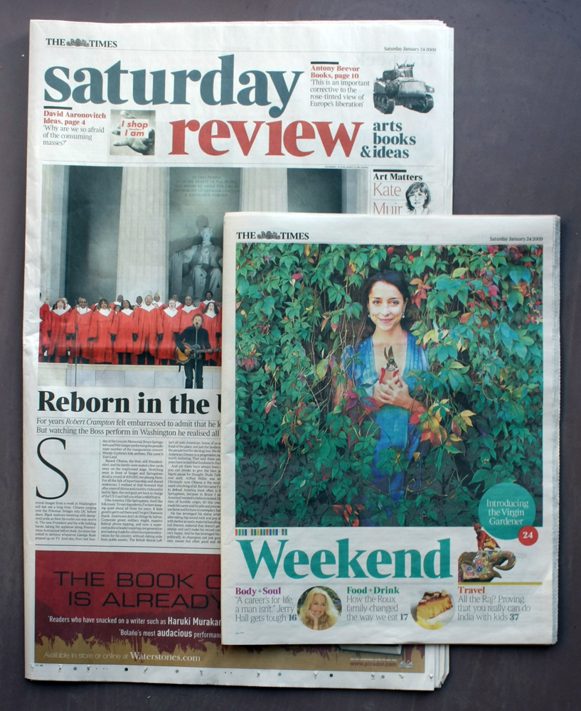
The Times redesigns its Saturday edition with some grand gestures

The Times appeared on Saturday morning (24 January 2009) in its new six-section configuration, writes Simon Esterson. The most obvious change is that the new Saturday Review section marks a return to broadsheet format. And after all those tabloids it does look big: a great sheet of newsprint, only really safely navigated at home on the Saturday breakfast table. (How do those Daily Telegraph readers manage on the train during the week?)
The large format, with its nod back to Times past, signals that the section contains the serious stuff of 'arts, books and ideas’.

Typographically, we’re treated to an extension of the vocabulary already in action in the redesigned daily Times2 section (see last week’s Eye blog about the changes). But here the bigger page allows more play with scale: while headlines, drop-caps and pictures can be bigger than a tabloid page allows, the six-column justified text format is sub-divided into twelve columns for narrow-measure captions and secondary information set in Christian Schwartz’s Stag Sans. There’s a lot of type, and while the section looks serious, it also manages to be rich and varied: dark blue rules in heavy weights, dotted rules in fine weights, little moments of red type, all held together by spines of horizontal and vertical white space, and differences in content signalled by unjustified setting. It is also put together with a magazine-like precision of picture editing and design detail.
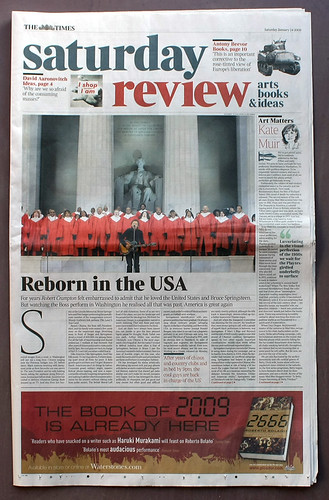
The only disappointing element was the section’s front page (below): starting a main story and a column, running a banner at the top with teasers and pictures and a horizontal advert across the bottom is asking a lot, even from a broadsheet page.

The new tabloid Weekend section contains the softer stuff: Body and Soul, Food and Drink, Gardens and Travel. Here, as befits the content, there’s more colour from a brighter colour palette, more smiling faces, pictures of cakes, and a series of very smart column headers from illustrator Joe McLaren (www.joemclaren.com).

But underneath it all, the new design chassis from Times2 bolts everything together, with no room for whimsy. The new weights of Times Modern (Ultra Light and Ultra Bold) look good here and remind me how much they seem to be morphing back towards their original Monotype Times Roman ancestry.
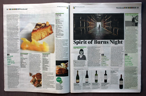
Lead designers on the newsprint sections are Alex Breuer and Emma Woodroofe. Picture Editor Jon Jones.
Playlist (below) is The Times’ answer to the Guardian’s all-conquering A5 format Guide. Its design is elegantly restrained in the way the Guide used to be and it has some clever fact panels and background information. Again, there’s lots of Stag Sans working with Times Classic.
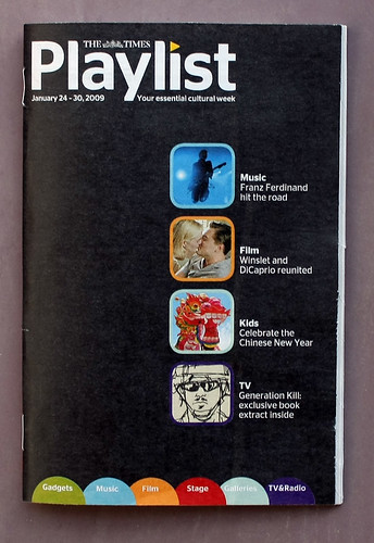
My copy was let down by the printing, though: the gravure process seems to be struggling with the fine type and newsprint stock.

Eye is the world’s most beautiful and collectable graphic design journal, published quarterly for professional designers, students and anyone interested in critical, informed writing about graphic design and visual culture. It is available from all good design bookshops and online at the Eye shop, where you can buy subscriptions and single issues.
