Tuesday, 11:23pm
13 September 2011
Code tripping

Designers and developers come together for Flash on the Beach

This Monday, I helped man Eye’s stand at Flash on the Beach, Brighton – and dipped into as many of the sessions as possible, writes John Ridpath. It was the first day of the conference (see our preview, ‘Code, design and inspire’), and everything kicked off with a keynote from Adobe. Among the company’s series of presentations, we saw a fast-paced demonstration of Edge, a new Flash-like tool that creates animated Web content using HTML5, CSS3 and JavaScript. With Apple’s notorious decision to drop Flash support on iPhones and iPads, it will be interesting to see what part Adobe will play in the future of the web.
But just because the newest specifications of HTML and CSS offer Web designers incredible new possibilities, doesn’t mean we should use them without caution. Identifying such Escher-esque impossibilities as embossed text with an outer drop shadow, Elliot Jay Stocks cautioned that ‘With great power comes great responsibility’. Instead of liberally using effects without asking ‘why?’, Stocks evangelised about the power of designing websites from the baseline grid outward – a basic principle for print designers perhaps, but a tricky feat in the world of dynamic, resizing content and cross-browser headaches.
After lunch, Gmunk (Bradley Munkowitz) took to the stage and gave some incredible behind-the-scenes insight into his studio’s graphics for TRON Legacy, before sharing the making-of (and out-takes) of his ‘Flash on the Beach’ opening titles (above).
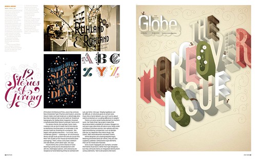
I couldn’t fit into Jared Ficklin’s low-key session in the Kickback Lounge, but having written about his unique approach to code and pyrotechnics in the wake of the 2009 conference, I can only imagine what fireworks the audience were treated to (see ‘Stephen Hawking’s Universe’). Instead, I made my way to the main hall for some Jessica Hische’s inspiring presentation, ‘Lettering is not fonts’ (see ‘Make each letter speak out loud’ in Eye 75, below).

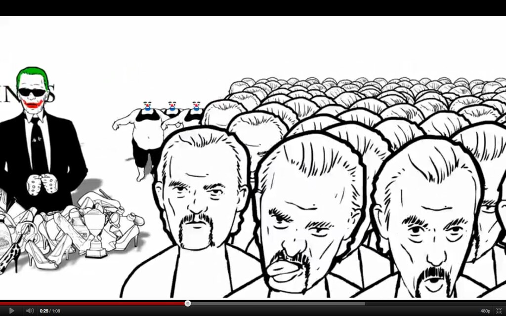
After a day of rushing between the conference’s three stages, delegates reconvened for the last of the daytime sessions: Han Hoogerbrugge (top). I hadn’t come across his bizarre take on animation and interaction design before, and was surprised and amused by the Dutch artist’s distinctive work. Sadly, I can’t make the final two days of the event, but I’ll be keeping a jealous eye on Twitter from my desk in London.
Eye is the world’s most beautiful and collectable graphic design journal, published quarterly for professional designers, students and anyone interested in critical, informed writing about graphic design and visual culture. It’s available from all good design bookshops and online at the Eye shop. For a taste of the new issue, see Eye before you buy on Issuu. Eye 80, Summer 2011, is out now.
