Saturday, 10:23am
4 June 2011
Critique commentary
Rick Poynor selects DVD covers from the Criterion Collection’s film list.

In ‘Commitment to content’, my latest Web-only Critique, I have written about the design of the Criterion Collection of DVDs, writes Eye writer at large Rick Poynor. Here, we present a selection of 22 covers from more than 500 films in the ever-expanding, numbered collection, highlighting four visual approaches used by art director Sarah Habibi, head of the Criterion art department, and Criterion’s designer, Eric Skillman.
These approaches are photography, illustration, graphic image-making, and the re-purposing of earlier visual approaches and found material. Such classifications can never be totally strict and aspects of more than one approach can often be found in a design.
For visual consistency, all the covers shown here have been created since 2006, when Criterion introduced a new identity by Paula Scher and Julia Hoffmann of Pentagram. Many equally effective earlier designs using the previous identity are also still available from Criterion. Some of these will presumably be updated with the latest identity as stocks sell out.
One other phenomenon is worth noting. Criterion’s graphic design has such a following that it has spawned a thriving subculture of fake Criterion Collection covers by designers vying to equal the masters or, who knows, win themselves a job. There are examples galore at Flickr, Tumblr, MUBI, Criterion Forum and many other sites. What these tributes often show is how hard it is to get a Criterion cover right.
Photographic
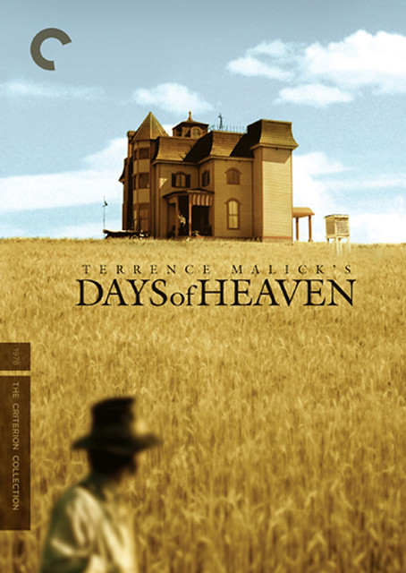
Above: Days of Heaven, United States, 1978, director Terrence Malick.
Art direction: Sarah Habibi. Design: Lucien S. Y. Yang.
The design, using stills from Days of Heaven, references the original illustrated American poster and foregrounds the film’s intense colour photography and atmosphere of poetry.
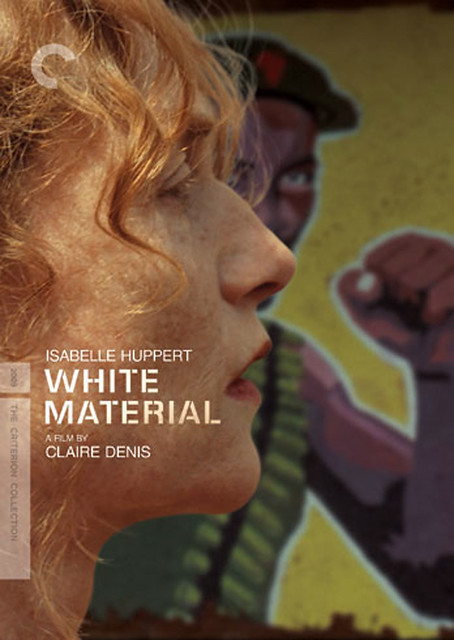
White Material, France, 2009, director Claire Denis.
Art direction: Sarah Habibi. Design: Michael Boland.
This image, embodying the central confrontation in White Material, doesn’t occur in the film. It’s a composite of actress Isabelle Huppert seen at one point in long grass and a later scene with a wall painting of an African rebel leader known as ‘The Boxer’.
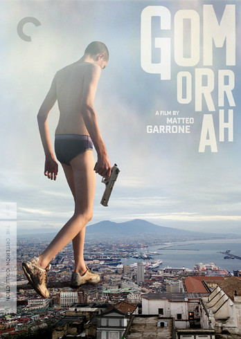
Gomorrah, Italy, 2008, director Matteo Garrone.
Art direction: Sarah Habibi, Neil Kellerhouse. Design: Neil Kellerhouse.
The gangster appears on the original poster and is here superimposed on Naples to suggest crime’s domination of the city.
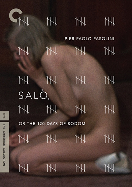
Salò, or The 120 Days of Sodom, Italy, 1975, director Pier Paolo Pasolini.
Art direction: Sarah Habibi. Design: Christopher Brand / Rodrigo Corral Design.
A quietly terrifying image of incarceration and suffering for one of the most disturbing films ever made.
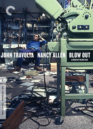
Blow Out, United States, 1981, director Brian De Palma.
Art direction: Eric Skillman, Sarah Habibi. Design: Eric Skillman.
A similar picture of John Travolta slumping at the back of the shot was used on an Italian poster when Blow Out was first released.
Illustrative
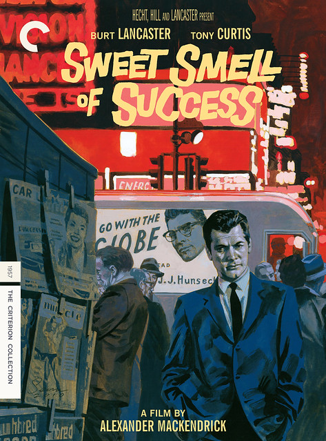
Sweet Smell of Success, United States, 1957, director Alexander Mackendrick.
Art direction: Eric Skillman, Sarah Habibi. Design: Eric Skillman. Illustration: Sean Phillips.
On his process blog, Skillman quotes from his brief to Phillips: ‘Stylistically, this film is kind of noir-but-not quite – very little specifically criminal happens, no one ever pulls a gun or anything, but the overall tone of moral decay and the use of shadow and light all fit the noir pattern. So noir-y kinds of shadows are definitely appropriate, but we wouldn’t want to go overboard [. . .] which is why I thought something painted, ideally with a nod toward some mid-century illustration styles, would be a good fit.’
The title lettering is found on the Sweet Smell of Success paperback published by Signet.
http://www.flickr.com/photos/tatteredandlostephemera/3568416910/
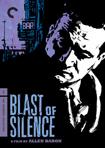
Blast of Silence, United States, 1961, director Allen Baron.
Art direction: Eric Skillman, Sarah Habibi. Design: Eric Skillman. Illustration: Sean Phillips.
‘When it came time to design,’ Skillman writes on his process blog, ‘the one thing that stuck in my head most about this film was the 2nd person narration throughout, which, to me, felt like nothing so much as old EC crime comics, which I’m a big fan of. So I had the idea that we could adapt a small segment of the film as a comic, with a cover to match. And that idea really started to seem prescient when we found out that director Allen Baron used to draw comics himself before becoming a filmmaker.’
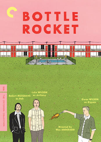
Bottle Rocket, United States, 1996, director Wes Anderson.
Art direction: Eric Skillman, Sarah Habibi. Design: Eric Skillman. Illustration: Ian Dingman.
A rare example of Criterion using a similar illustrative approach for the covers of all a director’s films.
‘The assignment turned out to be a massive undertaking that was slowly crafted over eight months. Wes was involved in every aspect of the project and nothing made it to final art without Wes’ approval,’ Dingman told stickersanddonuts.com.
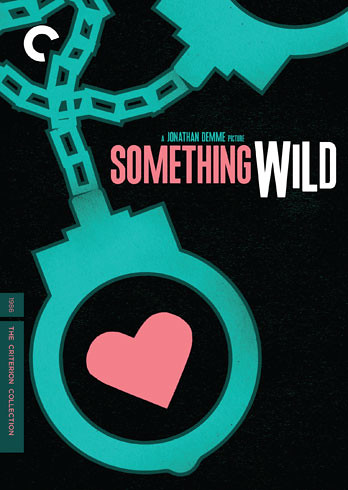
Something Wild, United States, 1986, director Jonathan Demme.
Art direction: Sarah Habibi. Design: Sam Smith.
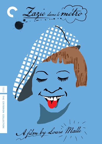
Zazie dans le métro, France, 1960, director Louis Malle.
Art direction: Sarah Habibi. Illustration: Yann Legendre.
The blue references the background colour of the original French poster, which had a photo of child star Catherine Demongeot.
Graphic
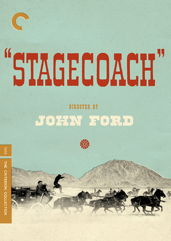
Stagecoach, United States, 1939, director John Ford.
Art direction: Eric Skillman, Sarah Habibi. Design: Eric Skillman.
More on Skillman’s process blog.
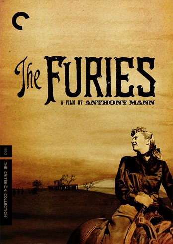
The Furies, United States, 1950, director Anthony Mann.
Art direction: Eric Skillman, Sarah Habibi. Design: Eric Skillman.
On his process blog, Skillman writes: ‘Since this was the first “real” Western in the Criterion Collection […] we felt it was important not to downplay the genre elements. But at the same time, it’s a somewhat atypical Western, very dark in tone, so we didn’t want to present it as something it’s not. The Furies is often referred to as a “noir western,” so I decided to try to combine the visual styles of those two genres.’
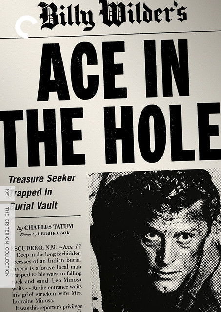
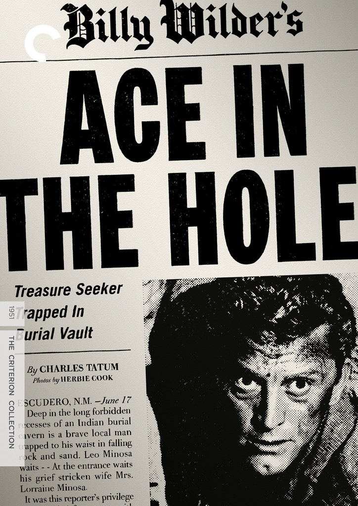
Ace in the Hole (also top), United States, 1951, director Billy Wilder.
Art direction: Sarah Habibi. Design: F. Ron Miller.
More on this design in my Critique on the Eye website.
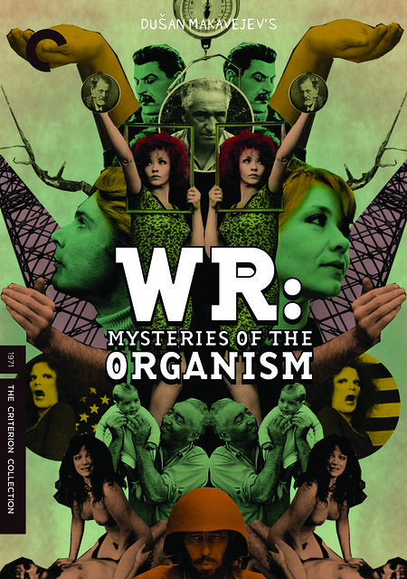
WR: Mysteries of the Organism, Yugoslavia, 1971, director Dušan Makavejev.
Art direction: Sarah Habibi. Design: Lucien S. Y. Yang.
The faux-constructivist montage includes a famous image of actress Milena Dravic punching the air, which was reproduced many times, most unforgettably on the cover of Amos Vogel’s Film as a Subversive Art (1974).
http://www.flickr.com/photos/18549761@N00/191141864/in/set-72157594201382433
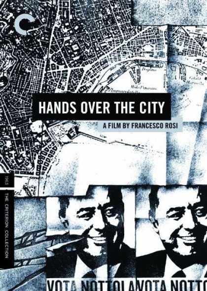
Hands Over the City, Italy, 1963, director Francesco Rosi.
Art direction: Eric Skillman, Sarah Habibi. Design: Eric Skillman. Illustration: Danijel Zezelj.
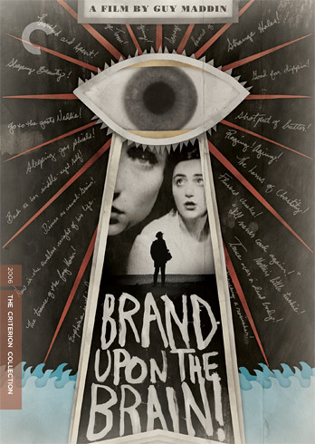
Brand Upon the Brain!, Canada, 2006, director Guy Maddin.
Art direction: Sarah Habibi. Design: Jason M. Hardy.
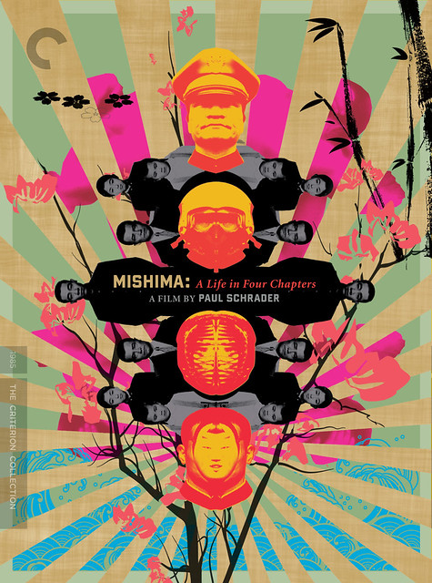
Mishima: A Life in Four Chapters, United States, 1985, director Paul Schrader.
Art direction: Sarah Habibi, Neil Kellerhouse. Design: Neil Kellerhouse.
At least one film critic regards this as the best Criterion cover of all: ‘The colors are a logical extension of Mishima’s wardrobe, the rays of his beloved rising sun skewered by the nationalist’s unique brand of patriotism. And there’s Mishima in the middle, everyone and no one all at once, his entire life finally scrunched into a commodified work of art that fits in the palm of your hand.’
Re-purposed
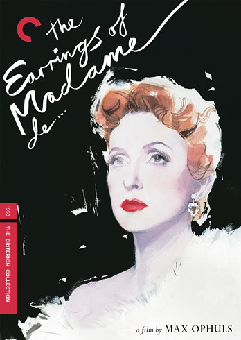
Earrings of Madame de … , France, 1953, director Max Ophuls.
Art direction: Sarah Habibi. Design: Eric Skillman. Illustration: David Downton.
The portrait of ‘Madame de’ fuses two film stills of actress Danielle Darrieux.
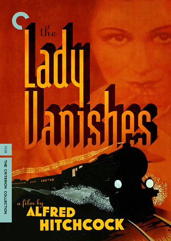
The Lady Vanishes, United Kingdom, 1938, director Alfred Hitchcock.
Art direction: Eric Skillman, Sarah Habibi. Design: Eric Skillman.
The painting of the train – central to The Lady Vanishes – comes from an old Swedish poster for the film.
More on Skillman’s process blog.
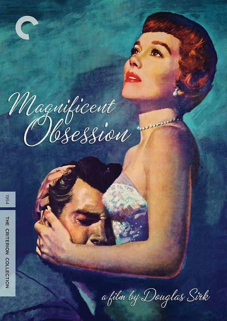
Magnificent Obsession, United States, 1954, director Douglas Sirk.
Art direction: Sarah Habibi. Design: F. Ron Miller.
This design simplifies and intensifies the original poster image by an unknown artist of Jane Wyman comforting Rock Hudson.
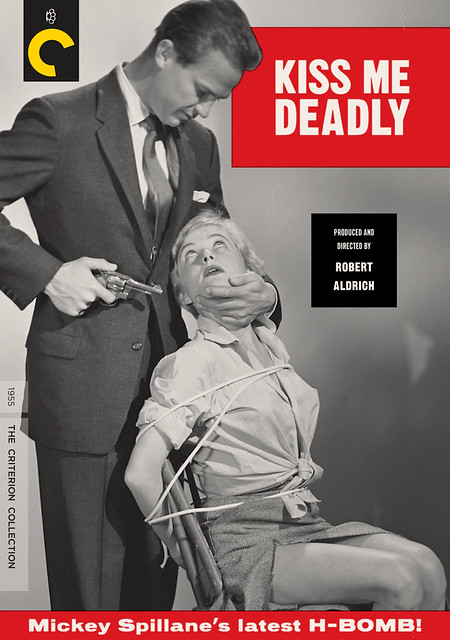
Kiss Me Deadly, United States, 1955, director Robert Aldrich.
Art direction: Sarah Habibi. Design: F. Ron Miller.
The staged-looking bondage photo showing the film’s stars, Ralph Meeker and Gaby Rodgers, is one of the original publicity shots previously used inside the case of an MGM DVD. While it captures Kiss Me Deadly’s tone of hysterical perversity, this scene doesn’t appear in the film.
The immortal phrase ‘Mickey Spillane’s latest H-BOMB!’ appeared on the original poster.
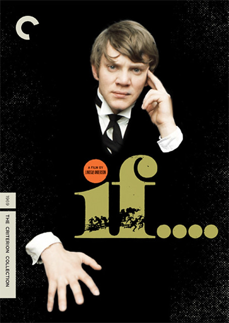
If.... , United Kingdom, 1968, director Lindsay Anderson.
Art direction: Sarah Habibi. Design: Aesthetic Apparatus.
The head and hands of Malcolm McDowell, playing a rebellious public schoolboy, are cut out from a publicity shot, which was previously used in a poster for the film’s re-release in 2002.
The If.... lettering is from the original poster campaign.
http://www.flickr.com/photos/littlemad/5050624376/
Read ‘Commitment to content’ Rick Poynor’s Web-only Critique column in full on the Eye website, eyemagazine.com.
See also ‘Video to go’ in Eye no. 9 (1993).
Eye is the world’s most beautiful and collectable graphic design journal, published quarterly for professional designers, students and anyone interested in critical, informed writing about graphic design and visual culture. It’s available from all good design bookshops and online at the Eye shop. For a visual sampler of some recent issues, see Eye before you buy on Issuu.

