Tuesday, 11:23pm
14 April 2009
Drawn to be wilder

Rian Hughes explores magazine hand-lettering in the latest issue of Eye

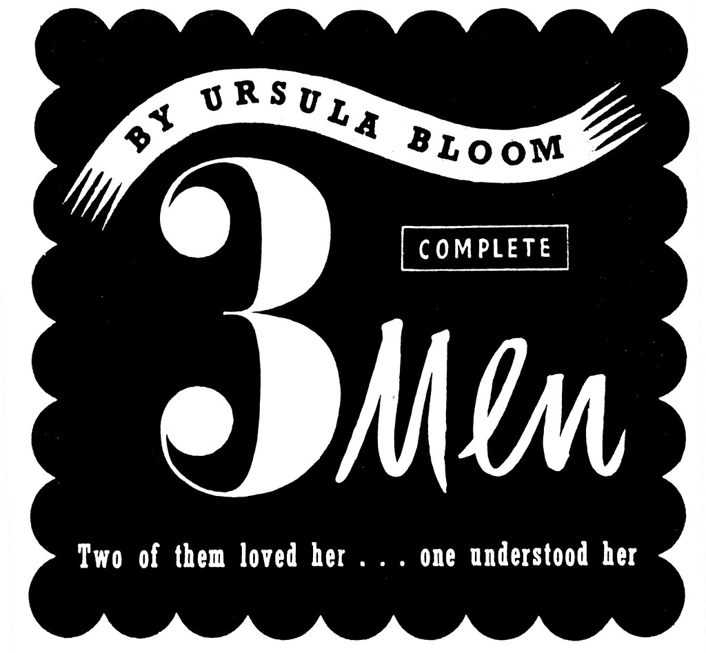
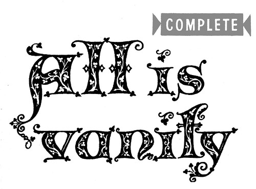
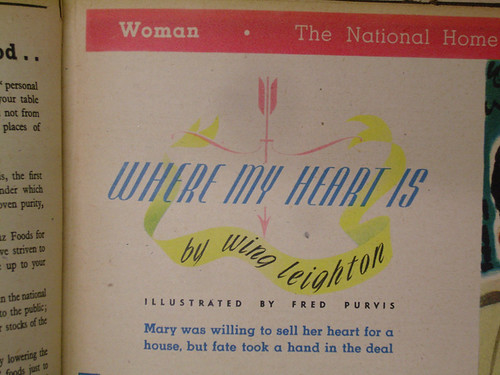
Custom type was not an occasional indulgent art in the pre-digital dark ages, it was the norm, says Rian Hughes in ‘Drawn to be wild’ (Eye no. 71 vol. 18).
The larger sizes of foundry type were not amenable to expressive layouts, and so hand-drawn headlines for magazines, books and advertisements were the most effective way to carry the message.
Fashions in type, as with fashions in fashion, often look to the past for inspiration and then update it with a new twist. The elegant Geo-Deco of the 1920s and 30s is revisited in the 70s with the addition of drop shadows, inlines and shading – a style currently enjoying something of a revival. The interlocks and casual scripts of the 50s and 60s are being revisited by foundries such as House Industries, and the psychedelic swirls of the late 60s and early 70s, though they do not easily lend themselves to digital setting, have resurfaced, too.
The refined 1940s stylings of Woman and Woman’s Own (top and below) – condensed and letterspaced fine-seriffed faces, stars, type reversed out of circles and set on curves – resemble nothing more than Neville Brody’s 1980s designs for The Face. Maybe he drew on his mother’s magazines for inspiration.
To see more of Rian’s extraordinary collection, and read about his eccentric classification system, buy the latest issue of Eye, a Type special. Subscribe now!
Look out for more type articles during Eye’s (somewhat inaccurately titled) ‘Type week’. See Derek Birdsall’s ‘Form of the Book’ article about Dracula. Not to mention Jan Middendorp’s Education article ‘Is type design teaching losing its soul?’ in Eye no. 71 vol 18. You can read an extract on eyemagazine.com. Jan’s review of Playful Type is on the Eye blog, as is his original report from the Gerrit Noordzij Prize Symposium and an article about Robothon. Not to mention the deeply upsetting Type blog top ten (not for the faint-hearted) and ‘Golden age of type? Or the dark ages?’
Rian’s own site is Device.
Eye is the world’s most beautiful and collectable graphic design journal, published quarterly for professional designers, students and anyone interested in critical, informed writing about graphic design and visual culture. It is available from all good design bookshops and online at the Eye shop, where you can buy subscriptions and single issues.


