Friday, 9:07am
28 January 2011
Enter at your peril

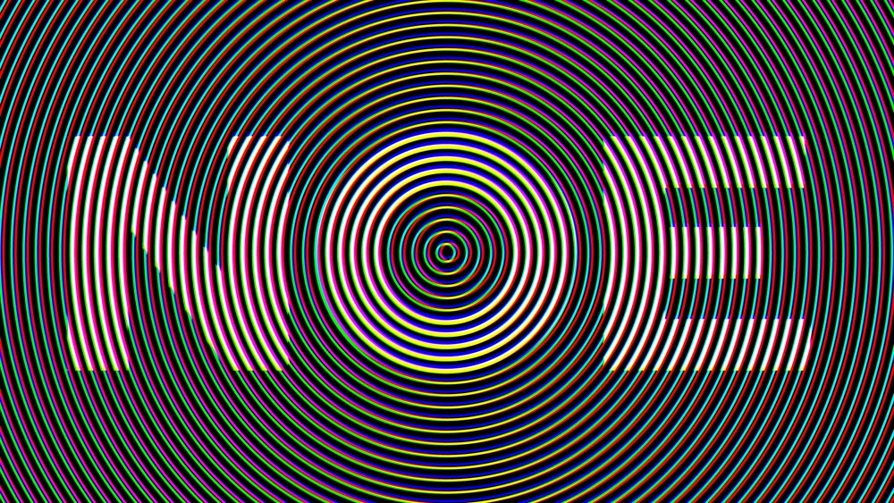
Gaspar Noe’s stroboscopic titles express the dark vision of his new film

The titles of Enter the Void cascade at the viewer in a blizzard of typographic noise.
Noé’s use of type in his latest film, Enter the Void, could seem more conventional than previous offerings: he confines it to the beginning and end. Even so, the type plays a vital role – see also Irréversible (2002) – in expressing his film’s dark vision. (read ‘A soul drifting in neon limbo’, Rick Poynor’s Critique column about Enter the Void in Eye 78, full contents here.)
Director: Gaspar Noé. Typographic design: Tom Kan. Kirlian photographic effects on title type: Thorsten Fleisch. Production: Wild Bunch and Fidélité Films.
Eye magazine is published quarterly for professional designers and students. It’s available from all good design bookshops and online at the Eye shop, where you can buy subscriptions and single copies. For a glimpse of the current one, no. 78, see Eye before you buy on Issuu.
