Monday, 1:29pm
21 February 2011
God’s eye view
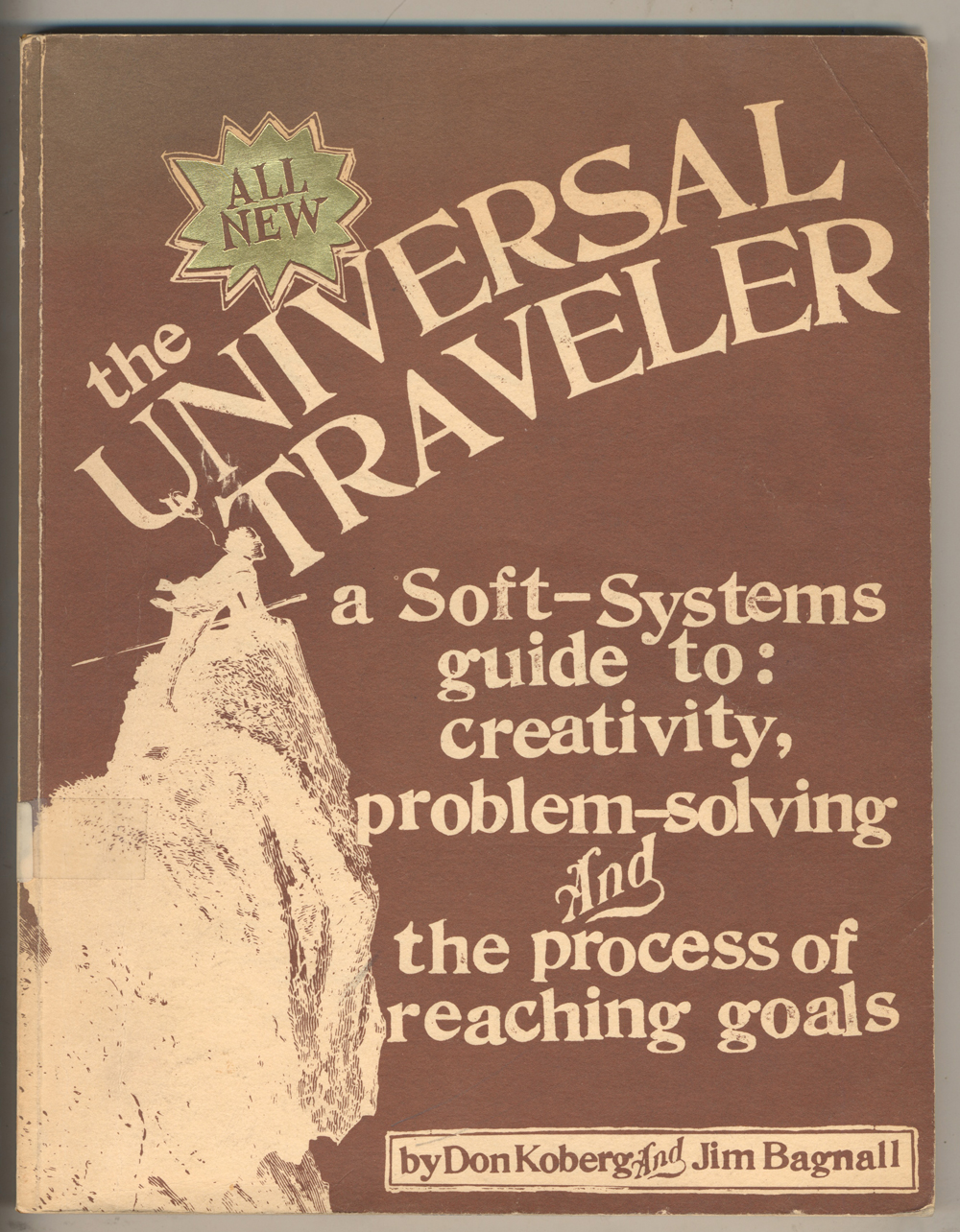
Anne Burdick navigates the hippy aesthetics of The Universal Traveler

Great moments in information design (continued).
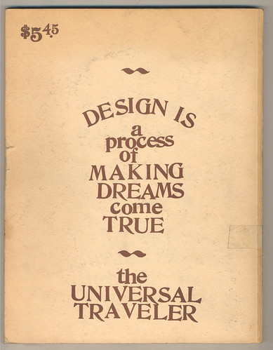
I was cleaning out my father’s studio library when I found The Universal Traveler, writes Anne Burdick. Subtitled A Soft-Systems Guide to: Creativity, Problem-Solving and the Process of Reaching Goals, it sat alongside other books that Californian techno-eco-utopian designers were reading in the 1970s: The Gutenberg Galaxy, Paolo Soleri’s Arcology (read Rick Poynor’s ‘The designer as architect’ in Eye 32), Buckminster Fuller’s 4d Timelock, and The Whole Earth Catalog (see ‘Tool-shop for a counterculture’ in Eye 78).
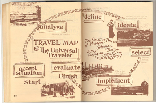
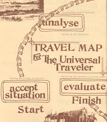
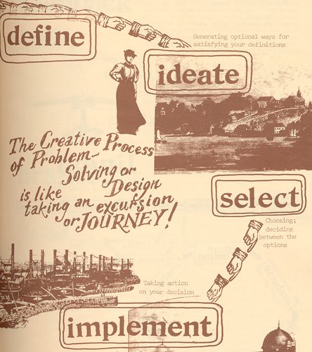
The goal of The Universal Traveler is to ‘provide a simplifying format for problem-solving’, and at its centre is the ‘Travel Map’ (below), a god’s eye view of the excursion taken by all universal travellers on their quest for creativity.
With its hand-crafted, hippy aesthetic and vibrant metaphors, the Travel Map is endearing, game-like, whimsical. But the jumble of Victorian woodcuts, rubber stamps and typewriter text – just this side of chaos – belies the scientific impulse of the book as a whole. For me, this misalignment is the Travel Map’s charm. The aesthetic speaks to the messy business of creativity and imagination that is housed in the structure of a flow chart whose origin lies in the highly rational, efficiency-oriented field of scientific management. Koberg and Bagnall’s project is, at heart, an attempt to control the seemingly uncontrollable.
The flow chart was introduced in 1921 by Frank Gilbreth, who with his wife, Lillian, had used motion studies to devise the ‘one best way’ for workers to perform a task in the smallest number of steps. The approach was quickly adopted within industrial engineering and lives on for its ability to create a clean, clear representation of a dynamic system.
In this regard, the Travel Map is nothing more than a gussied-up entry in a long series of attempts to describe process.
The paradox of bringing order and reliability to risk-taking and innovation through the rhetoric of early twentieth-century scientific management continues today. Strategic design firms and design-thinking proponents in both business and academia generate process maps that, while stylistically incompatible with The Universal Traveler, reproduce essentially the same underlying structures.
Koberg and Bagnall would agree: ‘We believe that all problems, no matter what size they may be, can benefit from the same logical and orderly procedures now employed in the highly specialised, computer-assisted statistical disciplines [...] The process remains constant. It is only the methods which need to be changed, and then, often in appearance alone.’
But can a hippy aesthetic or a design vernacular make up for the difference between creative thinking and the unforgiving sequence of the assembly-line or the computational algorithm?
I’m happy to wrap myself in the techno-eco-utopian vibe, but in 2011, it’s time to travel elsewhere.
Anne Burdick is chair of the graduate media design programme at the Art Center College of Design, Pasadena, and design editor of Electronic Book Review
For more our Great Moments in Information Design, see ‘Going Overground’ and ‘Billion-dollar brainteaser’ on the Eye blog, and Eye 78 itself.
Eye is the world’s most beautiful and collectable graphic design journal, published quarterly for professional designers, students and anyone interested in critical, informed writing about graphic design and visual culture. It’s available from all good design bookshops and online at the Eye shop. For a taste of no. 78, see Eye before you buy on Issuu.

