Thursday, 1:17pm
29 September 2011
Loose arrangement
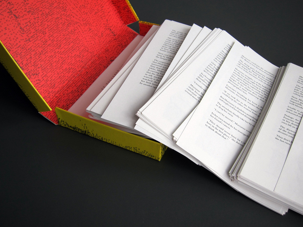
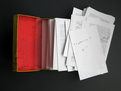
A book in a box that obliges readers to interact. Also available as a hectic app

Publisher Visual Editions has established a reputation for publishing titles that exploit the benefits of the books’ visual and physical elements over their digital counterparts (see ‘A nose for type’, in Eye 77 about Apfel’s design for The Life and Opinions of Tristram Shandy, Gentleman). All the publications on VE’s list, both published and proposed, are titles that play with the expected form of the book, writes Alexander Ecob.
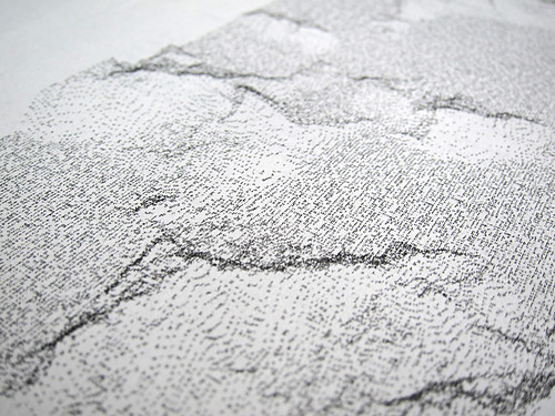
Above: The reverse of each sheet features a generative illustration made up of every word in the book.
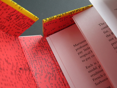
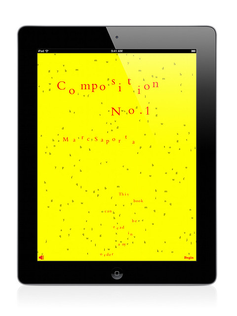
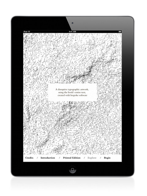
The latest book, Marc Saporta’s loose-leaf Composition No.1, breaks additional ground. Designed by Universal Everything’s Matt Pyke (his first book assignment), this ergodic text is also VE’s first foray into the world of iPad apps.
Many readers will have seen the ‘book in a box’ format elsewhere – from B. S. Johnson’s The Unfortunates (see ‘Random thoughts’, Eye 36) to McSweeney’s (see Lance Knobel’s article in Eye 78), but Saporta’s original edition of 1962 was one of the first examples in modern literature.
Composition No.1’s single sheets can be read in any order. Readers are invited to shuffle and select the unbound pages, defining the narrative for themselves. The text is printed on standard book stock (perhaps too thin for the shuffling required), and each page is backed with a generative illustration that uses every word from the book.
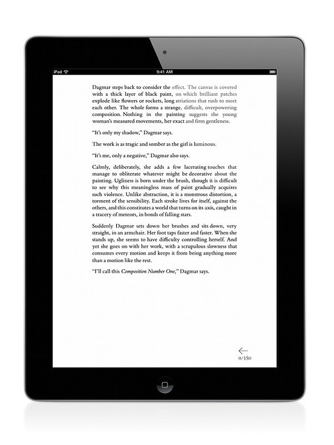
The iPad edition takes the shuffling process a step further. Pages flick by rapidly until the reader intervenes by touching the screen. You are required to keep your thumb or finger in place while reading, too: whenever you disengage, the pages resume their hectic transitional blur.
This might sound annoying, but the enforced interaction results in the very thing that many claim to be missing from digital media: focus. With a hundred other apps, bells and whistles at the fingertips of every reader, a sense of engagement is the holy grail for any developer. In the case of Composition No.1, there’s no possibility of distraction.
More about Visual Editions, visual-editions.com.
Eye is the world’s most beautiful and collectable graphic design journal, published quarterly for professional designers, students and anyone interested in critical, informed writing about graphic design and visual culture. It’s available from all good design bookshops and online at the Eye shop, where you can buy subscriptions, back issues and single copies of the latest issue. The latest issue is Eye 80.

