Thursday, 8:45am
21 July 2011
Measure for measure
Design education
Design history
Graphic design
Information design
Technology
Typography
A closer look at some neglected rules for typographic design.

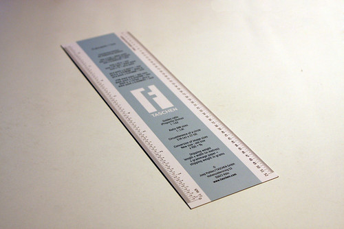
When we opened Taschen’s new English edition of Letter Fountain to photograph it for Ben Archer’s review in Eye 80, there was a slim implement (below) that I assumed had gone the way of composing sticks and Letraset sheets, writes Alexander Ecob.
Above: Type measure / bookmark included in Letter Fountain (Taschen).
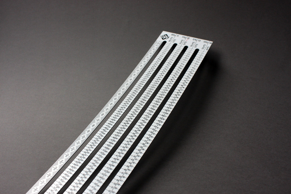
While this type measure is much more likely to be used for its handy list of unit conversions and glyph shortcuts than measuring type, it spurred us to pull open a plan-chest drawer to see what we could find.
The following are from the collection of Clive Barnes, long time production guru at Eye's printer Beacon Press (now known as the Pureprint Group).
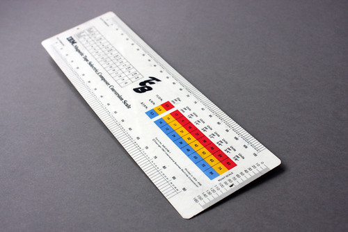
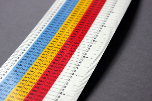
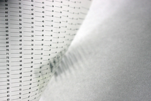
Above: IBM Magnetic Tape Selectric Composer Conversion Scale.
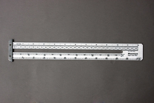
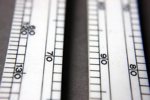
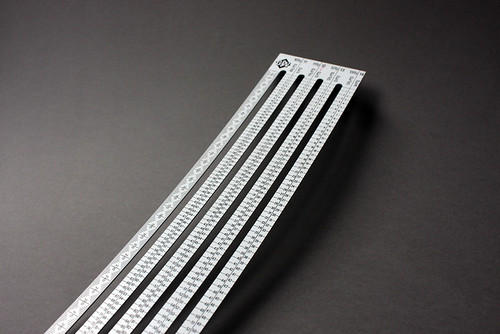
Above: Monotype point scale.
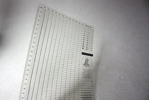
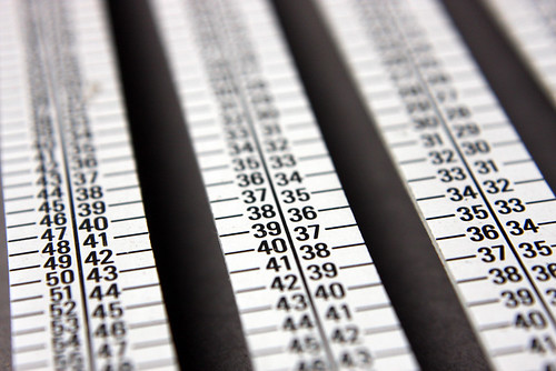
Above: The Beacon Print Guide type scale.
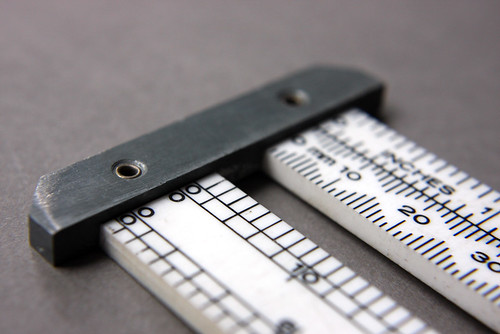
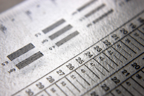
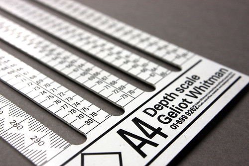
Above: Geliot Whitman A4 Depth scale.
See ‘Font of all type knowledge’ Ben Archer’s Eye 80 review of Letter Fountain [on Printing Types] by Joep Pohlen.
Eye is the world’s most beautiful and collectable graphic design journal, published quarterly for professional designers, students and anyone interested in critical, informed writing about graphic design and visual culture. It’s available from all good design bookshops and online at the Eye shop. For a taste of the new issue, see Eye before you buy on Issuu. Eye 80, Summer 2011, is on its way to subscribers and bookshops worldwide.

