Tuesday, 5:29pm
14 October 2008
On the slab

A hard-working 1970s typeface comes back from the cold

From the type department.
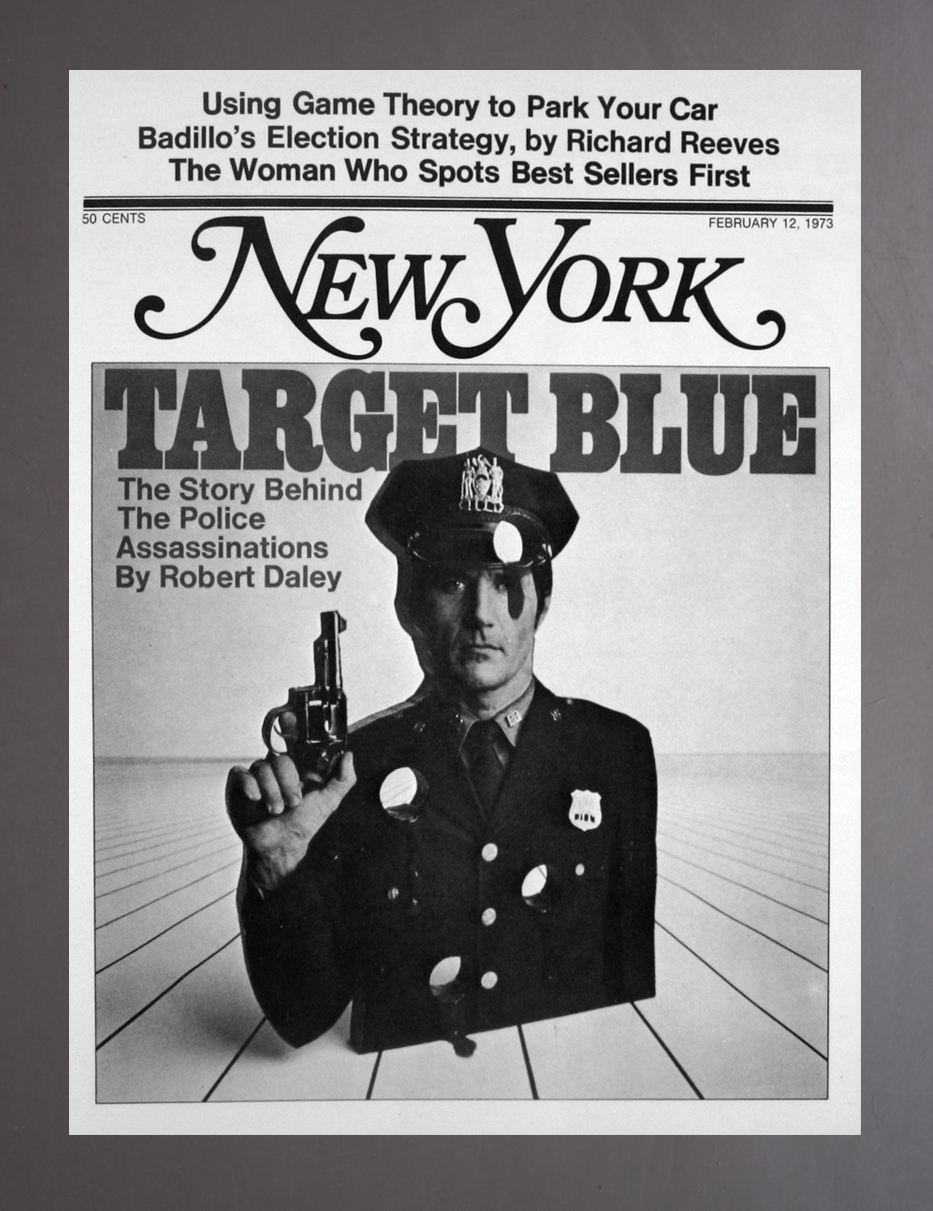
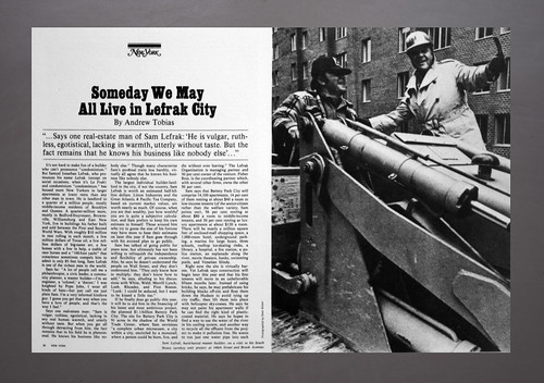
Another strong feature of the New York Magazine anniversary issue (see the recent Eye blog) is the powerful use of the Egyptian Bold Condensed display font. It’s a direct reference to the original Milton Glaser / Walter Bernard design
of the magazine (see the 1973 cover, above, and feature spread, below).

The Egyptian was a great 1960s and 70s workhorse face that fell from favour, probably through over-use. In the current issue, Design Director Chris Dixon has it working with bold all-capitals headline blocks and punchy pull-quotes.
David Hillman used it to make a strong front page and logo for The Stage, the British actor’s newspaper. New York’s version is a digital translation of the Amsterdam Type Foundry’s version of the font. Roll on the slab-serif revival.
Eye is the world’s most beautiful and collectable graphic design journal, published quarterly for professional designers, students and anyone interested in critical, informed writing about graphic design and visual culture. It is available from all good design bookshops and online at the Eye shop, where you can buy subscriptions and single issues.
