Thursday, 8:54pm
8 March 2012
Organisation vs anarchy.
Thomas Couderc of Helmo on working with Big Blue

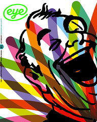
The cover of Eye 81 featured a detail from an illustration commissioned for IBM’s ‘Smarter Planet Outcomes’ campaign. The campaign was one of the case studies in Chris Maillard’s article ‘The far side’, a feature detailing relationships between clients and designers.
Via agency Ogilvy & Mather, IBM’s campaign drew on the talent of a number of designers including Non-Format, Noma Bar and Carl DeTorres.
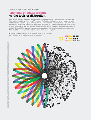
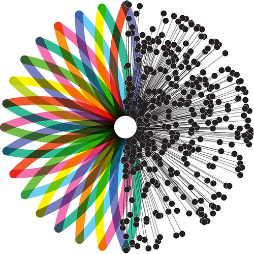
Thomas Couderc and Clément Vauchez, the two-man team behind French studio Helmo, played on the advertisement’s headline – ‘the tools of collaboration vs the tools of distraction’ (above).
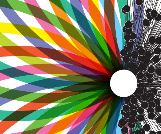
Says Couderc: ‘From this basic starting point we tried different associations of half circles, always in an abstract-diagram language, trying to express simple notions such as: simplicity vs complexity; continuity vs discontinuity; sharing vs individuality; organisation vs anarchy; harmony vs irregularity; 2D vs 3D; colour vs black and white.’
Above: image from ‘Communication vs distraction’ for IBM.
Credits: Creative director / art director: Chris Van Ossterhout; creative director / writer: Rob Jamieson; art producer: Leslie D’Acri / Elisabeth Lucas. Image: Helmo.
See also ‘Lines of communication’ on the Eye blog.
Read all the case studies from ‘The far side’ in Eye 81 (below).
Eye is the world’s most beautiful and collectable graphic design journal, published quarterly for professional designers, students and anyone interested in critical, informed writing about graphic design and visual culture. It’s available from all good design bookshops and online at the Eye shop, where you can buy subscriptions, back issues and single copies of the latest issue. The ‘Designers and clients’ special issue, Eye 81, is out now – see Eye Before You Buy for a visual sample.

