Thursday, 11:20am
25 September 2008
Q&A with Fraser Muggeridge

Who cares about graphic design history?

Fresh content! Read our Eye 68 Q&A with Fraser Muggeridge on the Eye site.
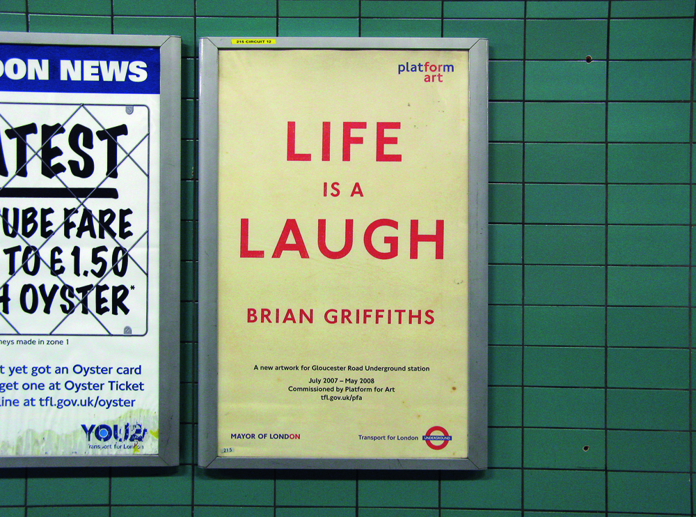
Top: ‘Life is a Laugh’ by Brian Griffiths, poster commissioned by Art on the Underground, London. Design: Fraser Muggeridge Studio, 2007. Muggeridge explains: ‘I made the poster look like a poster from the 1930 or 40s by doing the type, then printing it out, then photocopying it, then blowing it up, then rescanning, then superimposing on a dirty background that was taken from the end papers of an old book I had lying around.’

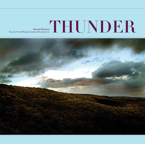
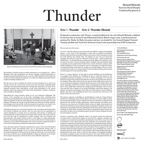
Above and below: Thunder by Hannah Rickards, Media Art Bath. Design: Fraser Muggeridge Studio, 2006. In this artist’s project, Muggeridge references design history by using different typefaces for each side of the LP sleeve, as if two different people designed the front and back, which frequently happened on albums from the 1970s. ‘This “lack of consistency” happened because printers of the time had only certain typefaces in certain sizes and weights,’ he explains, ‘so I mimicked this on purpose.’

For more infomation about Fraser Muggeridge studio see the site pleasedonotbend.co.uk.
Eye is the world’s most beautiful and collectable graphic design journal, published quarterly for professional designers, students and anyone interested in critical, informed writing about graphic design and visual culture. It is available from all good design bookshops and online at the Eye shop, where you can buy subscriptions and single issues.
