Wednesday, 11:43am
7 December 2011
Stamp collection
Royal Mail delivers another set of small-scale graphic design

This year’s edition of the Royal Mail Yearbook is another eclectic collection of British graphic applied to the postage stamp, writes Dannalie Diaz.
From countryside travels in the section titled ‘Classic Locomotives of England’, to the commemoration of the 400th anniversary of the King James Bible in ‘Christmas 2011’, the Royal Mail Yearbook portrays many dimensions of British life and heritage through its stamp designs and informative accompanying articles.
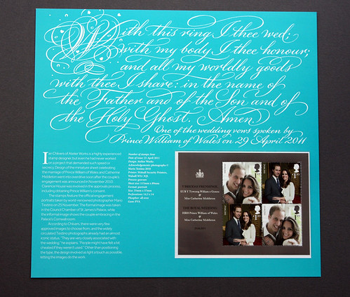
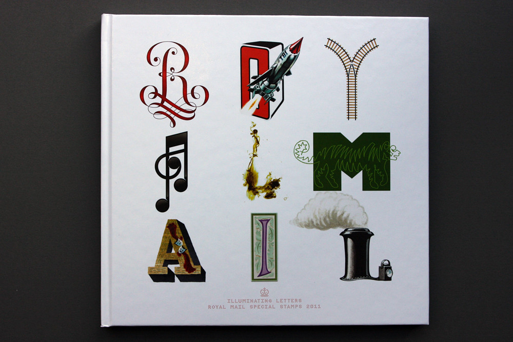
The hardback yearbook, designed by Magpie Studios, comes in a card presentation box, each letter representing a feature in the book. Inside are fourteen sets of actual stamps, secured by clear plastic pockets. There is also an insert (below) about the Royal Wedding, with an article by Jacquie Wines and stamps featuring the Royal Couple.
Each stamp set has a different visual appeal: endangered animals in the WWF stamps stare out with haunting intensity; the Crown jewels dazzle with their splendour and vast history; and the microlenticular Thunderbirds stamp set (see ‘Scarlet letter’ on the Eye blog) is like nothing I’ve seen before. Yet the collection I found most fascinating was the Royal Shakespeare Company (RSC) set (below).
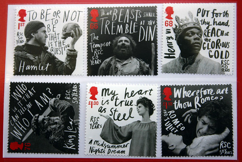
Above: Design: Hat-Trick Design. Lettering: Marion Deuchars.
There are two sets of stamps in this section, one set of six and another of four. The first set, for the RSC’s 50th anniversary, expresses the passion of the Shakespearean stage through black and white production shots, such as David Tenant’s Prince in Hamlet (2008) and Antony Sher’s Prospero in The Tempest (2009). The plays’ titles, along with selected quotes, are in lettering symbolic of the characters’ state of mind: the sharp and mismatched script in The Tempest stamp could allude to Prospero’s anger at his enemies; the rounded and curved calligraphy for A Midsummer Night’s Dream embodies the play’s romance and fantasy. (See also David Crowley’s article ‘Out of hand’ in Eye 80, which includes some of these stamps.)
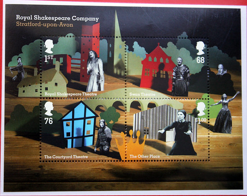
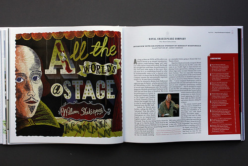
The second set (above), also designed by Hat-Trick Design, is more whimsical. Each image calls to mind a pop-up book, with cut-outs of actors and stage sets. The stamp design is based on the idea of set-design maquettes, and it combines cut-outs of actors’ photos with almost cartoonish backdrops to give a playful feel. These sets are complemented by an interview (opening spread, below) with actor Patrick Stewart by critic Benedict Nightingale.
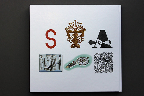
Below: back cover.
Royal Mail Yearbook, £95, £135 for the luxury leather bound version, available now from Royal Mail in Edinburgh.
Dannalie Diaz is an undergraduate at the University of Florida, studying English literature, and is currently in London on an FIE [Foundation for International Education] programme.
Eye is the world’s most beautiful and collectable graphic design journal, published quarterly for professional designers, students and anyone interested in critical, informed writing about graphic design and visual culture. It’s available from all good design bookshops and online at the Eye shop. For a taste of the new issue, see Eye before you buy on Issuu. Eye 81 is out now.

