Friday, 8:41am
8 July 2011
Swedish snaps
Revamped Form magazine champions regional design and Nordic typefaces

The new magazine formed by the merger of Form and Forum (a Swedish design magazine and a Nordic architecture magazine respectively) wears its influences proudly.
With a logo plucked out of 1905, body copy in a 1951 Swedish serif and guest Nordic typefaces in each issue, the new Form (art directed by Cecilia Lindgren) is a celebration of regional design and designers, writes Alexander Ecob.
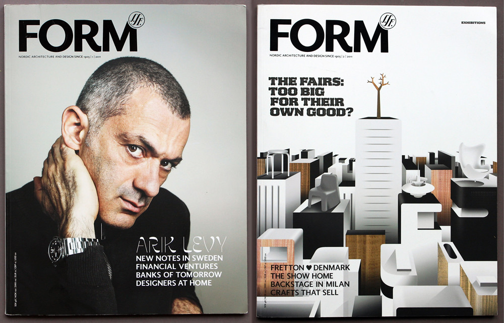
Top: Issues 1 and 2 of the newly relaunched Form magazine.
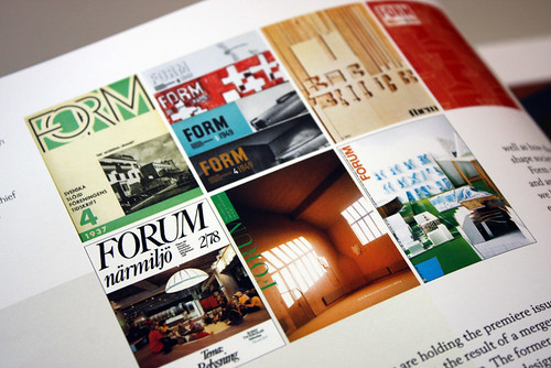
Above: Archival covers from Form and Forum magazines.
Lindgren says ‘Similarly to AR [Architectural Review, which Lindgren, along with Violetta Boxhill, redesigned in 2009] Form has a rich visual history, so it felt like a natural starting point to go through the extensive archives of the magazine.’
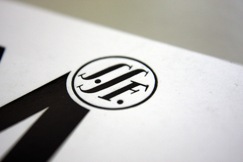
‘The logo ressurects a symbol from the Form archives, when the magazine used to be both architecture and design focused. The merging of Forum and Form means that once again Form is a magazine for both architecture and design.’ The use of the Swedish Society of Crafts and Design (SSF) logo is a nod to both the magazine’s rich heritage, and the dual focus of the earlier publication. Every issue of the magazine is published in both Swedish and English editions.
Above: The logo was originally used by the Swedish Society of Industrial Design (SSF) – the organisation that created Form in 1905.
‘The idea for the typography for Form was to use only Swedish or Nordic typefaces, since the magazine is specifically about Nordic design’ said Lindgren, and it is for this reason that she turned once more to the archives. Karl-Erik Forsberg – a heavyweight of Swedish design and art director of Form in the 1960s – designed what is thought to be the first Swedish serif typeface – Berling – in 1951, and it has been seen as an iconic representation of Swedish design ever since.
While poorly digitised versions of Berling have been available for some time, in 2004 Frederik Andersson and Örjan Nordling released their modernised Berling Nova, and followed up this success with a sans-serif companion in 2007. Lindgren said: ‘When I came across these two fonts, they seemed like the perfect choice for the new Form.’
Above: Headline and standfirst set in two weights of Andersson and Nordling’s Berling Nova.
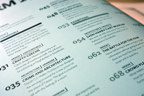
Above and below: Berling Nova Sans – all body copy as well as headlines and standfirsts in front and back sections are set in either Berling serif or sans.
The locally-sourced letterforms don’t stop there. With each issue, Lindgren brings in a different Nordic guest typeface for headlines and pullquotes.
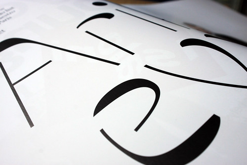
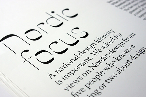
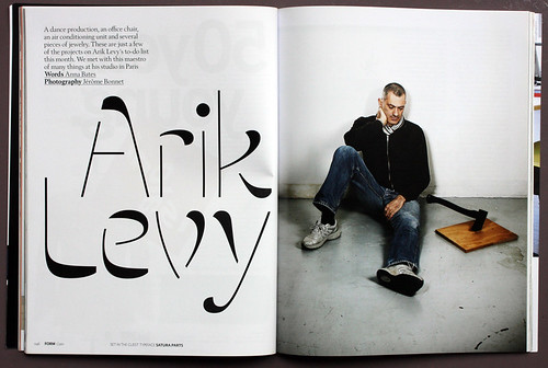
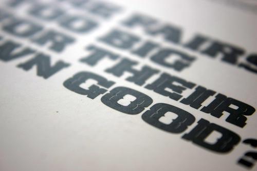
Issue 1 used Swedish designers Peter Bruhn and Göran Söderström’s Satura. Released just six weeks before the issue went to print, Satura is a diverse family with many variations and weights, including the bizarre stroke-contrast used by Lindgren. ‘I felt this was exactly the type of font we should use to get the concept across. It needed to be something that stands out, so the reader picks up on the idea of the guest typeface.’
Above and below: Satura by Peter Bruhn and Göran Söderström, the guest display typeface for issue 1.
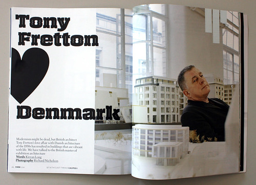
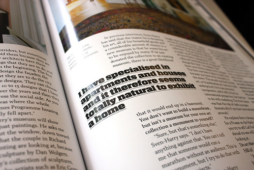
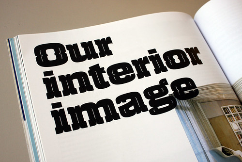
For the second issue, Lindgren used Calypso I, from the young Finnish type foundry Typolar. ‘I wanted something that was different from Satura,’ said Lindgren, ‘but that still had a lot of character, which I found in Calypso I.’
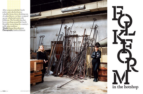
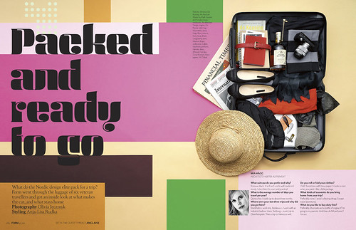
With issue 3’s guest typeface (Copper Stencil by Icelandic designer Gunnar Vilhjálmsson) due to be released later this year, and issue 4's Anglaise by Anette Schmidt, a Danish architect and graphic designer, Form is acting as a springboard for local talent. ‘The idea of the typeface fulfils two objectives of the magazine,’ said Lindgren, ‘the focus on Nordic countries, and an aim to cover every aspect of “form”, including graphic design.’
Above and below: Pages from issue 2 of the magazine, showing the guest typeface Calypso I by Typola.
Above: Spread from Form issue 3, typeface Copper Stencil by Gunnar Vilhjálmsson.
Above: Spread from Form issue 4, typeface Anglaise by Anette Schmidt.
Eye is the world’s most beautiful and collectable graphic design journal, published quarterly for professional designers, students and anyone interested in critical, informed writing about graphic design and visual culture. It’s available from all good design bookshops and online at the Eye shop, where you can buy subscriptions, back issues and single copies of the latest issue. The latest issue is Eye 79, a type special. Eye 80 is on press.

