Friday, 12:21am
30 January 2009
The Form of the Book 1

Time to consider a more holistic approach to publishing design?

To celebrate today’s ‘The Form of the Book’ conference at St Bride Library (above), Catherine Dixon introduces a new thread to the Eye blog. In future weeks, we will be inviting designers and design writers to select their favourite book designs (not just the covers) of the past year, and to explain their selection.
A couple of recent events in London have focused discussions on what makes good book design. Swiss designer Jost Hochuli shared his misgivings concerning an overly systematic approach to book design in a lecture at St Bride Library. Warning of the pitfalls of an overly dogmatic approach to visual layout, he proposed a more ‘open’ relationship between designer and system, allowing scope for intuition to inform the designed response.
The second event, which also involved Hochuli, was a round-table discussion hosted by the Helvetic Centre focusing on the exhibition ‘The Most Beautiful Swiss Books 2007’. Here Hochuli was joined by book designers Ron Costley, James Goggin and Laurent Benner in a panel-led consideration of the criteria used to evaluate contemporary book design, with much debate about the relevance of ‘beauty’. Robin Kinross commented that similar awards in The Netherlands avoid trying to evidence ‘beauty’, opting instead to recognise those books that have been ‘most cared for’ in a wider creative sense. (See Rick Poynor’s Critique in Eye no. 70 vol. 18.)
What became clear at both these events was that the books under discussion represented only a tiny proportion of the breadth of activity and kind of product encompassed within contemporary book design, and especially within the UK. It was acknowledged that only a very narrow range of books is celebrated in design terms, and that such books are often intended more for ‘looking at’ than reading. A degree of editorial collaboration, self-publication or self-authorship is not unusual, along with short print runs intended for niche markets.
A far cry then from the marketing constraints of mainstream publishing. Here there is less to celebrate. But it is here that design is perhaps needed most. If a designer has only one or two days to ‘design’ a book, a systematic approach is a necessity. And while the rigidity of many of the systems we do have may well be problematic, where are the designers to create new systems that will allow for a more humane approach to text layout?
Craft vs content
Contemporary evaluations of book design fuelled Nick Bell’s Confessions of an awards juror blog, which argued for the award-worthiness of a 2008 D&AD nomination. Bell prioritises the conceptual over the craft: ‘Craft – particularly the typographic variety – weighs heavily in graphic design. Craft resonates with designers more than ideas, much as we hate to admit it. The kind of debates that take place on D&AD juries bear this out – great ideas being passed over because “I didn’t rate the type.”’
Rather than trying to redress the balance between a consideration of content and craft in a given book, Bell re-polarises the argument. Yet the suggested split between ideas and execution is not one you find in other areas: the restaurant critic will not, for example, be heard to praise the idea for the experimental new menu if the culinary craft fails to deliver a first-class meal.
Content does matter. There is a danger of focusing too much on what something looks like without questioning what is it for. But there is also a danger in evaluating a book's conceptual contribution to a given field at the expense of its visual realisation – a problematic feature of much mainstream publishing. The form of the book will largely determine how effectively the content is experienced. Content and craft should then work together in the design of the book as a whole.
For me, the most satisfying book of the past year is the revised edition of Jenni Muir’s A Cook’s Guide to Grains (Conran Octopus). It’s interesting, and a pleasure to hold, to open and to read and use. The cover and illustrations (by a favourite print-maker of mine) are totally appropriate to the subject, and have been well balanced and integrated with the text. It is a quiet joy. And what's more, I suspect it will be for years to come.
The Form of the Book, St Bride Library, London, 30 Jan 2009 www.stbride.org.
Conference organisers Fraser Muggeridge and Sara De Bondt.
Below: Examples of work by Muggeridge and De Bondt.

Spread from Sleep of Ulro, by Goshka Macuga (A Foundation, Liverpool, 2007). Book design by Fraser Muggeridge studio, pleasedonotbend.co.uk.

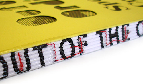
Spine detail from Sara De Bondt's design for the catalogue of ‘Out of the Ordinary: Spectacular Craft’ (Victoria and Albert Museum, 2007), which demonstrates how a sound knowledge of process can open up possibilities for innovative design. Saradebondt.com
Eye is the world’s most beautiful and collectable graphic design journal, published quarterly for professional designers, students and anyone interested in critical, informed writing about graphic design and visual culture. It is available from all good design bookshops and online at the Eye shop, where you can buy subscriptions and single issues.
