Thursday, 8:00am
2 April 2009
The Form of the Book 5
Dracula, blood-red prints of darkness (with dedicated typefaces)

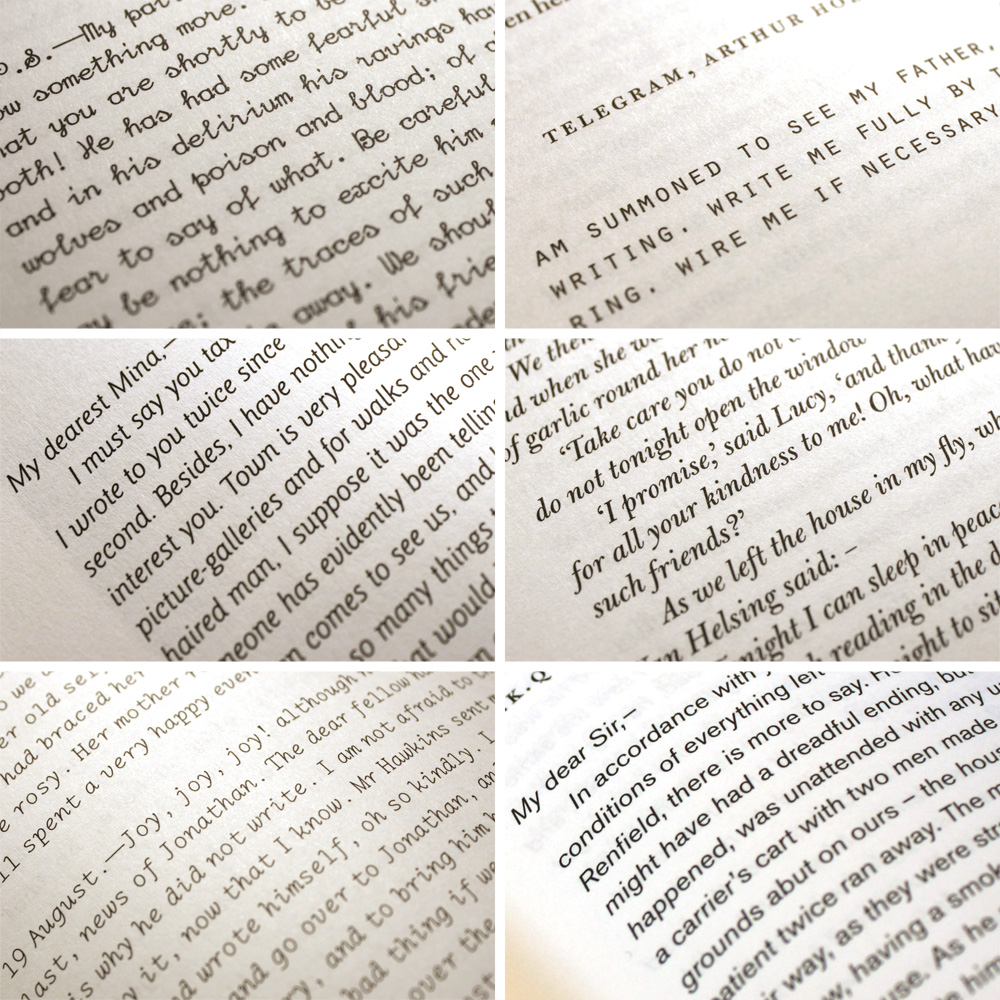
John Morgan’s meticulous reading of Dracula, Bram Stoker’s classic and complex ‘novel’ (originally published in 1897) results in a golden, golden-section edition, writes Derek Birdsall. As one of the characters repeatedly refers to the (then) modern invention of the typewriter, Morgan has set Mina Harker’s journal entries in a quirky version of typewriter type (Remington, of course!).
In fact, each character’s chapters are set in their own dedicated typeface, including Bulmer, Goudy and Akzidenz Grotesque (a font first released in 1896). Even a two-line telegram is set in Orator Standard, exactly matching a telegram of the time.
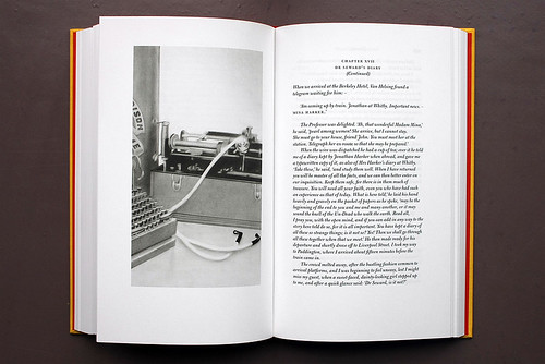
The book’s binding is reminiscent of The Yellow Book – another near-contemporary. Except that, instead of black, the blocking of the stylish title-piece is blood red – as are the endpapers, the head-and-tail-bands, and the tops of the pages. (Nice one, John).
The reproduction of the delicate illustrations (by James Pyman), the choice of paper and the golden-section format add up to an elegant and most satisfying example of modern book design and production (production supervised by Martin Lee).
Dracula: Words by Bram Stoker, Art by James Pyman, Design by John Morgan
Published by Four Corners Books, fourcornersbooks.co.uk, £13.95 / $27
Eye is the world’s most beautiful and collectable graphic design journal, published quarterly for professional designers, students and anyone interested in critical, informed writing about graphic design and visual culture. It is available from all good design bookshops and online at the Eye shop, where you can buy subscriptions and single issues.


