Wednesday, 2:00pm
1 April 2009
These letters are so wrong

But sometimes, as Playful Type shows, ‘any old shape’ really will do

‘A typically moral and conscientious Englishman’, Eric Gill once said, finds himself inclined to think that ‘an “R” ought to have a bow more or less semicircular and of a diameter about half the length of the stem’, even though in reality ‘any old shape will do to make a letter with’. But moralisation about type is not limited to the people with the stiff upper lips, writes Jan Middendorp.
There is a global category of type designers who shiver at the thought of a letterform not made ‘as it should’. And there are many traditionally minded typographers who will despise the kind of work collected in Playful Type: Ephemeral Lettering and Illustrative Fonts, the latest typographic compendium from Gestalten.
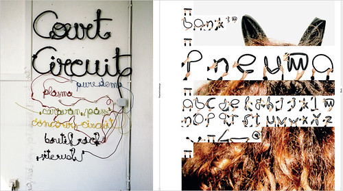
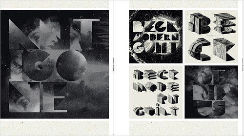
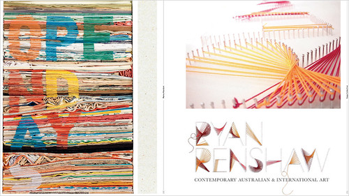
Briefly, Playful Type is a contemporary collection of adventurous lettering made in a diverse array of techniques – from craftsy hand-drawn titles via digital construction to elaborate staged photography – which have one thing in common: they are not letterforms as they ‘ought to be’. A large part of these are real-life commissions, such as the delightful pseudo-flower-power lettering in Studio Oscar’s posters for Totally London. Many others are self-commissioned pieces made as play or exploration. Showing that, in fact, any old shape does do to make a letter with.
As is often the case, the Berlin publisher has managed to capture a trend at what appears to be a high point of diversity and craftsmanship, collecting hundreds of excellent examples and displaying them with a fine sense of visual analogy and rhythm. What is lacking – and this, too, is no exception – is reflection, critical examination, depth.
The editors Hendrik Heilige and (Gestalten principal) Robert Klanten have collected great work from some of the best in the lettering business. Marian Bantjes, Sarah King, Si Scott and Gray 318, to mention only a few, have all received ample attention elsewhere. But to see their splendid compositions in the company of so much surprising new or less known work is thrilling.
Overall, the level of visual conceptualisation and execution is high. Apparently, we are at a point in (oh, well . . .) postmodern culture where total consciousness about past styles and techniques is not paralysing and confusing any more, but simply a starting point for making great-looking and amusing stuff. Whether it is ‘new’ or ‘old’, ‘high’ or ‘low’, bluntly direct or deconstructive is not a matter of life or death any longer.
Of course, with such an eminent cast of designers and such a rich variety of approaches to lettering, a book like this could be a source of delight to those who seek not only inspirational imagery but also some insight into the ideas and processes behind it. Why do designers who are knowledgeable about functional form indulge in ornament? To what extent are they guided by content and context in their choice of style and materials? When designers favour process over product, expression over serviceability, do they brood over legibility and communication nevertheless?
In the short, unspectacular introductions to each chapter not much is done to answer those queries. But, again, that is largely made up for by the excellent quality of the work reproduced.
Playful Type: Ephemeral Lettering and Illustrative Fonts, edited by Robert Klanten and Hendrik Hellige (Gestalten, £40 / €44 / $69).
The latest issue of Eye (no. 71 vol. 18) is a Type special. Get it today!
See Jan Middendorp’s Education article ‘Is type design teaching losing its soul?’ in Eye no. 71 vol 18. You can read an extract on eyemagazine.com. Also: his Robothon article on the Eye blog
Eye is the world’s most beautiful and collectable graphic design journal, published quarterly for professional designers, students and anyone interested in critical, informed writing about graphic design and visual culture. It is available from all good design bookshops and online at the Eye shop, where you can buy subscriptions and single issues.


