Wednesday, 4:53pm
17 March 2010
Think ink
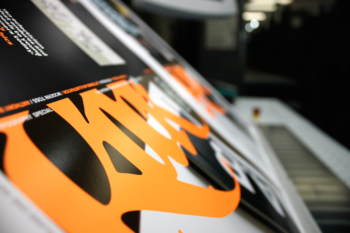
Special colour for calligraffiti on front of Eye 75, our typography special

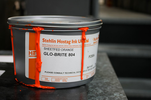
The cover of Eye 75, out very soon, uses a special colour, a fluorescent Pantone 804.
Here are some pictures that show the magazine covers in production last Friday, down at Beacon Press. You can almost smell the ink. Photographs: Jay Prynne.
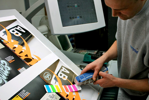
Above: Matching the special colour.
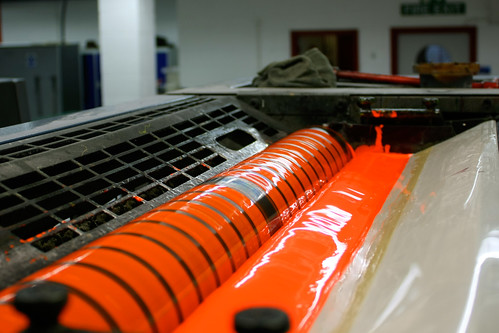
Above and below: the gloopy ink ducts, brimming with Glo-brite 804.
Below and top: Eye 75 cover on press.
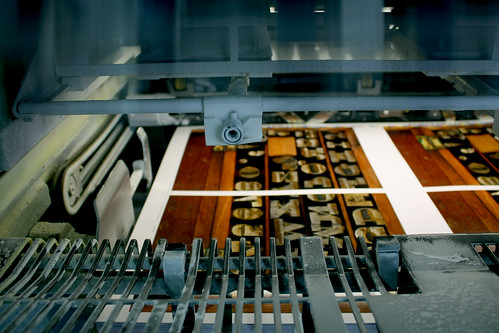
And here’s a glimpse of the inside covers coming off the press (below). Can you see what it is yet?
See ‘Cheap jack flash’, Eric Kindel’s article about fluorescent inks in Eye 60.
Eye, the international review of graphic design, is a quarterly journal you can read like a magazine and collect like a book. It’s available from all good design bookshops and at the online Eye shop, where you can order subscriptions, single issues and classic collections of themed back issues.

