Tuesday, 12:19pm
22 November 2011
Type Tuesday
Promo or primer? Nokia’s pure approach to a type specimen

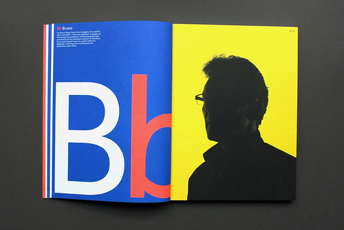
Nokia Pure – the new corporate typeface designed by Bruno Maag (below) for the Finnish mobile phone company – has already had a high-profile, high-publicity launch, with leading designers using it to create objects from posters to Morag Myerscough’s stool (see the case studies with ‘The far side’ in Eye 81).
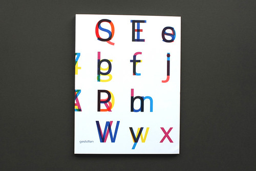
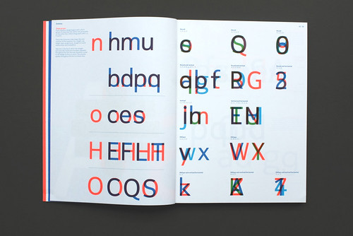
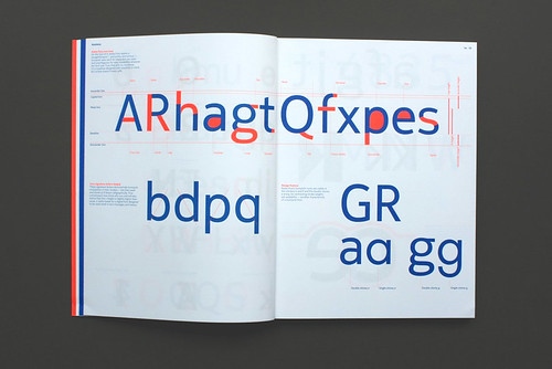
Now, writes Alexander Ecob, there is Twenty-six Characters: An Alphabetical Book about Nokia Pure, documenting the typeface’s genesis and characteristics.
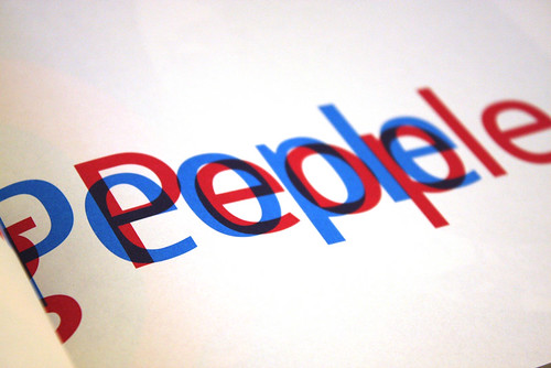
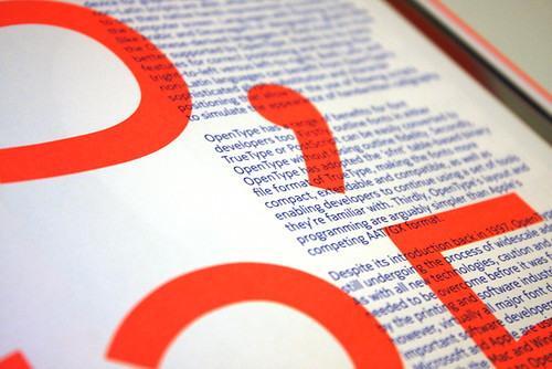
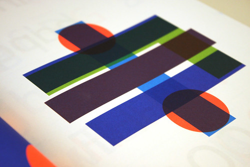
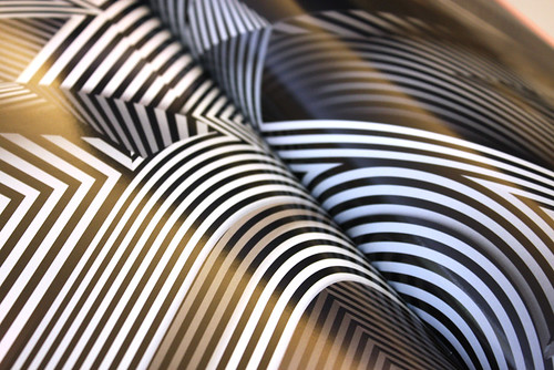
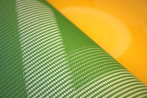
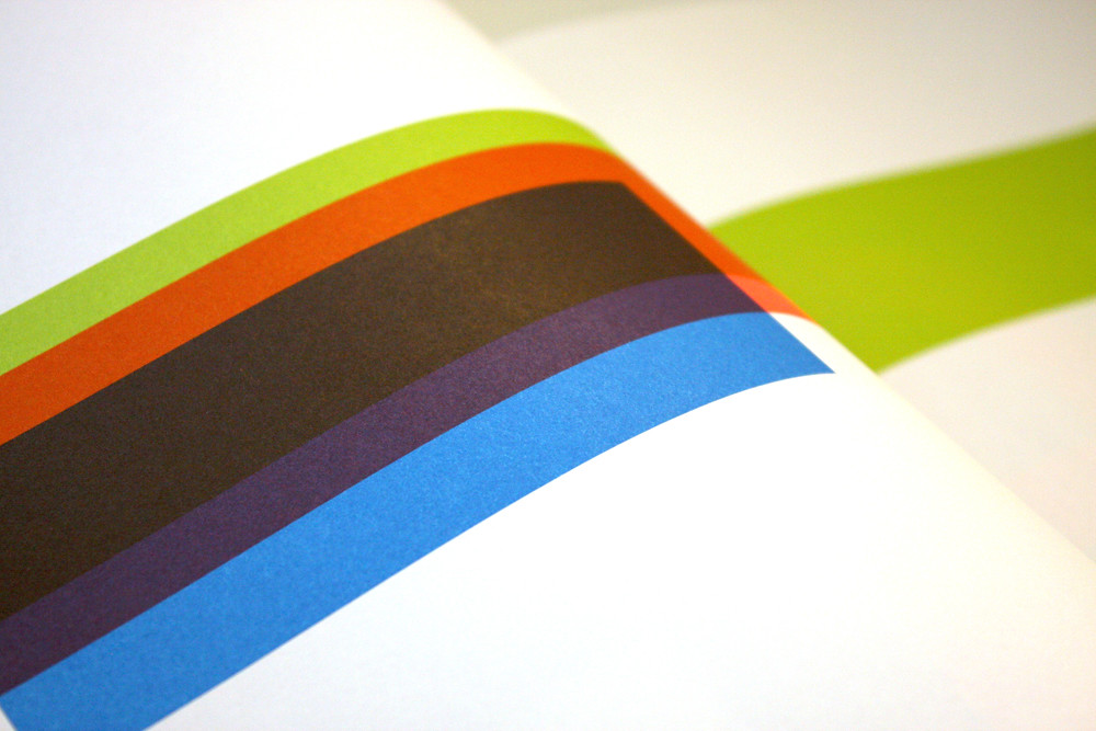
While Nokia may have intended only to create a luxurious promotional item (using high-gloss print, mixed stocks and fluorescent ink), or an extravagant type specimen, it has also made a decent typographic reference book.
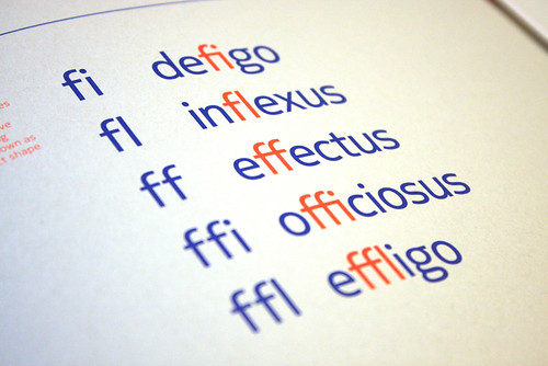
Although all imparted within the framework of Nokia Pure, the details of the font's development, the anatomy of the typeface, attention to kerning pairs and other subjects, while not saying anything more than a hundred other type primers, provide a good overview for type novices. And the care and attention that have been lavished upon the book (designed by Ivan Mato, Lisbet Tonner, Hugh Miller and Bradley Zimber) make it a more inviting prospect to flick through than many others.
Twenty-six Characters: An Alphabetical Book about Nokia Pure, edited by Aapo Bovellan and Chris Merrick, is published by Gestalten (£22.50, $38).
Eye is the world’s most beautiful and collectable graphic design journal, published quarterly for professional designers, students and anyone interested in critical, informed writing about graphic design and visual culture. It is available from all good design bookshops and online at the Eye shop. The new issue, Eye 81 is out now – see Eye Before You Buy for a visual sample.

