Tuesday, 8:07am
10 May 2011
Type Tuesday

Back with a flourish. Christian Schwartz talks swashes – part one

The twentieth century was not a good time for swashes, often described as the ‘curly bits added on to make type look fancy’, writes Christian Schwartz in Eye 62. During the previous four centuries swashes were often
an integral part of refined, elegant typography, but by the 1990s they had become a symbol of bad taste, relegated to the status of floral wallpaper. Perhaps this was because of their ubiquity in the 1970s, or because few of the people who used them with such zeal had the kind of restraint common in the preceding centuries.
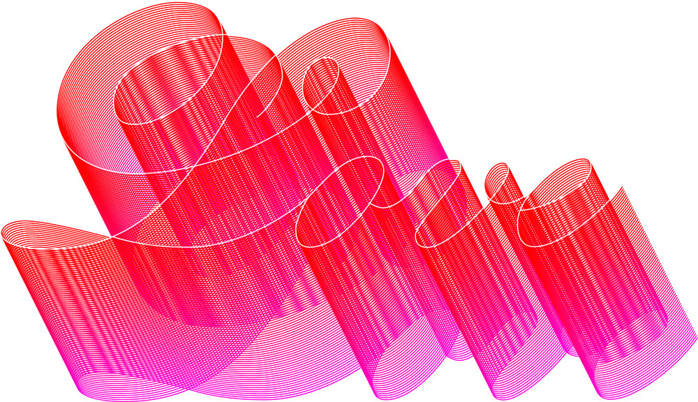
Top: Paul Barnes, unpublished lettering for private valentine, 1998.
Swashes are like salad dressing: great as a condiment, but you wouldn’t want to drink a whole glass. For a type designer, swashes provide an opportunity for the kind of unfettered self-expression that is usually found only in lettering and calligraphy. Well crafted swash characters tease out characteristics that already exist in a typeface and proudly put them on display. When poorly crafted or poorly used, swash characters become a clumsy parody, inadvertently making a mockery of the letters around them.
Above: Sibylle Hagmann, Odile Deco Initials, published by Contour through Village, Houston, 2005.
Recently though, interest in swash characters has been rekindled by a growing acceptance from type designers and graphic designers of the OpenType font format, which provides the ability to include hundreds of alternate characters in a single font. This interest is compounded by a resurgence of taste for ornamentation in general and specifically for 1970s and 80s graphic style, ironic or not.
Above: Marian Bantjes, lettering for The New York Times Magazine, 2005.
Now that the revival of the International Style is done and graphic designers are once again enamoured of ornament for its own sake (see Eye 58), fear of swashes has naturally subsided. This has led to work that references the 1970s (jokingly or not), and more interesting pieces of work, such as Paul Barnes’s lettering for a valentine which updates delicate eighteenth- and nineteenth-century forms with unabashed use of digital effects. Marian Bantjes in Canada and Si Scott in London are also working in this genre, adding swashes to bitmaps and sans serifs. Sibylle Hagmann’s Odile adds a contemporary twist to titling caps from the 1930s and 40s.
Read the remainder of Schwartz’s ‘Back with a flourish’ in Eye 62, Winter 2006. A small number of copies are still available as back issues from the Eye shop.
Type Tuesday is our new weekly column on typography and type design, featuring a mixture of brand new articles and material from the extensive Eye archive. For more Type Tuesday articles, click here.
For more Marian Bantjes see ‘Slow print’ in Eye 77, and our ‘Reputations’ interview in Eye 72.
Eye is the world’s most beautiful and collectable graphic design journal, published quarterly for professional designers, students and anyone interested in critical, informed writing about graphic design and visual culture. It’s available from all good design bookshops and online at the Eye shop, where you can buy subscriptions, back issues and single copies of the latest issue. The latest issue is Eye 79.


