Monday, 3:09pm
13 June 2011
Type Tuesday
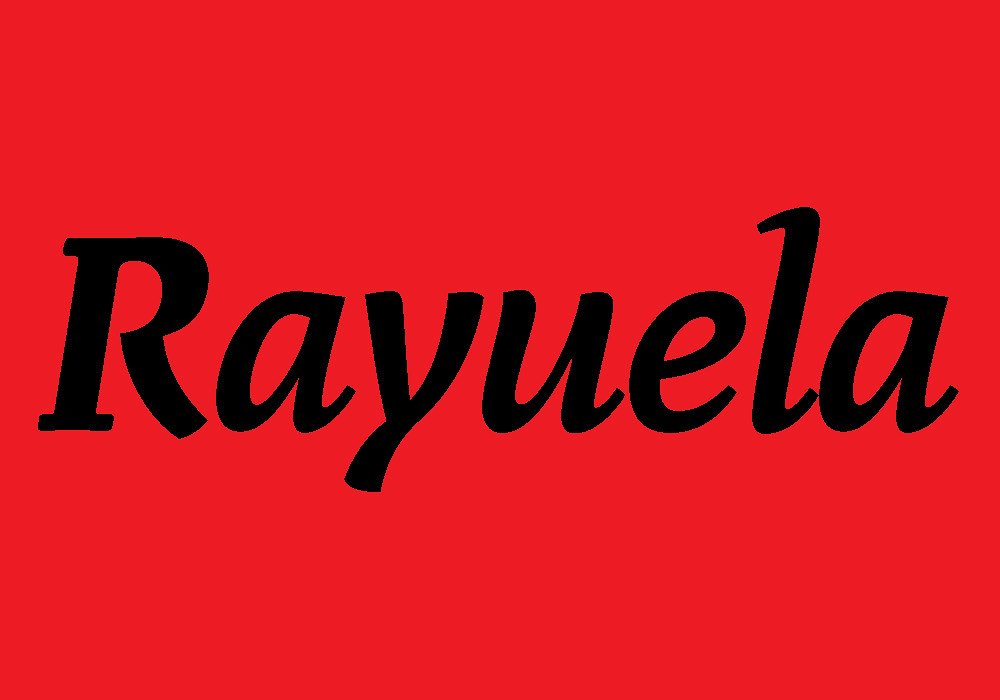
Lust and likeability #2: talking about Rayuela by Alejandro Lo Celso

Rayuela (‘Hopscotch’) is a novel by Argentine writer Julio Cortázar in which the reader is invited to jump back and forth between chapters. The typeface of the same name, developed while Alejandro Lo Celso was completing the type design Master’s course in Reading, is an homage to Cortázar’s playfulness.
Although it is primarily intended for text setting, it is informal and rhythmic. The weights are designated by the Spanish words for white, grey, black and chocolate. Available at pampatype.com.
In this second extract from ‘Lust and likeability’, first published in Eye 67, our informal jury of Jan Middendorp, John Belknap, Petra Černe Oven, Deborah Littlejohn and Mark Thomson express their opinions about this typeface.
Mark Thomson: Here the roman is very cursive, giving text a frisky feel. I don’t know how much of it I’d like to read – I think it works best for texts that don’t require a measure of objectivity in their expression. The Chocolate version still looks light in spirit even though it’s a ‘heavy’, and the Luz version (open capitals) takes the friskiness into an incised environment, another paradox in a type full of life and contradictions.
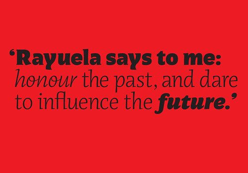
Petra Černe Oven: Designers such as Lo Celso give hope that our world will keep some cultural diversity, although we are all striving to reach the same highest standards no matter which continent we work on. Rayuela says to me: honour the past and dare to influence the future.
Deborah Littlejohn: Rayuela ranked eleventh [Littlejohn asked 95 designers to rank and rate the list of typefaces] overall. I placed it last as in my opinion the other classical serif fonts on the list are formally stronger. The italics of this typeface are too spindly, though Rayuela Chocolate has a lot more muscularity and presence.
Jan Middendorp: The emergence of Latin American type design has been the most surprising, refreshing typographic phenomenon of the decade. Rayuela, although developed in the European context of the Reading University programme, has a flamboyance and ‘swing’ that is rare in Europe. While avoiding the stiffness inherent in many classically inspired text faces, it is easy on the eye and clear – even when set really small.
Type Tuesday is our new weekly column on typography and type design, featuring a mixture of brand new articles and material from the extensive Eye archive. For more Type Tuesday articles, click here.
Part 1, Odile, was published last Tuesday.
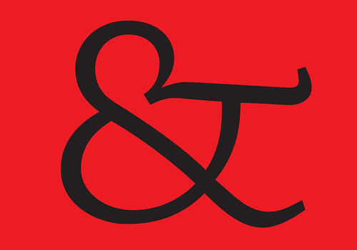
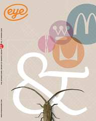
Lust and likeability was originally published in Eye 67, Spring 2008. The cover (below) features a Rayuela ampersand.
Eye is the world’s most beautiful and collectable graphic design journal, published quarterly for professional designers, students and anyone interested in critical, informed writing about graphic design and visual culture. It’s available from all good design bookshops and online at the Eye shop, where you can buy subscriptions, back issues and single copies of the latest issue. The latest issue is Eye 79, a type special.

