Sunday, 11:00am
24 May 2009
TypoBerlin Day Two
Another Jan Middendorp Eye report – Ale, Angel, Adam, John and Chip

TypoBerlin Day Two
As TypoBerlin 2009 is getting ready for its third and last day, your correspondent reviews day two and marvels at the sheer diversity of what was has been on offer so far. Friday was a day of extremes, writes Jan Middendorp.
While speakers from exotic places such as Buenos Aires and Iowa City encouraged audiences to drool over the tiniest and sexiest
details of letterforms (more about them later), German designers got together to take a look at the big picture: the position of their craft, and how collectively to improve it.
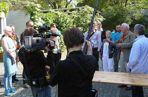
The graphic design scene here is having a hard time organising itself; the question whether and how this should be addressed was discussed in a long and surprisingly passionate sequence of interventions, from a series of 6:40-minute-long Pecha Kucha pitches to a spontaneous group discussion in the conference centre’s small garden. Being unable to organise oneself is unforgivable in Germany; so people tend to blame others for it, rather than asking themselves what they can contribute.
Part of the problem is that several associations with subtly different views compete for the attention of potential members as well as government bodies, which turns the decision to join or support any of them into a matter of party politics. It would be a big surprise if a solution were found anytime soon. But it was a good thing that contrasting views were exchanged (below) in what seemed an atmosphere of (somewhat tense) amiability.
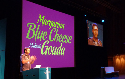
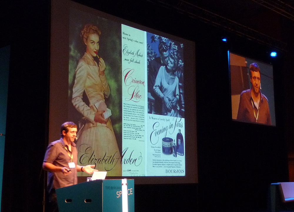
Meanwhile in the main hall problems of more universal importance were tackled – like ligatures. Alejandro (aka Ale) Paul (above and top) is a type designer from Buenos Aires who, as initiator of the Sudtipos type foundry, has helped put Argentina firmly on the typographic map. He was a packaging designer until the 2002 crisis made him redundant. Having realized that making type could put him in touch with an international market and bring him independence from his country’s fluctuating economy, he quickly made a name for himself as a maker of incredibly intricate script typefaces. He works from historical sources or collaborates with others, notably 70-year-old Angel Koziupa, a brilliant lettering artist whom everybody had forgotten. Paul is a popular speaker in the Americas and his lecture in Berlin clearly showed why: despite his perfectionism and technical approach, Paul has a talent for understatement and a mischievous sense of humour. Few people can turn on an audience by pointing at an ‘n’ in a 1950s ad and whisper “It’s orgaaastic!”.
Iowa type designer John Downer, too, is a master at turning hand-made letterforms into digital fonts. His background is in signpainting, and as this year’s conference theme was ‘Space’, his lecture examined ways in which signpainters simulate the third dimension. Downer had brought a fine collection of samples photographed across the globe, from the sophisticated to the clueless, showing effectively how *not* to go about a lettering job. His approach to audience manipulation was less subtle than Paul’s: he even encouraged them to rhythmically chant ‘Keep the edge sharp!’
Polish type specialist Adam Twardoch – somewhat of a technological guru in the type world – demonstrated that even when tackling a purely technological theme such as ‘the parameters of digital type design’ a degree of showmanship doesn’t hurt. By using witty Star Trek visuals (that ‘Space’ theme again) and keeping the pace up he added just the right degree of infotainment to keep his audience interested.
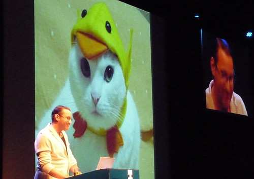
TypoBerlin’s audience is young and eager to meet design heroes, and one such hero is New York book cover designer (and novelist) Chip Kidd (above). It was Kidd’s third time at TypoBerlin, and those who can’t get enough of his theatrical act were not disappointed. Kidd is a born performer and the persona he puts on when on stage – an overacting, cynical New York queer, quite possibly an enlargement of his everyday self – is the perfect vehicle for telling the tales of success and rejection that are inherent to his job. His presentation was as hilarious as usual but then again – he’d done it here before. Will the next design star please rise?
Jan Middendorp on TypoBerlin Day One and TypoBerlin Day Three
TypoBerlin video blog.
TypoBerlin 2009 on Flickr.
Eye is the world’s most beautiful and collectable graphic design journal, published quarterly for professional designers, students and anyone interested in critical, informed writing about graphic design and visual culture. It is available from all good design bookshops and online at the Eye shop, where you can buy subscriptions and single issues.

