Wednesday, 12:36pm
2 September 2009
We can be heroes

Pentagram’s monster rock rebrand takes Guitar Hero up to eleven

Eye editor John L. Walters talks to Pentagram’s Michael Bierut about the new ‘brand architecture’ for Guitar Hero and its forthcoming spin-off games.
It’s tempting to describe Guitar Hero as the Spinal Tap of computer games. Except that in five years the product has achieved a level of sales and market penetration exceeding wildest dreams of that hapless (fictional) band, and most of their real-life counterparts.
Last year, Guitar Hero’s parent company Activision reported sales of more than 25 million units worldwide, making it the top US video game publisher.
Of course it’s a truth universally acknowledged that a single brand in possession of fortune (approaching $3bn, apparently) must be in want of an extensive redesign from a smart NYC agency. Activision is cooking up two new games variations – Band Hero and DJ Hero – the better to punish our plastic this Christmas. So it needed a look and feel that acknowledges Guitar Hero’s heavy metal roots, while giving the upstart titles the chance to hook the pop wannabees, indie kids and hip-hop turntablists with artwork that doesn’t look like it was first stencilled on Lemmy’s denim jacket.
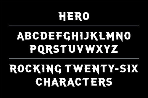
So Activision called in the design world’s very own Don Draper, Pentagram’s (and DO’s) urbane and articulate Michael Bierut (see Reputations, Eye 24). Eye magazine contacted Bierut by phone and email to get the lowdown on the project (see the report on Pentagram.com), completed in the first half of this year and launched yesterday, which includes headbanging artwork by Rick Valicenti (Thirstype) plus variations from Adam Larson (Adam and Company) and Brighton-based Steven Wilson. In addition to Bierut, the Pentagram project team included designer Joe Marianek and Kai Salmela, who designed the custom display typeface, Hero Bold (below).
John L. Walters Is this your first foray into games branding?
Michael Bierut My experience with games branding up until now has been only fleeting. Brad Jakeman, Activision’s Chief Creative Officer, is a veteran of Citi and Macy’s. I think he felt, on some level, that Activision was facing a classic brand architecture problem that transcended genre considerations.
JLW Are you a computer games player (or are your kids?), or did you come to it cold?
MB My tastes in computer games has always run more to Tetris, although I tend to be bad at games that require fancy fingerwork. My kids, however are real Guitar Hero fans, like all of their friends, and everyone else their age.
JLW And are you a heavy metal follower?
MB I graduated high school in 1980, so the soundtrack for my teenage years was Aerosmith, Journey, Rush and Black Sabbath. I can’t say I am a die-hard fan, but I get very nostalgic when, say, ‘Sweet Emotion’ comes on the radio.
JLW Regarding the visual treatments of the various logos, how did you go about finding / choosing the different people: Rick Valicenti, Adam Larson, Steven Wilson, etc., and what did they bring to the party? Are there more variations to see, or is that it for the moment?
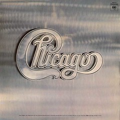
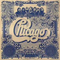
MB I had a lot of trouble reconciling the requirements of a classic coordinated brand architecture model with the anarchic values of rock and roll. Then we had the idea of looking back to classic record packaging, and how certain bands managed to maintain a characteristic look over a series of albums. Yes had Roger Dean, Little Feat had Neon Park, Parliament / Funkadelic had Pedro Bell. They had variety and consistency at the same time. Probably the best model, although they aren’t cool at all, were the 1970s horn band Chicago. They had a cursive logo by Nick Fasciano that received a different treatment (below) on every album through the art direction of John Berg. That same tactic is more familiar to people as the ‘Absolut Vodka’ approach: take an iconic shape and style it differently depending on the situation. Once we adjusted the logos, we needed to prove that they could be given different flavours through art direction. The people at Activision did their own explorations with the same artwork as we were doing ours.
JLW There’s something quite funny and silly about the Guitar Hero brand, with its nod to the fictional mishaps of Spinal Tap and their non-fictional contemporaries (though without a heavy-metal umlaut) . . . yet it’s also a multi-million dollar brand that seems to be outselling conventional music businesses . . . what do you think this says about the state of rock’n’roll?
MB There’s a theory that there has been an evolution to the way we experience music, from playing instruments in the family parlour to listening on the radio to buying records to downloading MP3s to playing Guitar Hero. In effect, we’ve come full circle and now we’re playing instruments in the family parlour again.
JLW Hero Bold - is this upper case only? Any umlauts?
MB Hero Bold was designed as a bit of a goof, and we were surprised when the client embraced it so quickly. All caps, no umlauts as of yet.
JLW Is this the end of your involvement with the brand, or is it an ongoing project?
MB Our assignment in this case was limited to working out the high-level brand architecture issues and staging the basic logos. I’m not sure I have the stamina to execute on the schedule demanded by the video game industry. To tell you the truth I’m excited to see what the kids do with the stuff.
JLW Finally . . . have you ever seen a Pentagram logotype tattooed on someone’s skin (and was this potential usage actually discussed at the client meetings)?
MB I’ve worked on only a few brands that enjoyed this level of engagement with the public. Two examples would be Harley-Davidson, where I’ve seen lots of tattoos but where we didn’t design the logo, and the New York Jets, where we designed a lot of brand insignia but I never saw it deployed beyond body painting.
I will say I’ve never seen anybody with a Citibank or Saks Fifth Avenue tattoo.
Captions from top
DJ Hero interpreted by Steven Wilson. Bierut calls this ‘a Boogie Nights special, which uses the geometry of the letterforms as the circuit board for a neon extravaganza’.
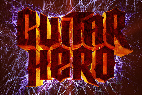
Guitar Hero by Rick Valicenti, ‘who took the new Guitar Hero logo, threw it into blast furnace, set it on fire, and then electrocuted it.’
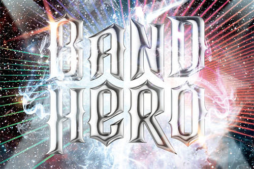
Band Hero by Adam Larson – the ‘pop orgy’ model, ‘with ultra-shiny chrome coating, laser light halo, fog machine and glitter highlights’.
Hero Bold, the new proprietary font designed by Kai Salmela.
Two Chicago covers by Nicholas Fasciano. Brushed aluminium; Steel engraving on bank note paper.
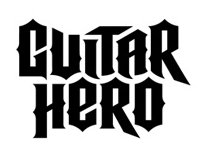
Below: original Guitar Hero logos, followed by Pentagram’s new version.
FEATURE ENDS
Enter the Music Design Awards, deadline 31 October 2009.
Eye is available from all good design bookshops and online at the Eye shop, http://bit.ly/Eyeshop. For a taste of the magazine, try Eye before you buy, http://bit.ly/ebyb.

