Friday, 10:03am
28 May 2010
What’s (first) on your iPad?
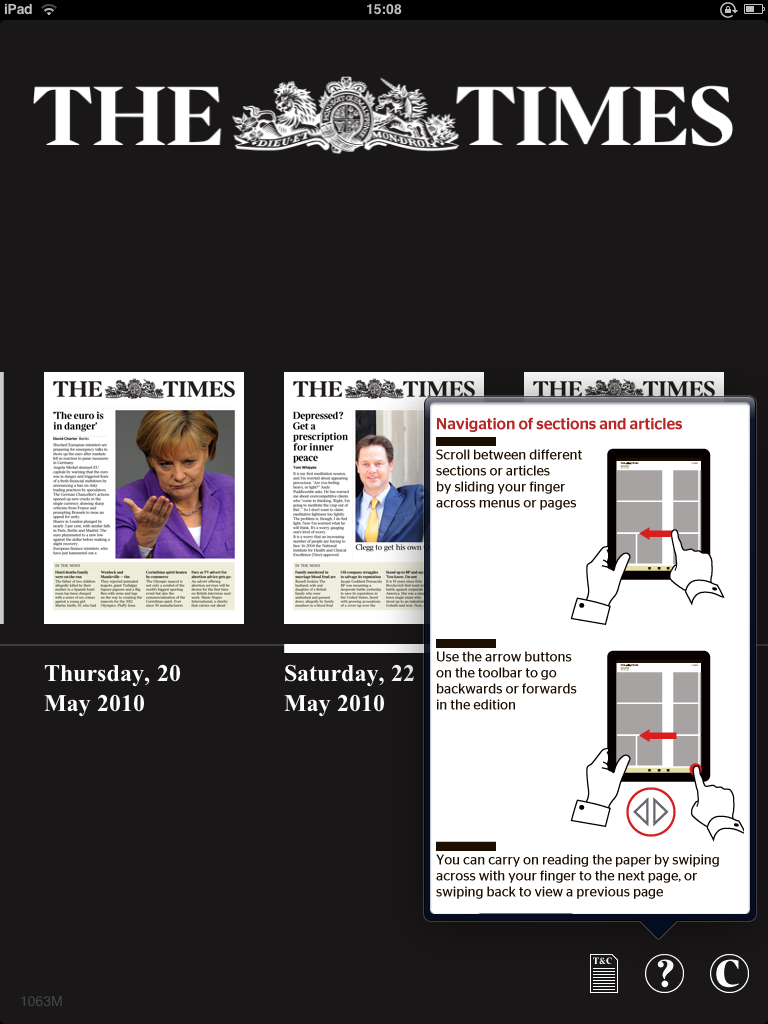
On the day of the iPad’s UK release, The Times unveils its app edition

The Times launched its iPad application today to coincide with the UK launch of the device itself, writes Simon Esterson. The first edition went live at around 6.30am this morning.
I don’t have my iPad yet so I’m working from a video on The Times’ new site (registration required, see ‘Thunderer comes out fighting’) and some screen grabs provided by the paper.
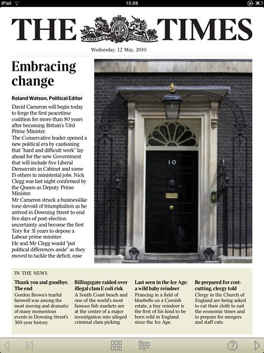
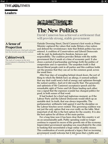
Not surprisingly it looks like the newspaper, only smaller, and the logic of the printed paper, the iPad app and the new website all retaining the essential DNA of newspaper design becomes clear. When you are one of the world’s best-known newspaper brands you want to harness that authority of The Times masthead and the memory of a broadsheet page whatever platform you’re actually using.
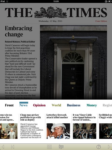
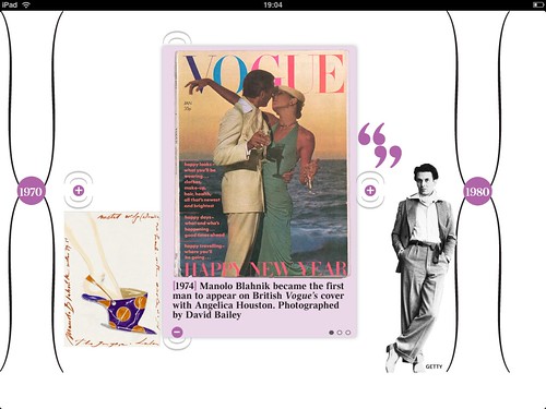
The apps navigation is elegant and clear (see above). The design team have resisted the over-complicated tricks of lots of the early iPad magazine apps and instead concentrated on delivering real content. Most viewing is in portrait format, with occasional horizontal uses of the iPad for photography and specials like this interactive timeline of Manolo Blanik’s career (below, designed by Alex Breuer with Applied Works). What’s amazing about this app is that it’s apparently the full edition of the paper.
App design by Jon Hill (and I’m told a warehouse full of developers).
Eye 75 is a typography special issue, featuring illustrative type and lettering, calligraphy, type on the Web, a profile of Anthony Burrill and Mark Thomson’s Reputations interview with Peter Biľak. You can read a selection of pages on Eye Before You Buy on Issuu. Student subscriptions are half price, bit.ly/EyeStudentOffer.
Eye magazine is available from all good design bookshops and at the online Eye shop, where you can order subscriptions, single issues and back issues.

