Wednesday, 6:39pm
13 January 2010
Where eagles dare

Büro Uebele rethinks the German Federal symbol for the Bundestag

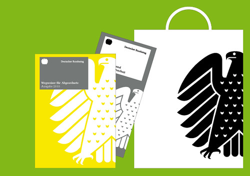
If it ain’t broke, don’t fix it, writes John Ridpath. When Stuttgart–based studio Büro Uebele took part in a competition to design a unified visual identity for the German Bundestag (top), they decided to stick with the familiar: ‘The Bundestag does not need a new logo,’ they explained. ‘It already has a familiar, long-established symbol’.
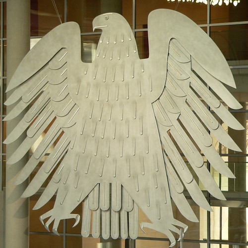
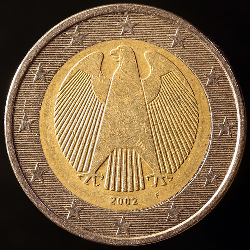
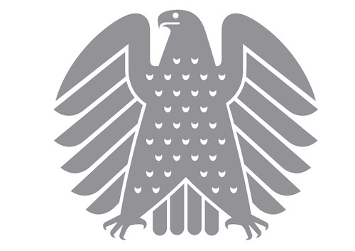
That symbol is the Bundestag Eagle (above), created by Ludwig Gies in 1953 and first displayed in the parliament buildings in Bonn. Gies’s sculpture is a somewhat chubby take on the Federal Eagle , and has become known unofficially as the ‘Fette Henne’ (‘fat hen’). Yet the symbol maintains a air of portly gravitas: it is one of the country’s most famous art works, and when Germany’s parliament was relocated to Berlin in 1999, the eagle went with it. Heinz and Sneschana Russewa-Hoyer’s design for the German 1 and 2 Euro coins features a similar representation (below).
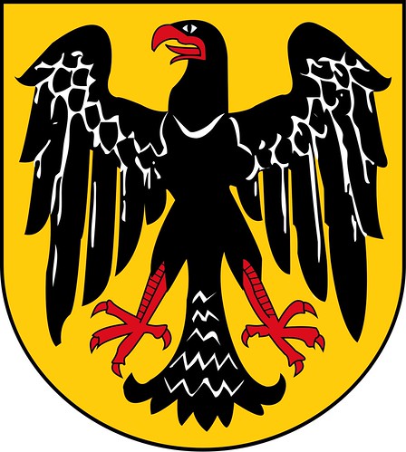
Germany’s eagle derives from the imperial imagery of the Romans. The symbol has regularly appeared in national heraldry since the fifteenth century, often in double-headed form. In 1919 the Weimar Republic adopted a pictorial single-headed eagle, mounted on a golden shield (above).
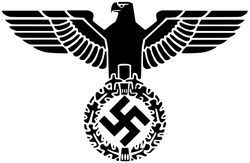
The Nazi party adapted this symbol, placing a more stylised and angular eagle atop a wreathed Swastika.* When the eagle’s head was turned to its left shoulder, it symbolised the Nazi party (this version was known as the Parteiadler); when the head was turned to its right, it represented the country (known as the Reichsadler, below).
In 1950, the Federal Republic of Germany reintroduced the symbol along Weimar principles, but known as the ‘federal eagle’. Artistic modifications were allowed, and today the symbol exists in many different forms.
The fat hen, compared with some of Germany’s eagles, has a geniality that Büro Uebele have sought to accentuate: ‘tightening the curve of the tip of the beak gives the design a friendly appearance’ (above). The design has also been simplified so it can work on a smaller scale: its feathers have been reduced to single row, and the spacing lines have been thickened.
Fortunately, this new symbol has managed to maintain the gravitas of Gies’s sculpture. And we can be thankful that the Bundestag didn't go the way of the Mexican postal service, who recently replaced their blue eagle with a pink and green pigeon (below).
Below: Büro Uebele’s design for the new Bundestag stationery.
Büro Uebele, uebele.com.
Bundestag, bundestag.de.
*See Roger Sabin’s review of Signs of Hate in Eye 54.
Eye, the international review of graphic design, is a quarterly journal you can read like a magazine and collect like a book. It’s available from all good design bookshops and at the online Eye shop, where you can order subscriptions, single issues and (new!) classic collections of themed back issues. Eye 74 is a Berlin special.

