Spring 2011
Beyond Blackletter

The lettering on the covers of Germany’s most popular film magazine expressed plot and tone with exuberant, readable forms.

The word ‘typecasting’ has multiple entendres, and the lettering and type used to introduce late 30s German movies on the covers of Illustrierter Film-Kurier fit nicely into this context, as they were designed to suggest the plot and tone of a cast of films that ranged from First World War adventure to farce and romantic comedy.
In the late 1930s and early 40s, this leaflet-sized magazine, published by Verlag Alfred Wiener since 1919, tapped into the escapist needs of a populace being thrown into total war. The editorial format was rooted in stunning film-still imagery with a limited amount of text, printed in velvety rotogravure, satisfying the need for a souvenir / programme about the major movies.
Millions of copies of the most popular issues were sold and distributed at cinemas.
In 1933, the start of the Nazi era, Weiner, a Jew, left Berlin for California, but the little weekly continued to be one of Germany’s most influential film fan magazines. Film-Kurier’s graphic style, adorned with hand-lettered serifs, sans and fashionable scripts that ran the stylistic gamut from classical to novelty, was as much of a draw as its content. By the late 1930s Film-Kurier’s designers were making ample use of photomontage and airbrush in a manner reminiscent of John Heartfield (by then in political exile) but without sharing his leftist politics. The magazine’s art department was comprised of journeymen letterers – and retouchers, as gravure reproduction showed the minutest of details.
Although the masthead was characteristically typeset in ‘official’ blackletter, this typeface was otherwise used sparingly and only in concert with ‘volkish’ themes, such as for the prosaic Drei Väter um Anna (1939). The die was cast for more exuberant and readable type forms.
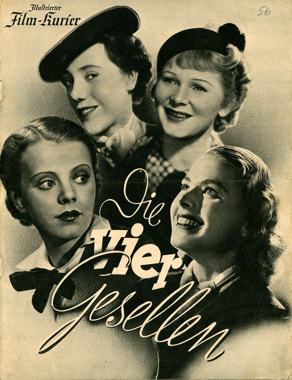
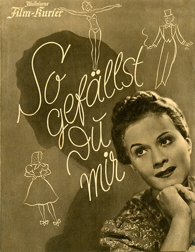
So the type for Die Vier Gesellen (1938), a romantic comedy about four art college graduates (one of them played by the young Ingrid Bergman) trying to set up an ad agency while waiting to land husbands, is vivacious and typical of the period’s advertising typography. So Gefällst Du Mir (1941), a farcical romance about a city girl who moves to the East Tyrol countryside, is branded with the informal script that was common in 1930s Germany. Der Lachdoktor (1937), a comedy about a quack doctor who hawks a ‘miracle drug’ consisting of water and very little else, is introduced by comic lettering suggestive of a carnival. Whereas Hotel Sacher (1939), set in one of the most famous hotels in Vienna (the home of the Sachertorte), is given a more sophisticated yet joyful type.
The gothic lettering used for Achtung! Feind Hört Mit! (1940), an espionage caper, is as much of a stop as the use of a cautionary term given global currency by the Third Reich. And the slab serif face for Aufruhr in Damaskus (1939) had to be bold indeed to suggest the struggle of a German officer who, after losing a battle with T. E. Lawrence (of Arabia), evades his enemy and leads the survivors to safety – all in one typeface. Wunderbar!
Despite the imposition of Nazi styles in design throughout the German publishing world, Film-Kurier managed to retain much of its alluring escapist aura through well matched type and image. This, of course, is the job of the movies and the periodicals that celebrate them.
First published in Eye no. 79 vol. 20.


