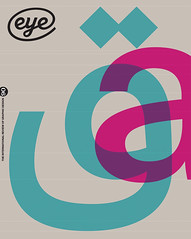
Summer 2015
Four seasons
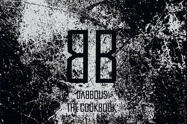
Micha Weidmann’s art direction for a cookbook by London chef Ollie Dabbous, with photographs by Joakim Blockstrom

Micha Weidmann’s design for Dabbous: The Cookbook accentuates the contrast between the delicacy of the dishes created by chef Ollie Dabbous and the rugged look of the restaurant that bears his name in London’s Fitzrovia neighbourhood (between Bloomsbury and Marylebone). Dabbous says that the restaurant embodies ‘a raw aesthetic, an upbeat environment and organic, uncomplicated cooking’. On the page, this translates into elegantly photographed dishes set against subtle, sweeping grey shadows, from which the understated typography emerges, set in a flexible grid.
Both the book and the restaurant (Dabbous’s vision was realised by architects at Brinkworth design consultancy) took inspiration from the restaurant’s location. The book is divided into seasons by die-cut French-fold sections, four for each season, with photography that highlights the textures of the restaurant’s site on Whitfield Street.
While it is a large ‘statement book’, Dabbous: The Cookbook avoids the clichéd practice of plastering the cover and inside pages with images of the chef at work. There is just one black-and-white photograph of Dabbous, seen from behind as he leaves the restaurant by the back door. The food speaks for the chef.
The most striking feature of this seasonal cookbook is Weidmann’s decisive and consistent use of shadows. Each spread has a slightly different background tone, with the highlight falling at a different point. As the days lengthen and more light floods into the restaurant, the shadows lessen, the mood lightens and the colours of the seasonal ingredients intensify.
Joakim Blockstrom’s photography allows the ingredients in each dish to take centre stage. None of the food has been faked. Photography for one dish was postponed for almost a year until the sea grass Dabbous used was in season again. Such extreme attention to detail, together with his unwavering vision, are what draw patrons to Dabbous’s restaurant …and make this book of his recipes such a pleasure to look at.
Sarah Snaith design writer, editor, London
---
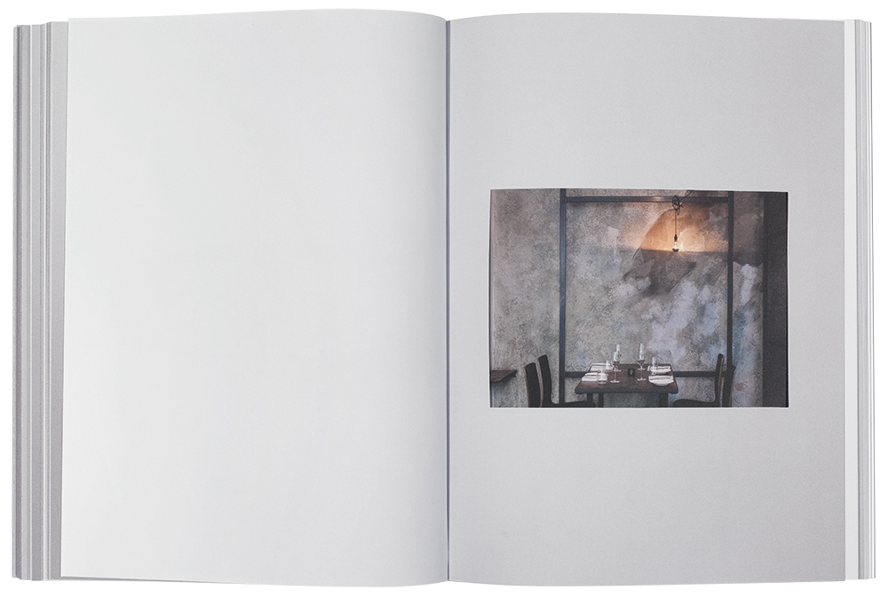 Section opener from Dabbous: The Cookbook with die-cut French-fold page on the right: Joakim Blockstrom’s photographs of the restaurant interior and the surrounding area are printed inside the fold and seen through the die-cut hole in the paper. The cut-out frames are intended to cast shadows on the photographs, in keeping with the book’s emphasis on natural light. Weidmann says: ‘The French-fold sections divide the seasons and help navigation in a physical way. Each page takes the same format, either portrait or landscape, but the fold makes the crop. It is like an artist’s frame, or passe-partout in French.’ There are twenty French-fold pages in all, four at the beginning of each season and four more in the ‘Essentials’ section at the back of the book. Top: Cover detail.
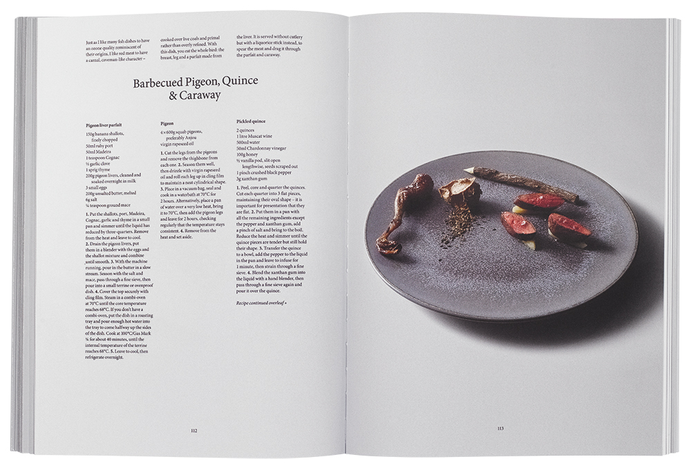 Spread showing an autumn recipe from Dabbous: The Cookbook. In response to the wide variety of recipes, some of them very complex, Weidmann designed a flexible layout that worked in one, two or three columns, depending on the length of the text for the recipe.
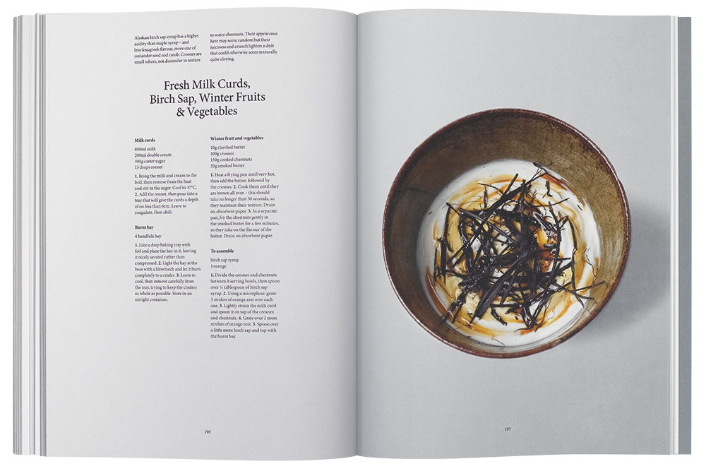 Spread showing the layout’s flexibility. A shorter recipe for fresh milk curds is set in just two columns. Weidmann says: ‘We went with this layout in the end because it did not try to be something on top of all the other things that were already there. The design of the dishes was allowed to come out.’ This winter dessert recipe includes Alaskan birch sap syrup and is topped with burnt hay.
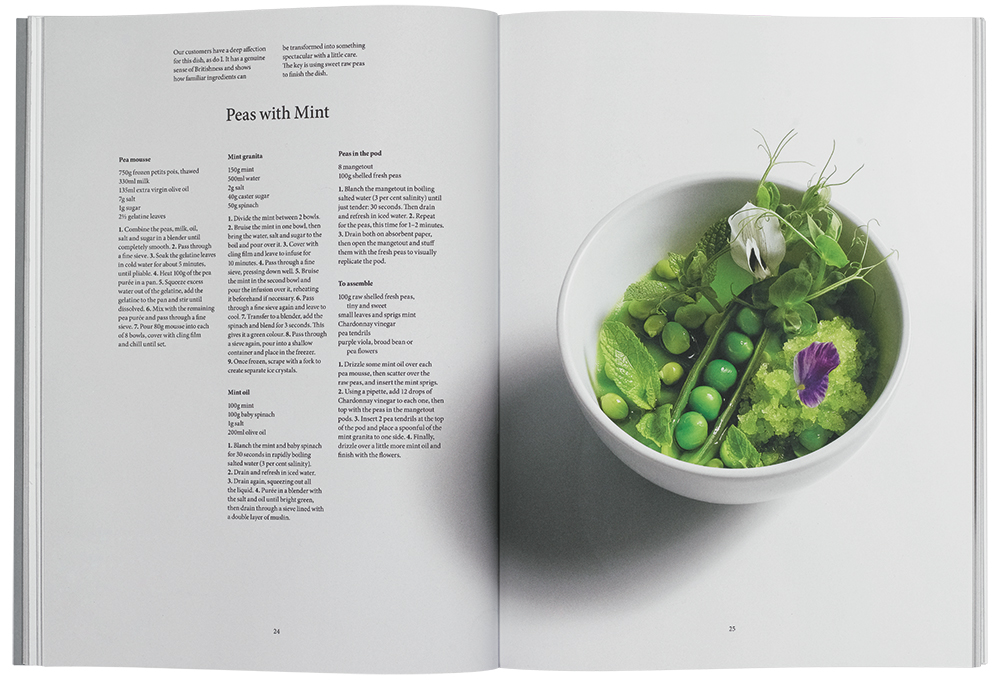 Spread showing spring recipe for peas with mint. All the dishes were photographed by Blockstrom in the Dabbous restaurant kitchen using natural light. The backdrop for each spread is a full bleed image of the dish photographed against a work surface, which reflects the season’s shadow and light. ‘The dishes were better suited to grey than white. Instead of introducing an artificial grey background, we decided to take advantage of the soft, relaxed shadows and shoot everything in daylight with no flash. Each spread uses a picture of a shadow, so that the shadows shift from page to page – the autumn is quite clear.
---
‘The core of the cookbook is the photography. Ollie [Dabbous]’s dishes are immaculately styled; they are arranged in a very graphic and particular way that the design of the book emulates. Early on, we decided that the photography was always going to be on the right-hand page and that it was going to be the dish and nothing else, shot from the best angle, often from above. The three of us [Dabbous, Weidmann and Blockstrom] sat together and sorted out the layout, so that we had the design done before we did the photography, in a way. The approach was that Joakim would shoot every dish the same way, so that you could see how each dish changes, how the seasons change, how the design and the colours are transformed.
‘The typography became very important. The layout had to have flexibility to allow for recipes of varying lengths – sometimes there were three columns, or two, or even just one. I think there’s a good balance between interesting book typography and not making it stand out too much or look “full of itself”.
‘There is a heritage of centred typography: historically a lot of luxury brands have used it. Although this is left-ranged text, the layout is centred – and that gives it a certain elegance and a counterbalance to the very centre-arranged photograph on the opposite page. It is almost as if the typography is the shadow of the dish, or the reflection of the dish.
‘Finally, the cover was designed to look like a piece of the Dabbous restaurant, like a slab cut from one of its walls. What I like about it is that it also sort of has the appearance of an overused pan that has been on the fire for too long!
‘The cookbook reflects the atmosphere [of the restaurant], the experience and the way the dishes are designed, as well as somehow showing how they taste.’
Micha Weidmann, talking to Sarah Snaith.
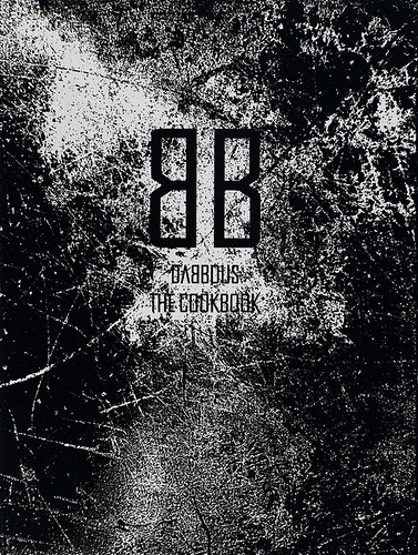
Dabbous: The Cookbook, (Bloomsbury). The black-and-silver cover is the product of a year of rigorous testing, initially with a printer in China and later in Italy. Two overlaid images were printed on matte-varnished reflective silver board with a textured grainy ink to create the scuffed effect. The Dabbous logo and title were screenprinted in black over the top for improved readability. The title is set in Agency FB Regular, the basis of the restaurant’s logo, designed by Brinkworth. The remainder of the book is set in Robert Slimbach’s typeface Minion. Design: Micha Weidmann Studio. Photography: Joakim Blockstrom.
First published in Eye no. 90 vol. 23, 2015
Eye is the world’s most beautiful and collectable graphic design journal, published quarterly for professional designers, students and anyone interested in critical, informed writing about graphic design and visual culture. It is available from all good design bookshops and online at the Eye shop, where you can buy subscriptions, back issues and single copies of the latest issue. You can see what Eye 90 looks like at Eye before You Buy on Vimeo.

