Summer 2024
Harmony and counterpoint

The ideas and assumptions behind ‘global’ or ‘multi-script type’ raise complex and nuanced issues that have taxed both type designers and graphic designers for years. Current technology and the demands of communication and ‘branding’ have thrown up debates about the creation of readable documents, signs, packages and websites in which two or more different scripts are obliged to coexist. In this article, designers from different corners of the globe discuss some of the concerns and contradictions that inform the making and setting of multiple scripts with Ferdinand P. Ulrich
[EXTRACT]

In recent years, the topic of ‘multi-script type’ has preoccupied both type designers and graphic designers. Though designing typefaces for two or more writing systems and designing documents that use multiple scripts are separate disciplines, decisions in each are informed by the other.
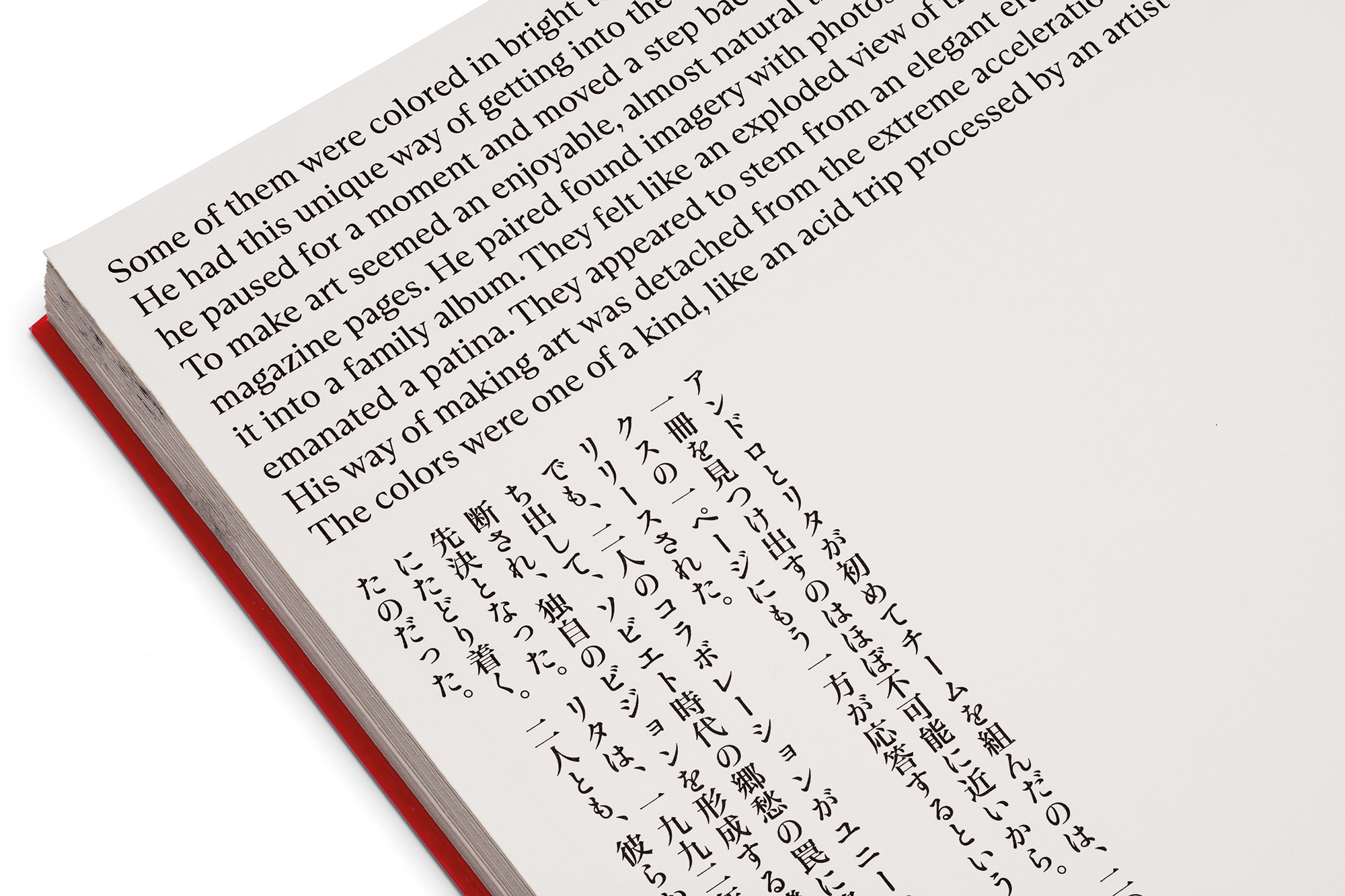
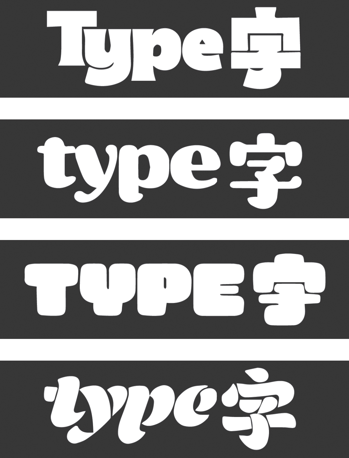
These issues were brought into focus for me through discussions with Toshiya Izumo about the selection of typefaces for Tsunagu Mono Gatari / Verbindungsstücke, the bilingual publication we designed together (see Eye 105). We used TienMin Liao’s Ribaasu for the cover titles, but the selection of text faces posed a different challenge: we wished to preserve reading habits and avoid forcing the typographic conventions of one script on another.
Ferdinand P. Ulrich typographer, type historian, lecturer, Berlin
Photographs by Norman Posselt
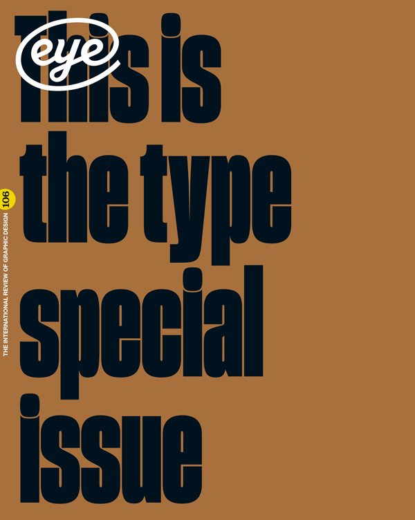
Read the full version in Eye no. 106 vol. 27, 2024

Eye is the world’s most beautiful and collectable graphic design journal, published for professional designers, students and anyone interested in critical, informed writing about graphic design and visual culture. It is available from all good design bookshops and online at the Eye shop, where you can buy subscriptions and single issues.

