Spring 2010
They work with words: 1

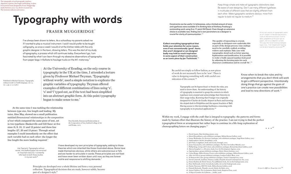
Fraser Muggeridge has devised a typographic spread exclusively for Eye.
Fraser Muggeridge studied typography at the University of Reading (where he is now a visiting tutor), then went to work with Sara Chapman at ‘the letter g’ in 1998 before leaving to set up his own studio in 2001. Muggeridge and his colleagues, Sarah Newitt and Stephen Barrett, share a pared-down aesthetic, in which colour, paper stock and format play as important a role as typography. The result is an elegant portfolio grounded in fine art, from artists’ books and gallery catalogues to posters, invitations, experimental novels, websites, record covers and the odd film title. The studio’s clients include Tate Publishing, Whitechapel Gallery, De La Warr Pavilion and Art on the Underground.
‘One of my early aims was to find clients that understood what I was trying to do,’ says Muggeridge. ‘That was actually quite hard – because our work is almost “boring”. Some people really don’t get it, and say to us “Can’t you design it a bit more?”’
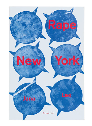
Semina No.4, 2009. The fourth title in Book Works’ ongoing Semina series, inspired by Wallace Berman's hand-bound Semina magazine from the 1950s and 60s (See Eye 39)
Top: The typography of each paragraph: typeface, alignment, typesize, line length and leading, is taken from printed items designed by Fraser Muggeridge studio between 2003-09, shown at actual size. The footnotes indicate each source.
The ethos of the studio, he says, has always been ‘to prioritise artists’ and writers’ content over the imposition of a signature style’.
Muggeridge co-curated ‘The Form of the Book’ conference at St Bride Library, London, in 2009 (and with Sara De Bondt designed and edited the accompanying The Form of the Book Book). He is also a member of the 2010 d&ad graphic design jury. An exhibition ‘Designed by Fraser Muggeridge studio’ takes place during March and April at KALIED editions (an artists’ book project space in London). Muggeridge’s new Typography Summer School, which aims to introduce graphic design graduates to ‘live typographic projects’, complete with ‘actual briefs, real clients and real budgets’, will be held in London this July (typographysummerschool.org).
First published in Eye no. 75 vol. 19.
Eye is the world’s most beautiful and collectable graphic design journal, published quarterly for professional designers, students and anyone interested in critical, informed writing about graphic design and visual culture. It is available from all good design bookshops and online at the Eye shop, where you can buy subscriptions, back issues and single copies of the latest issue.


