Spring 2018
Town shaped the Sixties
At a time of social and economic change, Tom Wolsey’s Town magazine, with its audacious use of type, photography and illustration, was in the vanguard of the upheaval. By Anne Braybon

The reputation of Tom Wolsey (1924-2013) as the boldest and most innovative editorial art director of his generation is tightly enmeshed with Town magazine. In the three years between 1960 and 1963 Wolsey developed an audacious design that underpinned an editorial policy pitched at a new generation of young metropolitan men.
Michael Heseltine, one of Town’s young publishers and a future politician, summed it up saying: ‘We were rash enough to believe there was a new world out there … the dawn of the Swinging Sixties.’
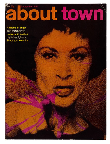
Cover of About Town, September 1961. Photograph: Terence Donovan. Art director: Tom Wolsey. This portrait of Chita Rivera, who played Anita in West Side Story, flags the ‘Anatomy of Anger’ theme.
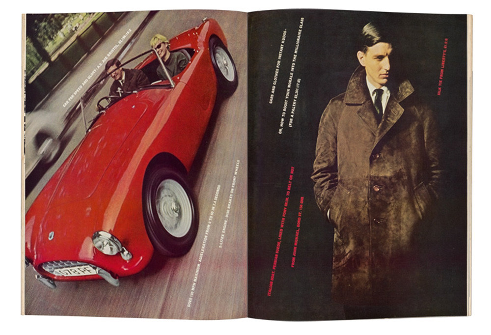
Top. Town, September 1960. Wolsey’s dynamic lines of angled type bring energy and a sense of aspiration to this feature. The static studio shot (by Terence Donovan) of a casually dressed man contrasts with a picture of a speeding car.
Wolsey’s status is contextualised by William Owen (author of Modern Magazine Design), who describes Town, together with the German Twen and French Elle, as one of the three outstanding midcentury European magazines. Yet, in comparison to his peers, little is known about Wolsey. Few people are familiar with his work now beyond recognising some iconic spreads and, perhaps, Mary Quant’s enduring daisy logo. But he was in the vanguard of a small group of visionary designers who led the changes that reshaped British graphic design and contributed to the social and economic changes that took place at the end of the 1950s and early 1960s.
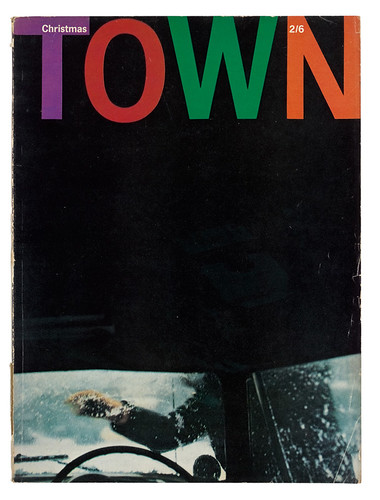
Cover of Town, Christmas / January 1963. Photograph: Saul Leiter. Art director: Tom Wolsey.
Wolsey’s work on Town, the news magazine Topic and subsequently Queen formed a brief interlude in his long advertising career in London and New York. He was born in Aachen, Germany, in 1924, the son of a respected textile manufacturer. However, to escape the increasingly intolerable political situation in that country at the time, he and his elder brother were sent to boarding school in England in 1936. His parents followed before the Second World War was declared. At Leeds College of Art, Wolsey was an award-winning student and this led to commissions from local manufacturers, including packaging for a textile company that was shown in ‘Britain Can Make It’, the 1946 exhibition of industrial and product design. After a long rehabilitation from an injury sustained at the end of the war, Wolsey left Yorkshire to study at the Central School of Arts and Crafts (now Central Saint Martins) in London, where tutors such as the progressive Modernist designers Anthony Froshaug, Herbert Spencer and Edward Wright introduced students to European Modernism and encouraged avant-garde explorations.
The Central School, together with the Royal College of Art, was the seedbed for an emerging generation of talented, vocal and assertive students. They had lived through the war and the period of austerity that followed, and now they were hungry for change. They sought out European and US design annuals and magazines. They chose sans serif fonts and preferred photography to illustration.
Right. July 1962. Photograph: Terence Donovan. Illustration: Mel Calman. Wolsey created a lively, humorous opening for a feature combining travel and women (or ‘birds’, in the parlance of the time). Calman’s trademark ‘little man’ alter ego queues up for exploration and relaxation on the landscape offered by Donovan’s voluptuous portrait.

Wolsey affirmed his engagement with European design in his first job at the widely respected advertising agency W. S. Crawford Ltd. Creative director Ashley Havinden was one of Britain’s most eminent designers and a proponent of Bauhaus design thinking, who often quoted Jean Cocteau’s adage, ‘know how far to go too far’. Wolsey reinterpreted this as ‘provoke, but not too far.’
‘Provocation is vital,’ Wolsey said, ‘to tune out the clutter of competing messages.’
By the late 1950s Wolsey’s work at Crawford’s was well known. He was a respected adman, but he was bored. Crawford’s reputation was waning, and Havinden was increasingly out of touch with the ad industry’s postwar complexities and late to embrace commercial television, a new medium in 1955. By the late 1950s there was full employment, increased wages and a ‘feeling of adventure and modernity’, but the magazine industry reacted slowly to this new affluence. Jocelyn Stevens, a young, wealthy member of Princess Margaret’s ‘smart set’, was the first to respond, purchasing the glossy women’s society magazine The Queen (later abbreviated to Queen) in 1957 and re-launching it the same year with sharp design and a witty editorial voice.
In tune with the time
In 1959 two entrepreneurial young Oxford graduates, Michael Heseltine and Clive Labovitch, followed Stevens’ lead and bought a quarterly title, Man About Town, from the publishers of the trade magazine Tailor and Cutter. With Heseltine as executive director and Labovitch as editor, Man About Town was re-launched in the spring of 1960 as a glossy men’s consumer magazine. Published by Cornmarket Press – the company the two partners set up alongside their property interests (Heseltine later renamed his part of the business Haymarket) – it was a prescient response to the consumer boom of the late 1950s and the burgeoning advertising industry that propelled it. The new owners could position the magazine to reflect the interests of the time and capture the advertising revenue to support it.
Labovitch recruited Wolsey, a friend from Leeds, to re-design and art-direct the new Man About Town. Wolsey worked evenings and weekends, ‘changing it as quickly as possible without losing advertising’. At the end of 1960, when the magazine went monthly, Wolsey left Crawford’s. He knew from the beginning that he would abbreviate the magazine’s title. ‘It was so out of tune with the time,’ he said, citing its Savile Row connotations of Establishment clientele and sartorial rules. He let the title atrophy to About Town in March 1961, and then to the emphatic Town in July 1962.
Wolsey had no magazine experience, but in his mind there was no difference between advertising and editorial design. ‘Both should be interesting, original, accessible, informative and entertaining,’ he said, ‘and if you’ve lived up to your promises they’ll buy you again.’ He relished the advantages that a magazine with no money, no history and only a handful of staff offered. There would be ‘no endless meetings, no bullshit, great flexibility, quick decisions, great responsibility’ … and no editorial philosophy.
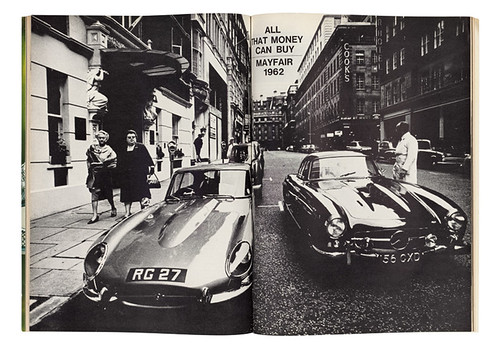
December 1962. Photograph: Don McCullin. In this opening spread for investigative journalist Jeremy Sandford’s article about Mayfair’s moneyed elite, McCullin captures two sports cars and positions them at the heart of a streetscape in which a concierge and a pair of stand like sentinels.
For inspiration, Wolsey looked at magazines outside Britain, admiring the elegant design and lateral wit of Henry Wolf’s Show magazine in New York and the consummate storytelling of Paris Match. For Town, Wolsey created an aggressive masculine style, picking up on a dominant cultural mood in Britain that was informed by the ‘Angry Young Men’. This loose grouping of young, largely working-class, novelists and playwrights raged against the existing social and political order and it informed Wolsey’s approach to typography, imagery and layout. He was looking for shock tactics.
September 1961. Illustration: Sidney King. Wolsey leavened the use of photography and illustration judiciously and to great effect. He commissioned King, an artist, filmmaker and designer, several times for Town. King’s furious lines and the artfully manipulated grotesque headline type fulfil Wolsey’s determination to ‘stop people in their tracks.’

At the time, the typeface Neue Haas Grotesk (renamed Helvetica in 1960) was unobtainable in England, so Wolsey travelled to Switzerland to buy the fonts. He employed the typeface with bravura, creating a variety of moods from high drama to quiet irreverence. He played with headlines, emphasising meaning, adding humour with visual word games and introducing old-fashioned display faces and graphic devices to change the tempo. Reyner Banham, writing in the New Statesman in 1963, praised Town as an exemplar of contemporary developments in typography.
Pictures and writing are ‘equal and indivisible’ Wolsey asserted, and the impact of the dense text spreads was both a counterpoint to the imagery and an act of editorial confidence. ‘Empty good looks are never enough,’ he said. ‘Pictures and writing should be equal and indivisible.’
He respected the quality of the writing and the reputations of its contributors; prominent literary figures such as Kingsley Amis, Lawrence Durrell and Ray Bradbury wrote for Town.
‘I loved photography,’ Wolsey stated in a lecture in 1999, giving this as the rationale behind his decision to work without a grid. ‘There was a prevailing belief at the time that, to achieve a coherent vision in a magazine, it was necessary to design within a grid. I find this Procrustean school of magazine design totally inhospitable.’ Instead, Wolsey’s priority was ‘to show the best photography to the best advantage. If one works with good photographers, if one loves a picture, you don’t cut its leg off to fit some pre-ordained system.’ However there was a rudimentary three-column grid for type with a strong horizontal axis and he did crop photographs, some ruthlessly, to strengthen the meaning or aesthetics and animate the flow. Wolsey retracted his position on grids when he re-designed Topic.
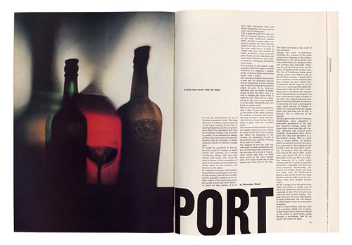
Left. November 1961. Photograph: Gene Laurents. Wolsey used the ‘Food and Drink’ section to introduce still life photography as a counterpoint to fashion and portraiture. Wolsey considers the white space as carefully as the positioning of the display type, with three text columns echoing the muted image.
Emerging photographers
Constrained by a ‘shoestring’ art budget of fifteen guineas a page [approx. £250 today], Wolsey made Town a showcase for talent. ‘There were lots of good new young photographers ready and waiting for me,’ he said. ‘They were still affordable and needed exposure. It was a great time.’
The breadth of the content in Town stretched from clothes to food, drink, jazz, art, architecture, media, politics, theatre, film and books. The inclusion of ‘women’ enabled him to work with photographers such as David Bailey, Terence Donovan and Brian Duffy, as well as Don McCullin and John Bulmer, playing glamour against grit. These Young Turks went on to reshape two key strands of British photography in the 1960s: fashion and photojournalism. At this early stage in their careers, their individual styles were less clearly defined, and they watched each other. Wolsey leavened the mix with Bill Brandt and John Deakin, and later added Art Kane, Bert Stern, Erwin Fieger, Frank Horvat and Saul Leiter.
‘McCullin and Donovan gave me the shock tactics I was looking for,’ said Wolsey. ‘Don [McCullin] especially, with his human approach and strong graphic sense of design, worked well with what I wanted to say.’ Donovan became his first mainstay. ‘I liked him immensely, he was so alive, so active,’ said Wolsey. ‘He was invaluable – he made memorable pictures that stay with you. I valued his intelligence and flexibility.’
Together, Donovan and Wolsey initiated a new way of photographing men’s clothing, moving the static studio-bound models outside into industrial landscapes and introducing narratives such as the scripted secret agent spoof Golden Loin that tapped into a dominant topic in the anxious Cold War era. In effect, they were reconstructing the image of the contemporary male, releasing him from the wartime culture of the heroic man among men. Also, by redesigning many of the ads, Wolsey brought a cohesive look to the magazine, removing the visual interruption of old-style illustrations and hand-lettering. For these redesigns he commissioned young photographers such as Bailey and John Cowan, who worked with models of both sexes, to inject a hedonistic mood.
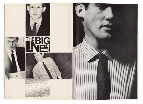
April 1962. Photograph: Terence Donovan. Wolsey’s fusion of sharp headline writing and design, his selection and rhythmic positioning of the images and the formal discipline of the layout turn a simple display of shirts and bland models into a witty and visually stimulating spread.
Features opened with breathtaking force: Wolsey would bleed a single image across a double-page spread, bringing the potency of advertising to editorial. His virtuoso cropping strengthened meaning or aesthetics, and enhanced the narrative flow. The impact of this was mirrored in raw expressive illustrations by the likes of Ben Shahn, Sidney King, John Sewell and LeRoy Nieman. The success of this approach depended on meticulous reproduction.
Wolsey’s design demanded maximum enlargement from the 35mm format that the majority of the young photographers were using. Its loose, grainy quality became a keynote look of the 1960s. Cornmarket had been astute in recruiting the exceptional ‘bulldog’ production manager Dennis Curtis. He met Wolsey’s exacting demands for intense tonal contrast with stunning results. The rich blacks and clean whites – ‘soot and whitewash’ as it came to be known – heightened the impact of the imagery and type and provided the punch Wolsey demanded in a period when colour pages were still limited. Curtis’s ability to produce the first double-page spread from a portion of a 35mm colour slide also extended Wolsey’s design possibilities.
Wolsey never directed those he commissioned; instead he collaborated with people he felt were on the same wavelength. His description of working with William Klein’s photographs reveals his belief in the primacy of storytelling and suggests an almost Zen-like way of working. ‘So there I would be at midnight,’ Wolsey said, ‘my office floor carpeted with hundreds of Klein’s wonderful pictures to let the story come together in my mind, and establish the key pictures to propel the ideas over the spreads. This was a very exciting part of the job. Not the layout. No layout ever changed people’s minds and attitudes – it just shouldn’t get in the way of the story.’
Uncompromising belief
Town’s art and production departments were stable, but editorial wasn’t. Two editors came and left within two years and Labovitch filled the interludes before and between them. Cornmarket’s influential advertising director, Lindsay Masters, acknowledged that Labovitch gave Wolsey virtually complete freedom. ‘He protected him,’ said Masters.
This did not preclude conflict, though, and Wolsey’s assistants attest to the battles that took place between art director, editor and publisher as Wolsey pursued his drive for perfection. But his clarity of purpose made him powerful. ‘I was afraid of him and respected him,’ McCullin said. ‘His reputation reached out. Even Donovan, one of the cheeky monkeys, didn’t mess with Wolsey. He said to me “He oozes electrical power”.’
Wolsey once said, ‘Good taste is an English disease; the French don’t have it, the Germans don’t have it.’ He also admitted that he ‘wasn’t easy’, but his strength lay in an uncompromising belief in what he was doing. His assistant, Jeanette Collins, later praised his ‘practical and intellectual understanding of what the magazine was trying to achieve’ and his ability to ‘conceive the whole magazine as an entity in his head’.
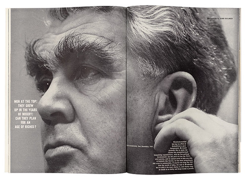
December 1961. Photograph: John Bulmer. This empathetic portrait of union leader George Woodcock’s hirsute head is perfectly cropped and positioned. Wolsey brings together text, images and design with dramatic effect.
Wolsey’s peers
Wolsey’s recollections and contemporary sources indicate that he had a broad network of friends and colleagues across London’s visual arts, film, literature and design scenes. The Association of Graphic Designers London (AGDL) was formed in 1959. Wolsey was one of six like-minded designers invited by the founding members (Dennis Bailey, Derek Birdsall, John Commander, George Daulby, Alan Fletcher, Colin Forbes, George Mayhew, James Mortimer and Peter Wildbur) to show work in their first exhibition, ‘Graphic design: London’, in 1960.
The Designers and Art Directors Association of London (D&AD) followed in 1962. It melded the panache and ambition brought by an influx of New York art directors (such as Robert Brownjohn and Bob Gill), with the energy and vision of the young London designers. An initial exhibition was organised in 1963 and Wolsey was on the jury selecting the first D&AD awards. More than half the accepted consumer magazine entries were his.
A sea change in British graphic design was gathering momentum. American writer David Usborne brought Bailey, Fletcher, Forbes, and Wolsey to the fore in his analysis of British design, suggesting that these men (and this group was all male) ‘could rival anything produced in America, Switzerland or Italy.’ In 1963 Herbert Spencer’s Typographica magazine identified 36 key typographers (including Wolsey and one woman, Margaret Calvert) and exhibited their work at the publishers Lund Humphries. In 1960 Bob Gill (see Eye 33) described London’s contemporary design as a ‘squeak’ – by 1963 the roar was beginning.
In the summer of 1963, Wolsey left Town to work with the brilliant editor Bea Miller on Queen magazine, but within months, Miller left for British Vogue. The following year, disenchanted with the encroachment of adverts and loss of potency in magazines, he left to set up his own advertising bureau. Wolsey later recalled: ‘Everything was so open in the 1960s. The period was just wonderful. England was small, you knew everyone you needed to know.’
At its best, Wolsey’s virtuoso synthesis of word and image was peerless. Stylistically, his wit, Modernist thinking, typography and use of imagery were unique in editorial design as an expression of the visual language of that moment.
‘Wolsey was one of us,’ said designer Romek Marber (see Eye 91), before adding, ‘but he was on the outside’. As an art director, Wolsey was fierce and vocal; as a design colleague he was quiet, respected and liked. Dennis Bailey once described him, with admiration, as ‘a rare bird’. Michael Rand, art director of The Sunday Times Magazine, praised Town as a groundbreaker, and Wolsey’s role as a nurturer. ‘He influenced us all.’
Anne Braybon, art director, curator and photo historian, London
Town magazines from the collection of Chris Gregory, @60sarchive
First published in Eye no. 96 vol. 24, 2018
Eye is the world’s most beautiful and collectable graphic design journal, published quarterly for professional designers, students and anyone interested in critical, informed writing about graphic design and visual culture. It is available from all good design bookshops and online at the Eye shop, where you can buy subscriptions and single issues. You can see what Eye 96 looks like at Eye Before You Buy on Vimeo.

