Autumn 2009
Cage recast as eye candy

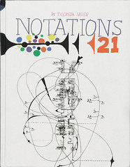
Notations 21
By Theresa Sauer<br>Art-directed by Michael Perry<br>Mark Batty, &pound;38<br>

American composer John Cage was a prankster, a gameshow champion and a creator of graphic scores whose conceptual and aesthetic beauty often outstrips their musical content. Graphic scores such as Cage’s Aria (1958) are provocations whose influence on visual culture may be more profound than their impact on listeners. Musicians who cite Cage as an influence, such as John Adams or Brian Eno, tend to point to his role in liberating music from its mid-twentieth-century straitjacket.
Cage’s 1968 book Notations was a landmark publication that brought together graphic scores by fellow composers, including Earl Brown, Gavin Bryars, Morton Feldman and Charles Wuorinen, arranged alphabetically without explanatory information. In a brief introduction, Cage explained that the ‘precedent for the absence of information which characterises this book is the contemporary aquarium … a large glass house with all the fish in it swimming as in an ocean.’
Today the fish are in a different tank, and we are swimming in information. Composers use Sibelius for scores and parts and Logic or Pro Tools to manipulate raw sounds and sonic data in the manner of sculptors and weavers. Sound and vision may be strangers on the page, but their graphic alliance dominates every website and interactive application. The history of graphic scores has a place in this new world – design educators often cite their use as a short cut that helps motion graphics students understand and think creatively about timelines.
Theresa Sauer’s Notations 21, unfortunately, is Cage recast as 21st-century eye candy. Sauer has doggedly followed Cage’s example in organising the book alphabetically, and many of the same composers appear, but the experimental spirit of the 1960s has been quashed. Where Cage used stark monochrome typography (determined by the I-Ching) and white space, Sauer and her designers opt for decorative, oatmeal backgrounds and long essays in barely legible pastel type.
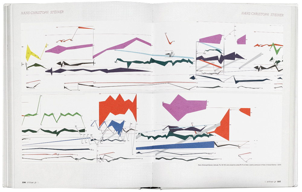
There are examples of interesting post-1968 work, by Christopher Fox, Barry Guy, Stephen Montague, James Tenney, Hans-Christoph Steiner and others. William Hellermann’s Music Sweeps Up (1984), a musical dustpan, provides some welcome humour and visual relief (though the designers can’t resist filling the margins with more oatmeal graph-paper).
And there are some 1950s and 60s classics by Earl Brown, Cornelius Cardew and Cathy Berberian (all featured in ‘Sound, code, image’, Eye no. 26 vol. 7).
Cardew once said that notation was a means of making people move, and by that definition, almost any image – even the most pathetic contributions to Notations 21 – can be used to make music. But for the book to be a worthy successor to Cage’s original, there needs to be some acknowledgement that the audiovisual parade has moved on (for example, in the work of Golan Levin, Carsten Nicolai and Ryoji Ikeda – or in Eno and Byrne). What we’re left with is another overblown book whose form shuns experiment for nostalgia and whimsy.
Eye is the world’s most beautiful and collectable graphic design journal, published quarterly for professional designers, students and anyone interested in critical, informed writing about graphic design and visual culture. It is available from all good design bookshops and online at the Eye shop, where you can buy subscriptions and single issues.


