Wednesday, 12:01pm
15 July 2015
City of signs
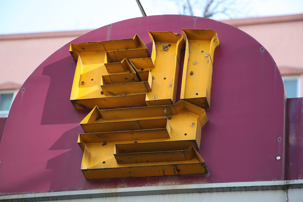
Artist Alida Sayer witnesses a collision of ancient and hyper-modern in Andong, South Korea

The city of Andong, though widely considered the bastion of ‘traditional’ Korea, possesses a distinctively perpendicular aesthetic, writes Alida Sayer.
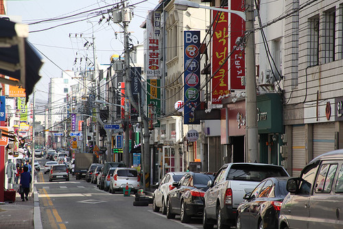
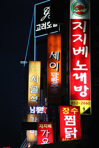
In part, this is due to the fact that most of the buildings that still stand here date from around the 1970s onwards, so even the ‘old’ town is predominantly made of angular cast concrete. Yet present-day Andong is also awash with one of the most distinctive aspects of contemporary Korean visual culture: commercial signage. Signs indicating restaurants, bars, karaoke venues, motels, mobile phone shops and various other opportunities to spend or be called to action all appear to extend from or sit upon any available surface. Such is the prevalence of these illuminations, and the manner in which they operate so synonymously with the geometric layout of the urban environment, that it almost seems as if the city itself has evolved around a desire to frame or to encounter them at the correct perspective.
A street in the city centre of Andong.
Top: 텔 / Motel.
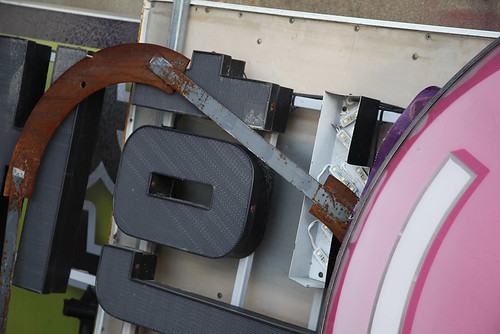
Redundant sign parts: (right) LG logo and (left) 대한 / Dae Han (a common shop name and part of the full name of Korea / 대한민국).
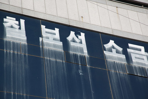
칠보석 소금 / Conglomerate gemstone – Salt.
A local inhabitant explains that there are few restrictions about who may erect one of these signs, where and in what style, yet by and large they all still look incredibly similar and generally share a common language of synthetic textures, vivid colours and crudely stylised, densely packed type. There is a sense that there is a common understanding in Andong of what a sign must be and what it must look like, with which everybody agrees. Perhaps this is testament, I suggest, to the principle of a shared and unspoken intuition that is supposedly one of the defining characteristics of the Korean people? Yes, the local inhabitant says, but it is probably also because there are only a select number of commercial sign production businesses that serve the entire city, who are often fully entrusted by their clients with the design process as well as the manufacture – and these sign producers have a penchant for the bold and the bright.
Illuminated signs at night; 고려 / Motel, 지지배 노래방 / karaoke, 세이 단란주점 / adult drinking and karaoke, 시골갈비 / country Galbi (marinated beef) and 장수 찜닭 / pressure-cooked chicken.
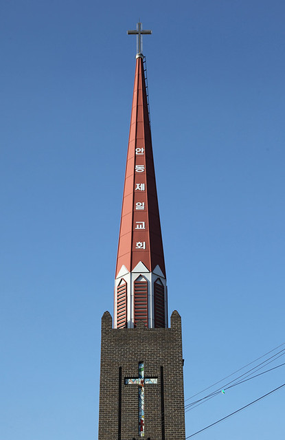
안동제일교회 / Andong First Church.
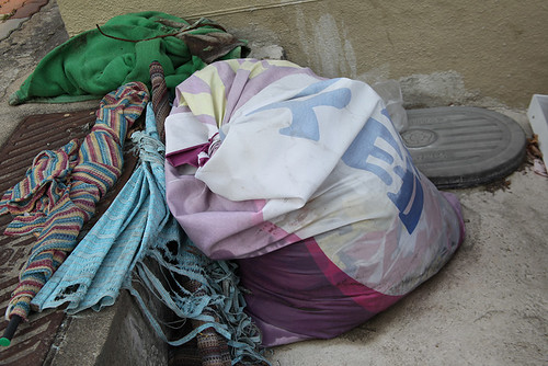
Yet despite the predominantly synthetic visual language of the commercial that pervades the urban centre of Andong, the city also possesses a rather paradoxical sense of honesty and of the raw, which equally ripples through the life cycle of its signs. Many of them deteriorate over time, gradually transforming into objects that misbehave, still earnestly projecting their fragmented messages despite being yesterday’s news. Often they are only partially removed and their traces accumulate: great swathes of green sticky-tape corners, for instance, remain from posters long torn-down. Others have been weathered into the very fabric of the walls they once hung from. Occasionally the signs are re-purposed, such as fabric banners that are sewn into sacks for refuse or strung between fence posts to delineate allotment plots. Stacks of redundant sign parts can be seen occasionally heaped at the side of the street, ready for salvage, or being used to plug a gap between buildings or to cover some uneven street surface.
This close coexistence of synthetic commercialism and the more rough and ready practicalities of life in a provincial city embodies the quintessential character of Korean culture today, which is often described (both by visitors and by the country itself) as a collision of the ancient and the hyper-modern.
Fabric advertising banner re-purposed as a refuse sack. Text reads 고시텔 / low budget rent room.
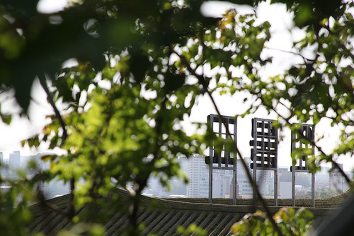
Hillside sign facing out over the city. 원불교 / Won-Buddhist temple.
All images by Alida Sayer, June 2015. Translation: Kevin Sohn.
Alida Sayer, artist, Norwich and London
Eye is the world’s most beautiful and collectable graphic design journal, published quarterly for professional designers, students and anyone interested in critical, informed writing about graphic design and visual culture. It is available from all good design bookshops and online at the Eye shop, where you can buy subscriptions and single issues.
