Monday, 12:00pm
3 June 2013
Private fears of public speaking

A report from day two of the inaugural Point conference in London

Conference themes are often loosely interpreted by speakers and the themes themselves leave space for interpretation, writes Sarah Snaith in the second of two reports from the conference (see John O’Reilly’s ‘Talking about the A-word’ on the Eye blog).
The inaugural Point conference sought to break this mould by choosing the loaded term ‘authenticity’. To commence day two, Lucienne Roberts of Graphic Design& honed in on some of projects that relate to the theme from the past few years, including the campaign identity for David Miliband in the Labour leadership race (2010), the exhibition design of ‘Madness & Modernity’ (Wienmuseum, 2010) – where simplified doorway arches acted as metaphors for the mind – and GraphicDesign&’s book Page 1: Great Expectations (2012 – see ‘Forward to page 1’) on the Eye blog).
Roberts’ challenged the audience with the rhetorical question, ‘Am I really saying that graphic design can’t be authentic?’
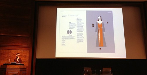
Roberts showed slides from a book project she is working on that plots the history and design of nun’s habits: ‘Nuns are the epitome of less is more.’
Top: Sean Rees of Purpose.
Sean Rees and Nathan Webb (Purpose) presented their brand identity for The McGuire Programme, an organisation that helps people who stutter. Rees, who is a former sufferer and a graduate of the programme, began his portion of the presentation by playing a video that demonstrated his former difficulties. Rees took a sharp steady breath between each sentence and spoke with feeling about the design work Purpose is doing to represent ‘turning negative speech experiences into positive ones’.
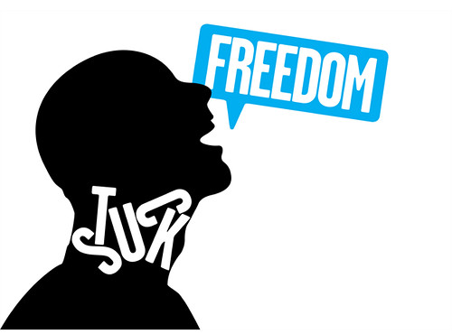
Faced with the challenge of uniting the McGuire Programme’s many identities, websites and points of contact worldwide, Purpose designed a brand image that uses a restrained two-colour palette and puts the sentiments of sufferers at its core – that words can feel ‘stuck in the throat’. The organisation’s new website is due to launch in the coming months.
The McGuire Programme identity by Purpose design positions the organisation as a tool that can free stutterers from the condition.
Music video for Whinnie Williams You don’t love me, created by Jessica Dance and Robert Muller.
Jessica Dance and Robert Muller of Get Mullered and Dance interpreted the conference theme by giving a playful presentation of commentary while screening a selection of their short film clips. They have worked for Mulberry, Selfridges and Hanson of London among others. The pair recounted their many production challenges and the lessons they have learned in the process including the anecdote, ‘it’s important to love what you are attempting to do, as it takes a lot of attempts to do what you love.’
Following presentations by Darkroom and Multistorey’s Rhonda Drakeford and Open Studio Club founder Nick Couch, Clare Sutcliffe of Code Club took the stage.
Code Club: Talking Code film, via YouTube.
Code Club founder Clare Sutcliffe’s talk ‘Hacking the future’ was a compelling call to action for coders willing to ‘inspire children to try digital making’ in an after-school club environment, often without computers. Sutcliffe is driven to enable nine to eleven-year-old ‘digital natives’ to become active creators rather than passive consumers. The volunteer-led network currently has 739 clubs across the UK and plans to increase to 5000 by the end of 2015.
The short Elliott Erwitt film, screened to start the afternoon session, was a welcome break from the rapid pace of the 30-minute presentation schedule. He spoke from his couch in New York City about his experience of doing photography ‘that has to do with the human condition’. Numerous black and white street photographs of dogs had the audience in flurries of laughter. Dogs are easy, everywhere and ‘they don’t ask for prints’ said Erwitt.
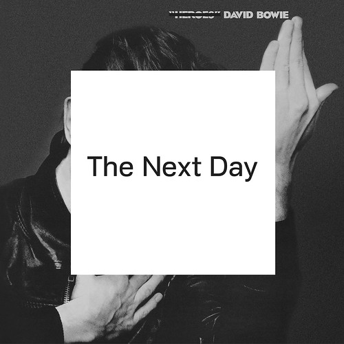
David Bowie’s The Next Day. Cover design by Jonathan Barnbrook.
Jonathan Barnbrook’s talk began with an opening slide that read, ‘Authenticity, the real place of graphic design in society’ and later proclaimed, ‘don’t compartmentalise your morals’. He spent much of his time exposing the many iterations in the process of designing David Bowie’s The New Day album cover, which at times was considerably more colourful and complex, saying that the final design is representative of listeners’ ‘relationship with ourselves’ through Bowie’s music.
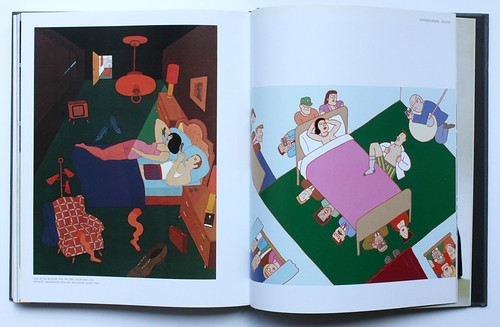
Spread from Seymour: The obsessive images of Seymour Chwast (Chronicle Books, $40) featuring ‘Look at the window, 1972’ (left) and ‘Observation’, 2005 (right).
‘There’s nothing authentic about what we do, we’re representing something’ said Seymour Chwast, the renowned designer / illustrator and co-founder of Push Pin Studios. The hour-long talk allowed the audience to pause and contemplate some of Chwast’s most humourous and observant works playing on his obsessions with, ‘cars, people’s heads, feet and shoes’ as applied to the presentation title ‘God War Sex’.
The breadth of Chwast’s presentation was reflective of his lengthy and varied career. After recalling his use of old type with Milton Glaser, ‘In the 1950s everything was going Modern, flush left and rag right. We went against the grain and used type that was decorative’, he moved on the pleasures of problem-solving. ‘I enjoy the process of solving problems, sometimes you rely on luck to get you through … You look for symbols representing something to answer a problem and find a new way to put it together.’
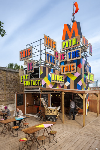
Colour is as much Morag Myerscough’s identity as it is an identifying marker of her work. Myerscough’s exuberance was apparent in her description of each one of her recent projects including work-in-progress images that illustrate her popular sequential colour tweets. Myerscough perfectly concluded the conference by teaming with her partner Luke Morgan and his band The Highliners, showing the fervent installation video documenting the making of Movement Cafe alongside a live music performance.
Morag Myerscough’s Movement Cafe.
Read ‘In the thick of it’ about Morag Myerscough in Eye 79 and Dan Wilkinson’s review of Seymour: The Obsessive Images of Seymour Chwast ‘Pipe dreams’ in Eye 73.
Sarah Snaith, writer and editor, London.
Eye is the world’s most beautiful and collectable graphic design journal, published quarterly for professional designers, students and anyone interested in critical, informed writing about graphic design and visual culture. It is available from all good design bookshops and online at the Eye shop, where you can buy subscriptions, back issues and single copies of the latest issue. You can see what Eye 85 looks like at Eye before You Buy on Vimeo.

