Tuesday, 8:00am
15 October 2019
At your service
Armin Hofmann
Thérèse Moll
anonymous designers
Design education
Design history
Reviews
Typography
Graphic Design Manual – Principles and Practice
Armin Hofmann. Niggli, hardcover, £35Armin Hofmann’s Graphic Design Manual. A review by Alex Cameron

A reproduction of Armin Hofmann’s poster, Giselle, designed for the Basel Open Air Theatre in 1959, has hung at my desk for more than twenty years, writes Alex Cameron.
In graphic design terms, it is as inspirational as it is beautiful. The poster is a highlight of graphic design history for its expert synthesis of photography and typography. Giselle is perfectly crafted, kinetic and considered, a masterclass in direct visual communication from a leading Swiss proponent of the postwar ‘International Style’.
Spread from Graphic Design Manual showing exercises with segments of circles on a circular grid.
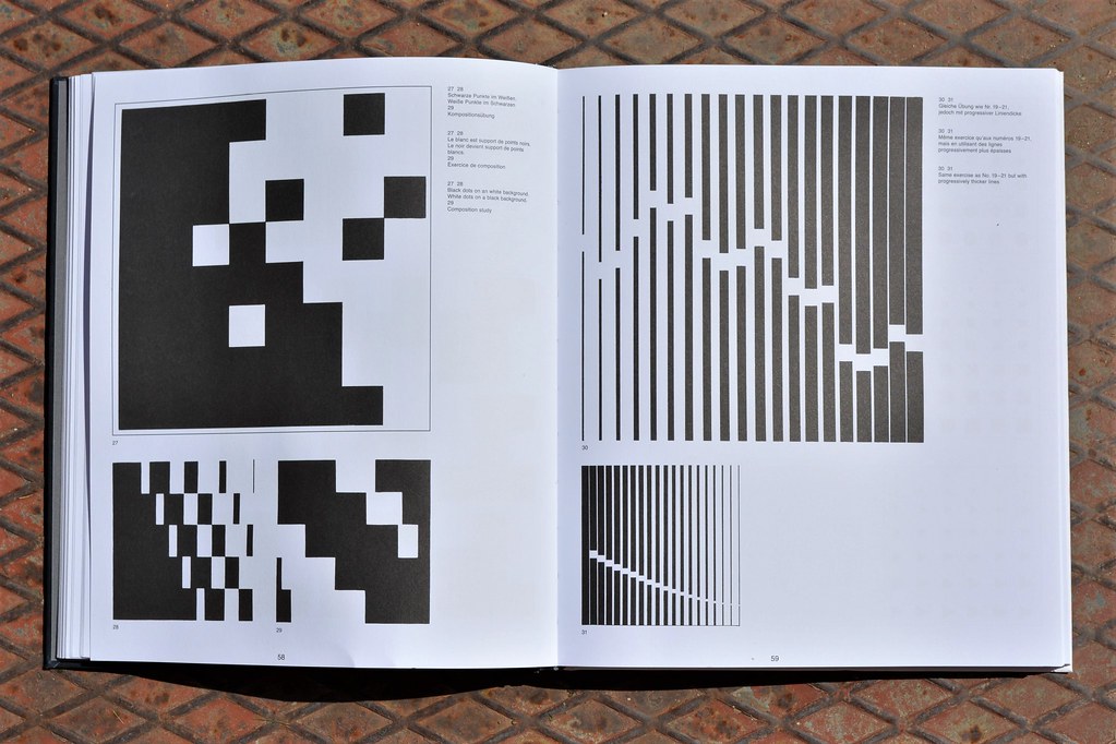
Top. Spread showing ‘composition studies’ with dots and lines.

Hofmann’s Graphic Design Manual – Principles and Practice, first published in 1965, was not a portfolio but a trenchant critique of art education in schools, and a detailed and practical demonstration of a methodological approach for a maturing graphic language. It was founded on principles employed in his commercial work and his role as head of the Basel School of Design. Some of the (uncredited) work used to illustrate the Manual was by Hofmann’s students, including Nelly Rudin, Karl Gerstner and Thérèse Moll. Gerstner would later embed the Swiss Style at pharmaceutical giant, Geigy, (see The designer as programmer) while Moll would introduce it to MIT in the US (See article in Eye 98).
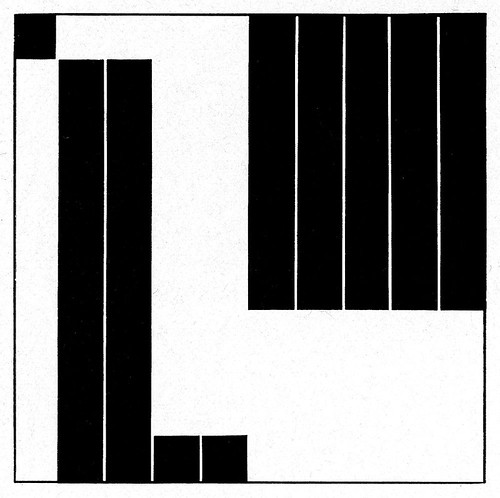
Student exercise by Thérèse Moll, in which certain parts are blanked out from the lattice grid of black bars, which was included in Hofmann’s book Graphic Design Manual in 1965. See ‘The enigma of Thérèse Moll’ in Eye 98.
 The Manual also served as an international manifesto for the Swiss Style. It is published with text in German, French and English and printed throughout in black and white. While this fixes it in time, the specificity of the content renders it future proof. It was republished in 1988, with a short preface that referred to the paradigmatic shift in graphic design, the ‘desktop revolution’. Why republish it in 2019?
Today, alternative and competing definitions of graphic design abound, and the blurring of conventional nomenclature is proving problematic, to such a degree that a basic agreement is difficult to reach inside and outside the profession about the role of the graphic designer. Now is the perfect time to revisit Hofmann’s Manual and reassess an essentialist perspective on graphic design, a necessary ‘recalibration’ to rediscover the fundamentals. Hofmann was clear, ‘it would be wrong to conceive the work of the [graphic] designer as anything but the service of giving messages, events, ideas and values of every kind a visible form.’
Progressively graded lines that evoke movement applied to a railway poster.
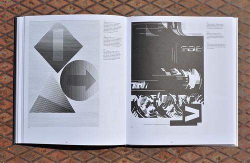
The structure of the Manual is a logical development of his teaching methodology. The primary sections include, ‘The Dot’, ‘The Line’, ‘Confrontation’ and ‘Letters and Signs’. Each is fully illustrated – starting with probing, experimental abstractions and ending in actual finished work. Dot and Line are elementary exercises and experiments in contrast and light and the creation of movement and forms. ‘Confrontation’ speaks of reconciling antagonistic forms (such as abstractions with photography) while ‘Letters and Signs’ provides depth and rigour to the core of what graphic designers do – communicate with an audience through words and signs.
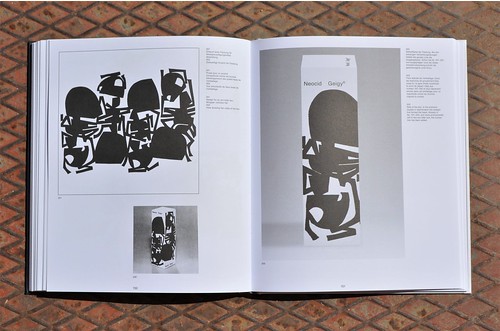
Designs for ant-killer packaging for Geigy.
What remains pertinent today about the ‘International Typographic Style’ – as the ‘international’ in the name suggests – is its outward-looking and universal set of values. It is a critique of its own time that remains relevant to ours. Design trends can tend towards an elitist disregard for wider audiences in deference to faux avant-garde styles. Hofmann instructs: ‘No dividing line must be drawn in future between work done with art qualities in view and work done with merely a commercial application in view. A valid form of unity can be found.’ The attitude of, ‘art good, commercial bad’ has no place in the graphic design landscape.
Hofmann’s Giselle is now in the gallery (Cooper Hewitt, Smithsonian Design Museum) but that was never the intention; it was designed with an audience at its core. Similarly, Hofmann’s Manual is intended for study and critique, not the coffee table. His work on the essential elements of graphic design is timeless and peremptory. The Graphic Design Manual is vital reading for designers young and old and everyone in between.
Alex Cameron, editorial designer, lecturer and design writer, Madrid
Cover design by Hofmann showing a ‘composition and motion’ study with the letter ‘i’, from the ‘Letters and signs’ section of Graphic Design Manual.

Eye is the world’s most beautiful and collectable graphic design journal, published quarterly for professional designers, students and anyone interested in critical, informed writing about graphic design and visual culture. It is available from all good design bookshops and online at the Eye shop, where you can buy subscriptions and single issues. You can see what Eye 98 looks like at Eye Before You Buy on Vimeo.
