Tuesday, 11:00am
17 March 2015
Offset 2015: day one

From Irish design heroes to the silver screen – Anna Kealey describes a packed programme that included Peter Maybury, Ian Anderson, Hey Studio and Annie Atkins

Offset’s first day, Friday 6 March, included speakers from a range of backgrounds – graphic design, advertising, film, industrial design and illustration. But some connecting themes emerged: the importance of physicality and texture, meticulous production methods – and seizing opportunities despite tight deadlines, writes Anna Kealey.
Armed with impressive tote bags of swag, 2500 people piled into Bord Gáis Energy Theatre for a sixth – and sold-out – instalment of Offset, Dublin’s annual international design conference. This year’s branding, resembling Aztec-inspired QR codes, felt dizzying; but so, in different ways, was the line-up.
Peter Maybury opens Offset 2015.
Top: Annie Atkins. Photo: Pamela Bowman.
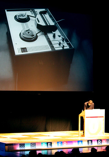
While Offset always gets some remarkable international speakers, it also makes an effort to showcase the best of Irish design. First on the conference’s main stage was the Irish artist, graphic designer and musician Peter Maybury, who discussed everything from publications for art clients to his audio-visual experiments.
Barber & Osgerby’s Filo sofa.
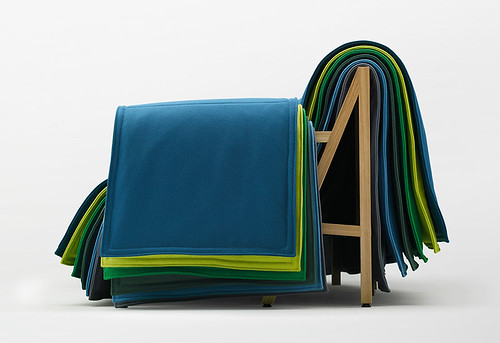
Edward Barber, of the London industrial design firm Barber & Osgerby was a self-declared ‘anomaly’ (since Offset speakers tend to work in just two dimensions) but gave one of the weekend’s most inspiring talks, deconstructing the industrial design process rather in the manner of the firm’s Filo sofa. The 60-person studio works regularly with prominent clients: the Ace Hotel, London Science Museum, and the V&A.
The Double Space installation (2014) at the V&A by Barber & Osgerby.
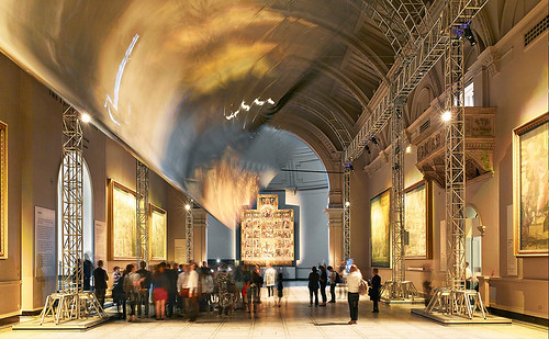
Even so, their Double Space installation last year at the V&A’s Raphael Gallery was extraordinary – Barber described standing under its mirrored ceiling as ‘nerve-wrecking’. He ended with a detailed account of the process of designing the 2012 Olympic torch in ten days. With 8000 perforations – representing each of the relay runners, but also reducing materials costs and weight – the result was one of the most elegant Olympic torches.
Boys & Girls’ Jenga and helium balloon desk, 2009.
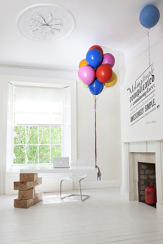
Rory Hamilton, creative director at Boys & Girls, Dublin’s trendiest-looking office, gave a humorous presentation on the benefits (and perils) of starting an independent ad agency. He recalled how at launch in 2009 Boys & Girls devised some compelling but cost-effective methods of self-promotion: they got worldwide press for a series of fantastical office furniture, including a Lego boardroom table and a reception desk held up by Jenga bricks at one end, helium balloons at the other.
Over the weekend, Samuel Beckett’s famous line ‘Ever tried. Ever failed. No matter. Try Again. Fail again. Fail better’ (from Worstward Ho, 1983) was bandied around to the point of tedium. Hamilton expressed scepticism that anybody quoting the line had ever ‘stared truly down the barrel of absolute failure’, and to illustrate the point he led the audience through his last advertisement for Guinness at BBDO – ‘The Dot’. The original concept involved an ambitious tracking shot from the pupil of an eye to a cityscape; but the crew was forced to abandon the shoot because of strong winds (though not strong enough for a successful insurance claim).
Design by Ian Anderson / The Designers Republic for Fila Brazillia’s tenth album Dicks (2004).
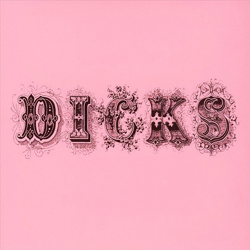
Ian Anderson condensed 29 years of outstanding work at The Designers Republic (see Reputations in Eye 71) into an alphabetical list (‘A’ for Autechre and Aphex Twin). He told us that the tenth album by electronic duo Fila Brazillia became Dicks (rather than the intended Dix) after a confused pub conversation: ‘I was excited because I knew I could do a poster with “Dicks Out Now” on it.’
On the second stage, at the ‘Anatomy of a Well Crafted Book’ panel, Peter Maybury, fellow designer David Smith and printer Marcel Meesters discussed the challenges of book design. Smith spoke about the value for students of engaging with the book as a means of learning about typography and hierarchy. A question from the audience sparked a debate on the quality of the Irish printing industry – Maybury and Smith both spoke of having their hearts ‘broken repeatedly by Irish printers’: a show of hands suggested many in the audience had suffered similarly.
Cover illustrations by Hey Studio for Monocle, March 2011.
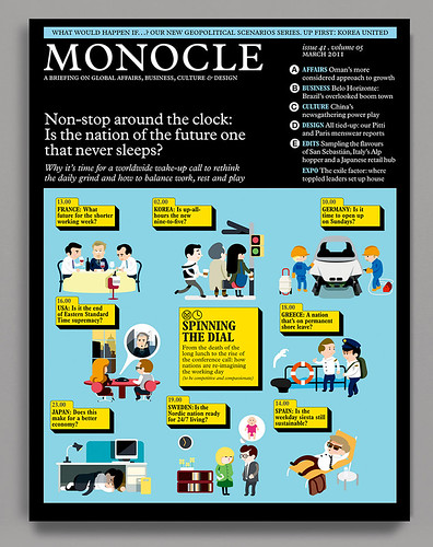
In a presentation peppered with charming animated GIFs, Veronica Fuerte and Ricardo Jorge of Barcelona’s Hey Studio recalled spending over a week working on their first commission for Monocle magazine – a tiny 2cm x 2cm illustration. The dedication paid off: Hey’s bold illustrative style is a huge part of Monocle’s aesthetic.
Hey’s stationery for glassblower Jeremy Maxwell Wintrebert.
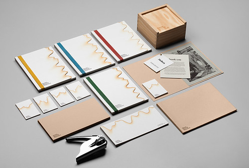
The studio’s most effective work was the identity design for glassblower Jeremy Maxwell Wintrebert. To get the physicality and uniqueness Wintrebert brings to his art, the final stationery was created by laser burning, so no two pieces were alike; the items even smelled like Wintrebert’s workshop. The talk finished with a fast scroll through Hey’s delightful Instagram account.
Some of Annie Atkins’ design work for The Grand Budapest Hotel (2014).
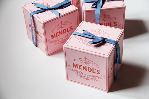
The day culminated with Annie Atkins (see ‘Ready, Offset go’). Inviting her on to the stage, organiser Bren Byrne called it the ‘moment we’ve all been waiting for’, and deafening applause confirmed the sentiment. Using extracts from the script for The Grand Budapest Hotel, Atkins demonstrated how she goes through each section highlighting anything that might need to be designed by the graphics department – not just ‘hero props’ (like a prison map that earned more than two seconds of screen time) but inconspicuous items including a champagne bottle and a patterned handkerchief.
‘I believe graphic designers have a responsibility towards spellings and grammar,’ Atkins said, but confessed that her famous pink Mendl’s boxes (below) featured an extra ‘t’ in ‘Pâtisserie’ (an error that had to be corrected in post-production). She also revealed her ‘top secret formula’ for ageing paper: soak in three Barry’s Tea bags for every ten years it is meant to have aged.
Still from Boxtrolls (2014), Outfits illustrated by Annie Atkins.
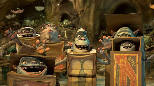
Atkins spoke of the importance of using physical objects from a period as a references for scale and texture – for the children’s steampunk animation The Boxtrolls she created outfits for the subterranean, cardboard box-wearing creatures by redrawing Victorian-era packaging without straight lines.
To design a card for J. G. Jopling, the assassin in The Grand Budapest Hotel, Atkins studied a calling card made for Adolf Hitler and Eva Braun. Atkins makes several identical versions of each prop, with painstaking attention to detail. Her talk was an education in designing for film.
To be continued …
Anna Kealey, design educator at University of the Arts London and the University of Gastronomic Sciences, Italy
Eye is the world’s most beautiful and collectable graphic design journal, published quarterly for professional designers, students and anyone interested in critical, informed writing about graphic design and visual culture. It is available from all good design bookshops and online at the Eye shop, where you can buy subscriptions, back issues and single copies of the latest issue. You can also browse visual samples of recent issues at Eye before You Buy.
