Monday, 10:30am
22 September 2008
Record design framed
john l. walters
Design history
Graphic design
Illustration
Photography
Reviews
Visual culture
Does ‘Spin’ reduce graphic design to the level of art on a wall?

The Spin exhibition is small, free, easy to find (if you’re in or near London) and won’t take up too much of your time, writes John L. Walters.
Forty-five examples of ‘record design’ are shown mounted in 44 of those nice matt black twelve-inch frames you get from Art Vinyl. The exception is David Tartakover’s gatefold (12 x 24 in) artwork for an album called Children by Arik Einstein and Shemi Levy.
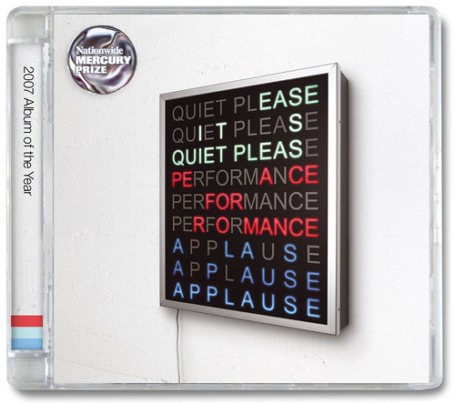
Supporting materials include contact sheets and prints from Roger Philips’ photography session for Goodbye Cream (art-directed by Alan Aldridge); interior artwork by Andrew Elkins for the cassette liner (!) of James’s Seven; Oscar and Ewen’s conceptual pile for Well Deep: Ten Years of Big Dada Recordings; Mark Melvin’s lightbox (above) for the 2007 Mercury Music Prize compilation.

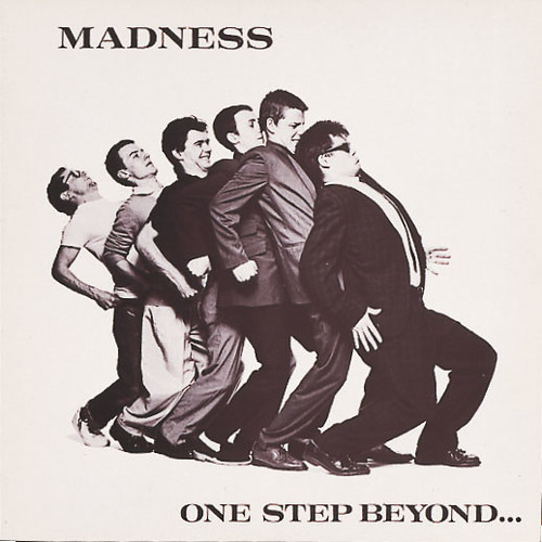
But the press release promises ‘a rare opportunity to see the original artwork which inspired some of the most iconic record covers of our time’. To be generous, I’d say there are half a dozen iconic examples here, including Hard-Fi’s Stars of CCTV, Madness’s One Step Beyond (below) and Adam and the Ants’ Kings of the Wild Frontier (the last two designed by Jules Balme) and possibly The Chemical Brothers’ Surrender with its illustration by Kate Gibb (above).
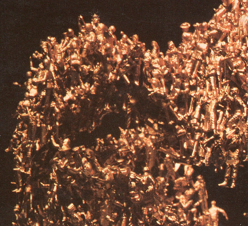
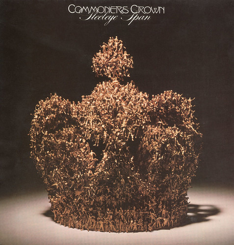
Nancy Fouts’s cover for Steeleye Span’s Commoners Crown might have been iconic, had the folk-rock album been better known; her literal-minded crown, made from tiny model humans glued together and sprayed gold, prefigures the Chapman Brothers by nearly a generation.
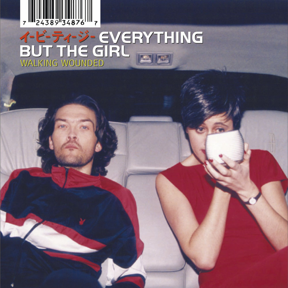
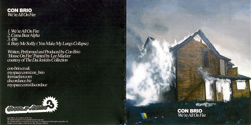
Form’s cover for Everything But The Girl’s Walking Wounded (top) is there, and the vinyl version looks very handsome in its frame. But this also highlights the problem of the CD era: many of the covers from the past two decades are five-inch squares plonked in a black void. Relatively contemporary covers, such as Girls Aloud’s Biology (also by Form) and Con Brio’s We’re All On Fire (bottom), with its painting by Lee Maelzer, come across badly against their big brothers from the 1960s, 70s and early 80s: Family Entertainment, The Clash’s Combat Rock, etc.
And this does a disservice to designers and art directors. Hege Saebjornsen’s photograph of Adele is not just a CD or LP cover - it's a poster, a giant billboard, a tiny image on iTunes, and it works hard to represent the singer across all formats.
Airside / Fred Deakin’s artwork for Deakin’s own band Lemon Jelly is highly adaptable, too (see his recent compilation Triptych, which won a prize in the 2008 European Design Awards) but he’s represented here by ’64-’95. It’s nice, but it doesn’t really tell the casual viewer what is going on, or how the designers have tackled the challenge of the brief.
But it’s a shame to reduce something as rich and multi-layered as music design to mere ‘art on a wall’.
‘Spin: The Art of Record Design’, The Arts Gallery, University of the Arts London, 65 Davies Street, London W1, to 3 October 2008.
Eye is the world’s most beautiful and collectable graphic design journal, published quarterly for professional designers, students and anyone interested in critical, informed writing about graphic design and visual culture. It is available from all good design bookshops and online at the Eye shop, where you can buy subscriptions and single issues.
