Thursday, 1:05pm
16 December 2010
The big chill

Fraser Muggeridge
Giorgio Sadotti
john l. walters
Graphic design
Typography
Visual culture
Ice and police on the streets inspire a new print from artist Giorgio Sadotti.

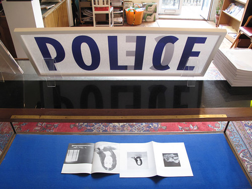
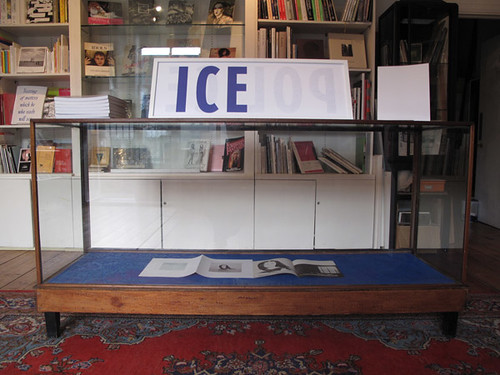
‘It’s not really a collaboration,’ says designer Fraser Muggeridge about his work with artist Giorgio Sadotti. ‘But it’s a bit more than being a fabricator. I’m a producer.’ Muggeridge is talking about his latest ‘production’, writes John L. Walters, the limited-edition two-sided silkscreen of Sadotti’s POLICE ICE ICE POLICE designed by his studio (above and below).

It’s a three-dimensional object, something you can view from both sides, screenprinted on paper thin enough for the words to show through. And it’s topical: the past few weeks have seen a lot of ice, and a lot of police on the pavements of London. Sadotti calls it a ‘leaning sculpture’ (below).
‘If your mother in law came round you might put it the other way round with the ICE on the front,’ (below) says Muggeridge.
‘Giorgio is a conceptual artist. When it comes to typography he knows about how things should look but he doesn’t know the names of typefaces,’ says Muggeridge. ‘That’s my role.’ Sadotti, also responsible for Tate Britain’s Christmas tree ‘decorations’, emailed a scan of some hotel stationery that used the kind of typeface he wanted. The designer pulled down his copy of Encyclopedia of Type Faces and after a long search found it on a Sunday afternoon – Erbar.
So it’s not a Muggeridge poster, like that letterpress pangram (currently on display at ‘Reverting to type’) but his interpretation, his ‘production’ of Sadotti’s idea. It’s more akin to a virtuoso performance of an ideas-based piece of music, like Joanna MacGregor or David Tudor playing John Cage.
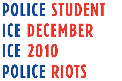
To promote the print, Muggeridge and Sadotti have made another image (above) that expands upon the original piece, which may count as one of the first graphic responses to the recent protests about UK tuition fees. And I suspect we’ll see more ice, and more police on the streets before the winter’s out.
Giorgio Sadotti
POLICE ICE ICE POLICE, 2010
A unique reversible silkscreen on paper
30 x 88 cm. Edition of 100.
To order please email [email protected]
See pleasedonotbend.co.uk/artists/giorgio-sadotti.
Eye is the world’s most beautiful and collectable graphic design journal, published for professional designers, students and anyone interested in critical, informed writing about graphic design and visual culture. It’s available from all good design bookshops and online at the Eye shop.
